Under the Spotlight
What does the age distribution look like?
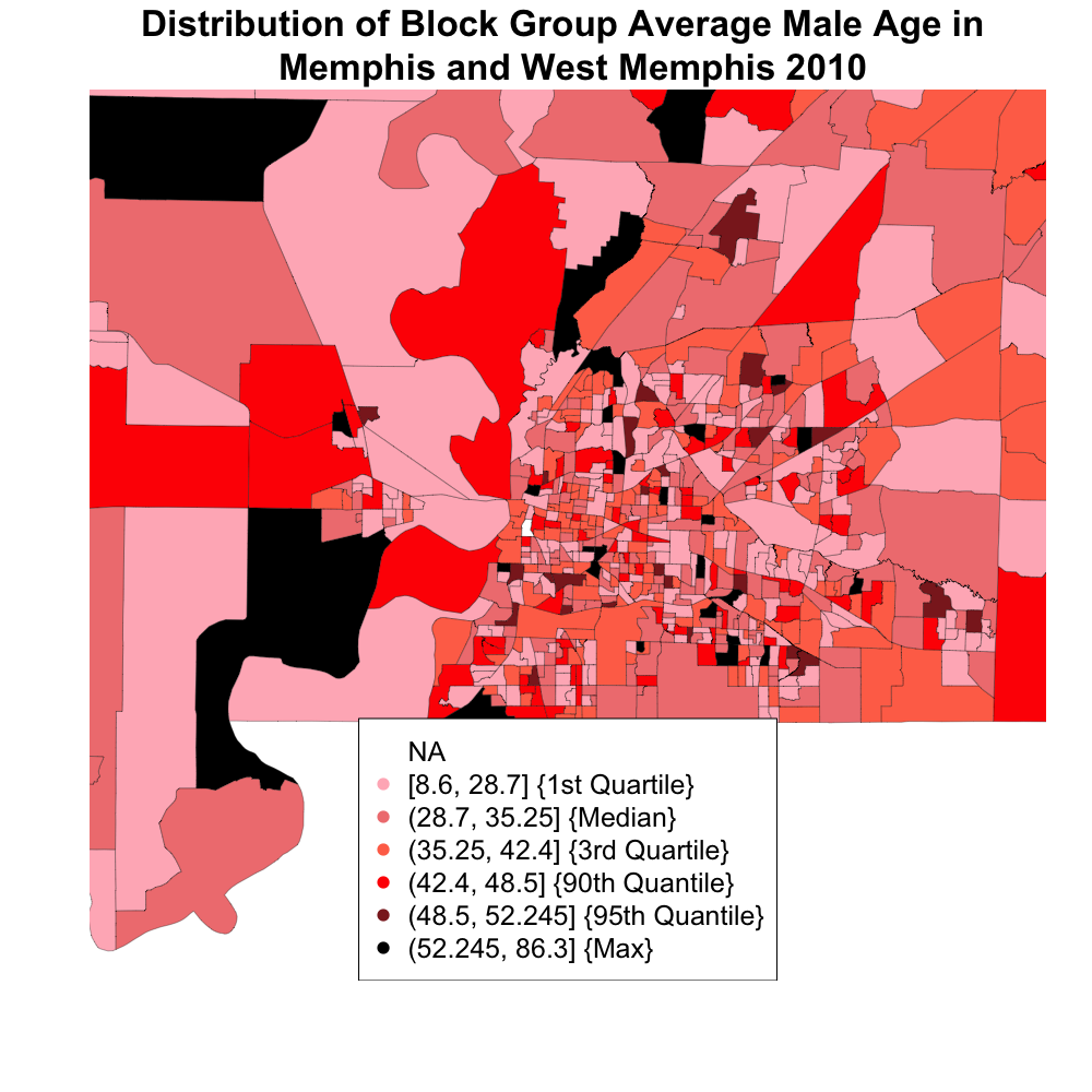
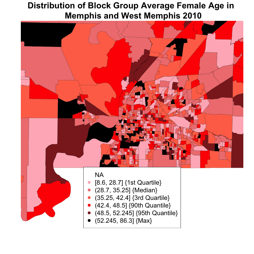
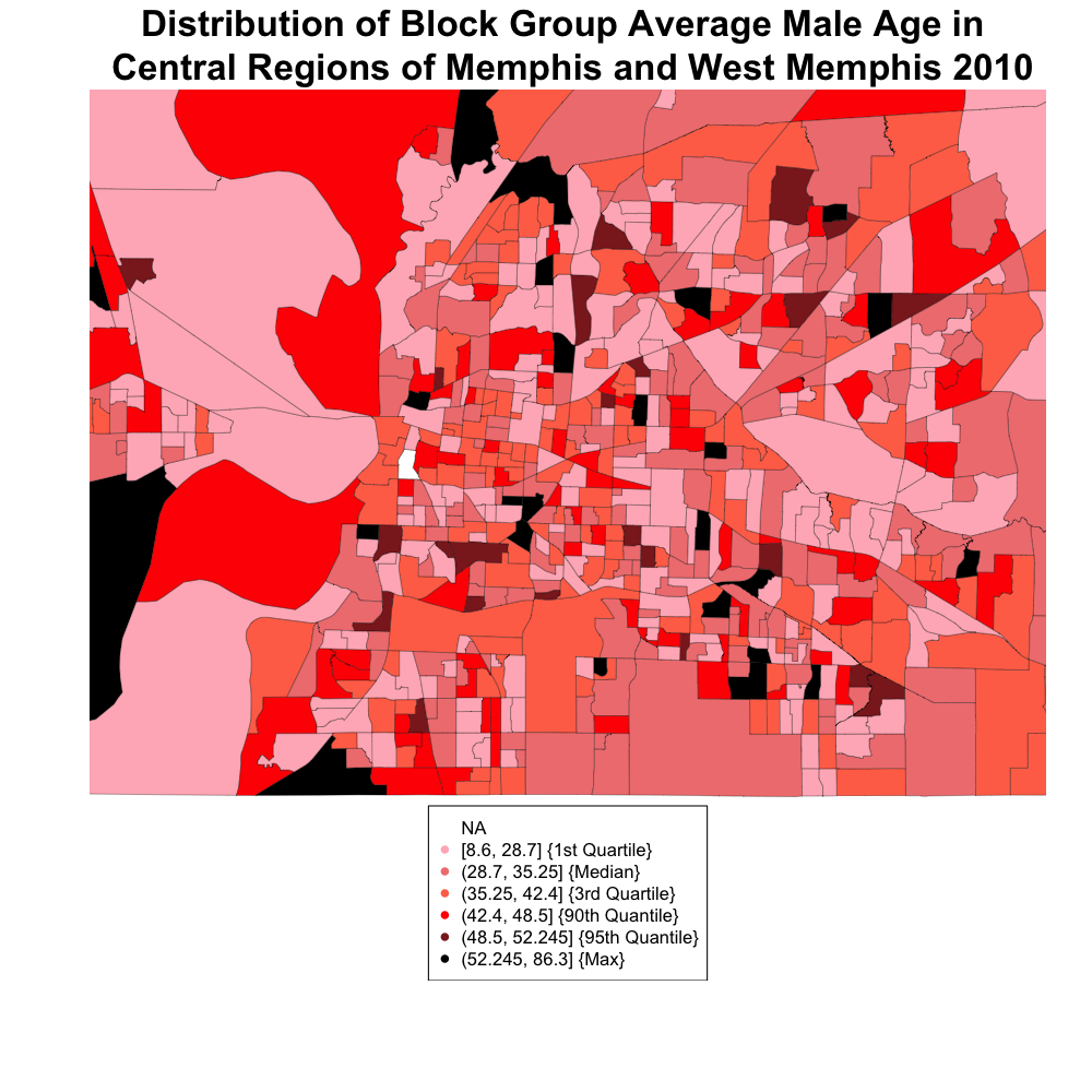
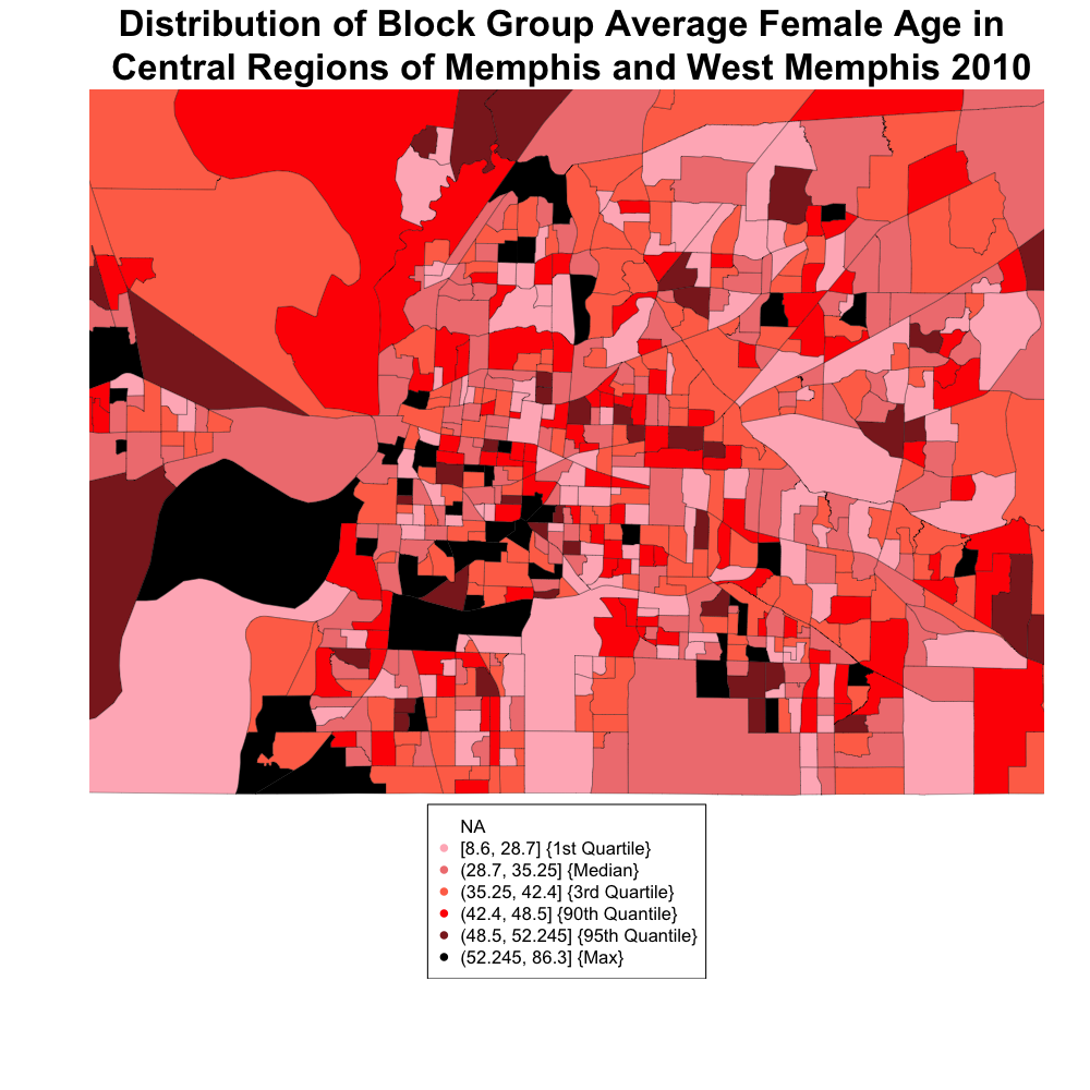
Visualization
Choropleths (click on image to enlarge)
Let's zoom in (click on image to enlarge)
Captions
This is a plot of Memphis/ West Memphis color-coded by age. Examining the plot, we see that certain block groups make up what can be seen as an older or younger area. In particular, the southwest corner of Memphis seems to have somewhat older females living there, while the center and northeast corner tend to look younger. The outskirts and West Memphis area tends to change in no discernable pattern. Males seem to look younger overall, or at least have fewer blocks with the darkest shade. It would be interesting to see what proportion of block groups has the same color across gender category.
We chose choropleth maps to show this data because it gives a clear picture of how age is distributed by geographic location across the city. A heat map and a contour plot would not have worked here because they are both 2D density estimates, which require one more variable. In this case we are only looking at one variable, age.