Under the Spotlight
How does age correlate to race in 2010?
Visualization
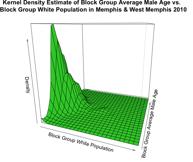
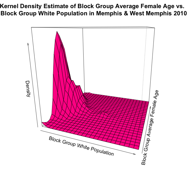
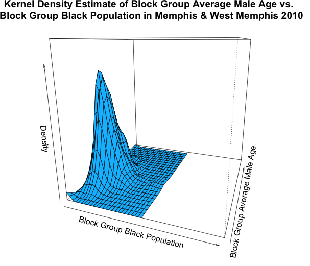
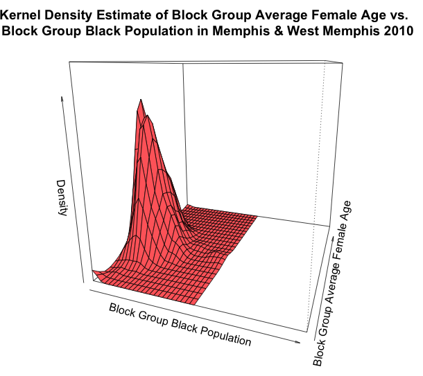
Perspective Plots (click on image to enlarge)
Alternative Arrangement
Captions
These four perspective plots (with scaled axis for easy comparison) demonstrate that block groups tend to have smaller black population in general compared to white population, and that the average age in these block groups tend to be more variable (in addition to re-emphasizes the point made in the second set of graphics that females tend to live longer than males). Because of the consistent scale of the axes, it is immediately obvious that the ages of black males are more variable, because the mode is not as high, and the lack of spread (“pointiness”) of the mode for whites is distinguishable. We also see that the mode for females (both black and white) is generally pushed to the right indicating that they live longer. The colors used do not indicate anything, though they could have been useful to indicate gender or race. However, this would limit the takeaways of the graph to be along gender or racial points, while much more information is displayed.
These four plots are useful in that they quickly summarize many points like main racial and gender combinations on the distribution of age. However, the lack of numerical labeling on the axis and complexity of three-dimensional graphs does not allow for detailed, quantitative takeaways. This could have been done with two dimensional graphs examining key relationships as used in series 2 and 3—however this would limit the amount of takeaways, and perhaps leave unanswered questions for the viewer. With that being said, our previous graphs gave the viewer information about the quantitative data portrayed in these graphs. Because of more specific charts used in other series, this series used the four graphs to give an overview of age over two variables.