Under the Spotlight
How does the distribution of households of different sizes look like?
Visualization
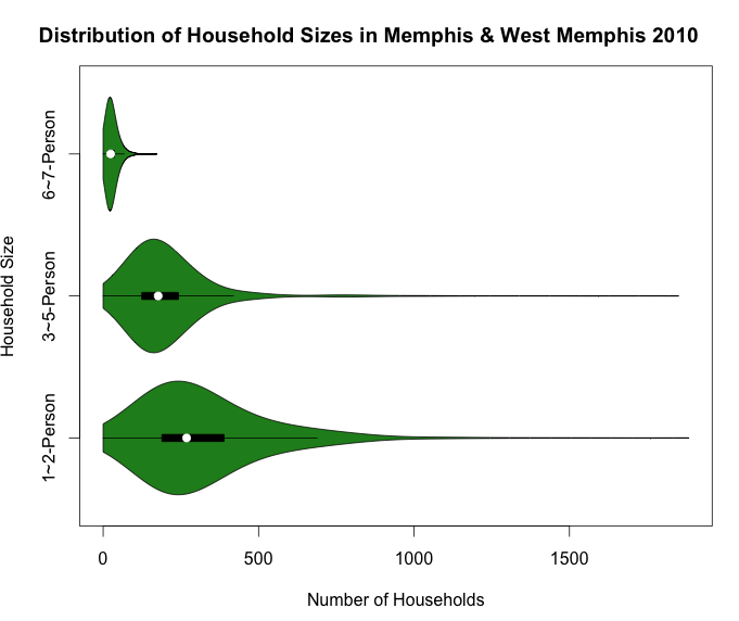
1D EDA
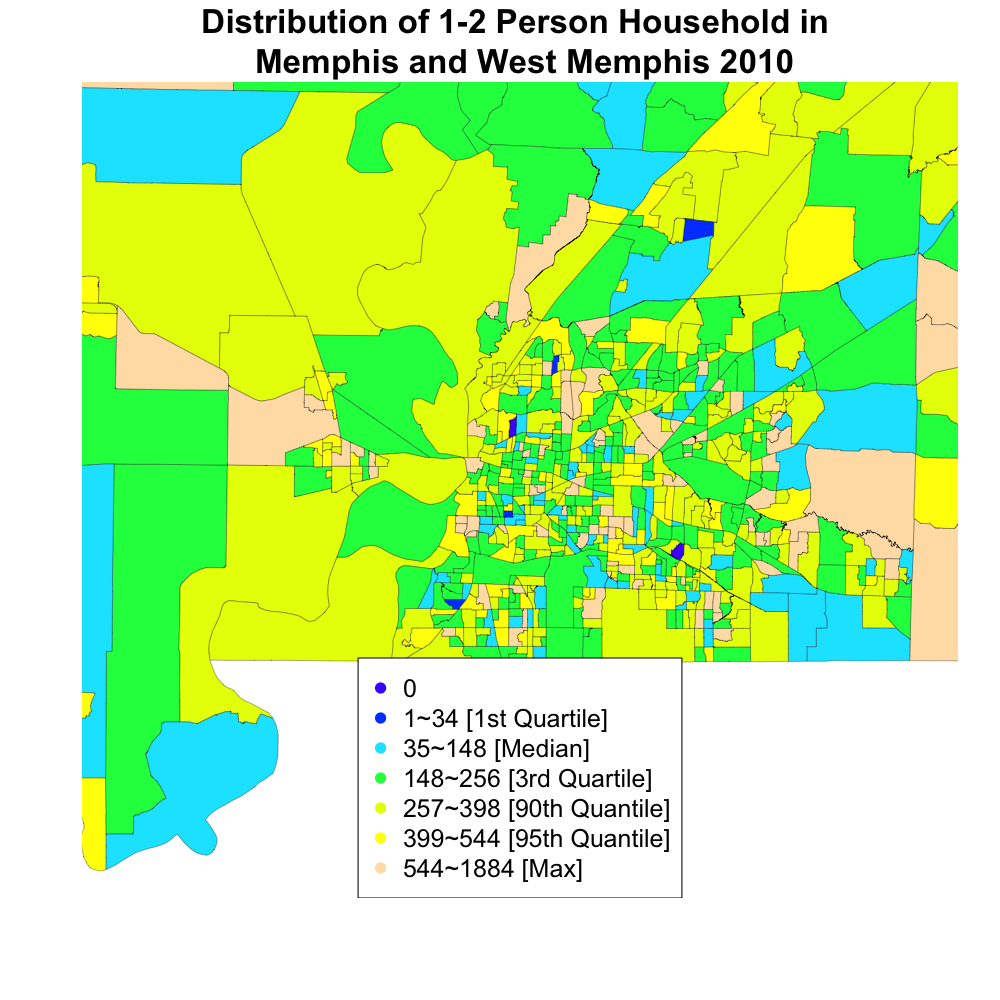
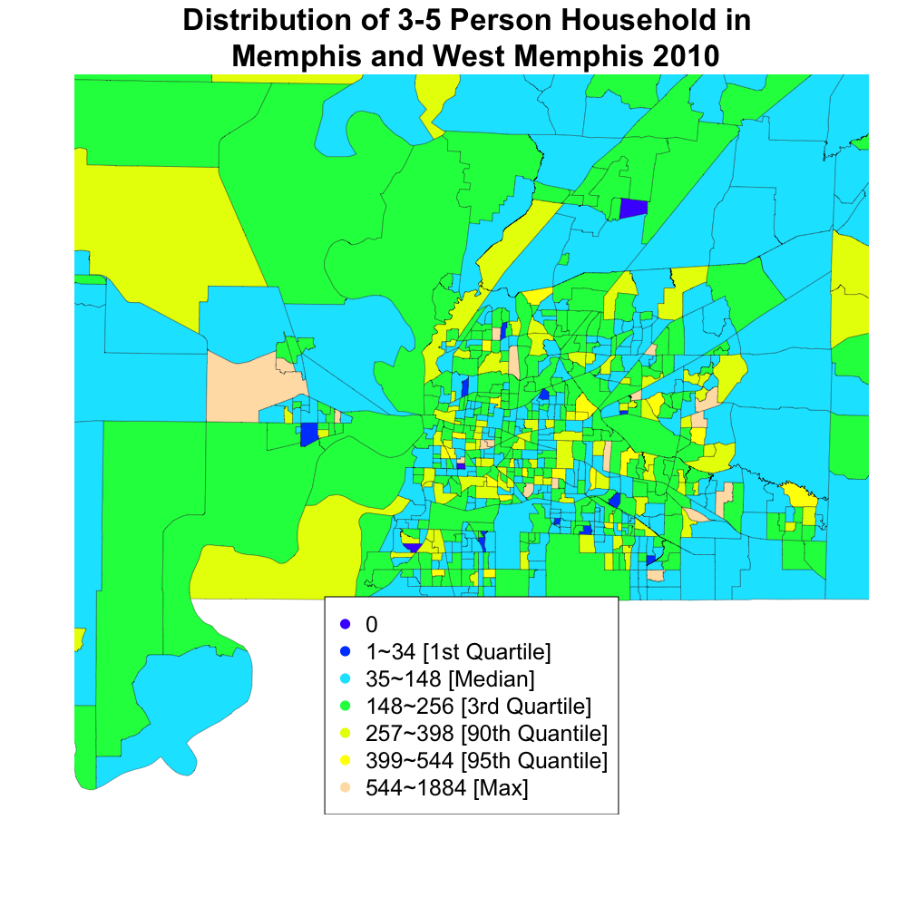
Choropleths (click on image to enlarge)
Captions
In describing and showing how the distribution of households of different sizes looks like, we first examine the violin plot. This shows us household size and how many of each type we have. Immediately noticeable is the fact that very few houses have 6-7 people, it is significantly less than the other categories. There are also more 1-2 person houses than 3-5, the 75th percentile of 1-2 person households just about matches up with the end of the main body of the violin plot of 3-5, while the outliers both stretch out across the x-axis.
We chose the violin plots for this data because it shows the most information for this situation. This is because it gives us the same information that can be shown by a boxplot, plus the density curve around it. For this reason, it is better than just a boxplot or density curve by itself. We could have also used a series of bar plots but this would have also lost information for us because that would have only given us counts and amounts, not the specific quartile values or density information that we are looking for.
Finally we have choropleth maps, which show how the distribution of house size varies across regions. Immediately, we see that the average household size in W. Memphis seems to be smaller than in the Memphis area. This could be because there are more people in Memphis and more young people living on their own. The maps also confirm the finding of the violin plot, that there are many more 1-2 person houses than the others.
This map complements the violin plot because it adds more substance, mainly geographical information, to the data. Now we have a better idea of where the different sized houses tend to lie throughout the metropolitan area.