Under the Spotlight
What does the income distribution look like?
Visualization
Choropleths (click on image to enlarge)
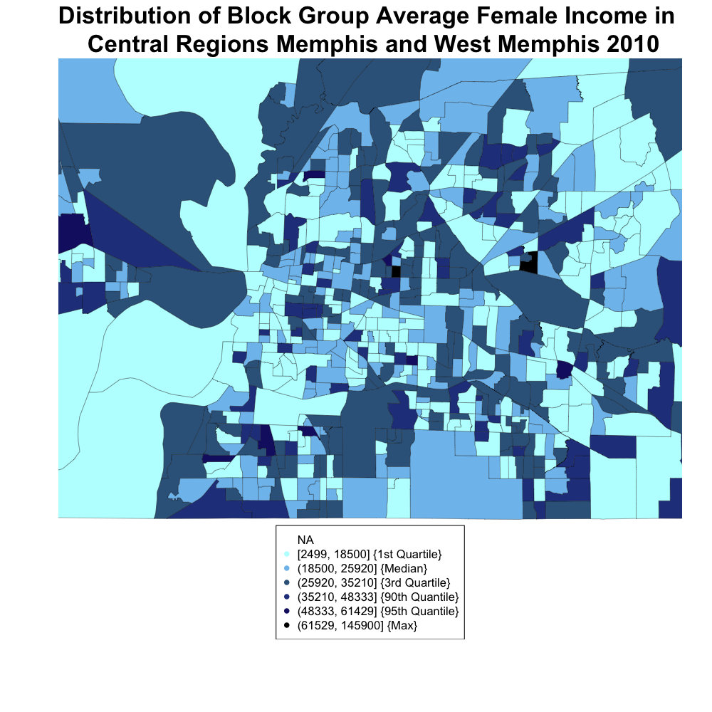
Let's zoom in (click on image to enlarge)
Captions
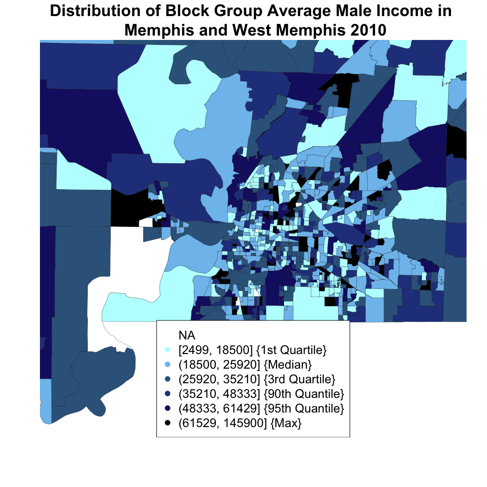
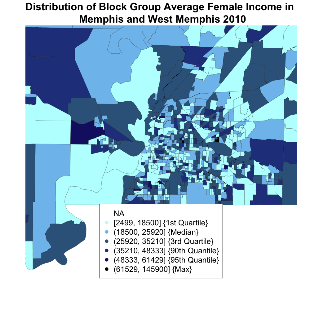
This is a map of Memphis/ West Memphis color coded according to average income and broken up by males and females. By directly comparing the genders with no change in range for categories, it allows us to easily see not only which areas tend to be more prosperous, but also how individual blocks change between male and female. One thing that is clear is that females have much fewer blocks in the darkest category, which correspond to higher income. That makes sense because we know from the previous graph that they make far less as a whole. Looking at the male graph, it seems that the richest area, represented by darker color, is in the north to north-west of the city center. The inner city seems poorest. West Memphis seems to be a bit better off but it is hard to tell. Certainly the western area seems more prosperous.
It makes sense to display this data as a choropleth map because it allows us to see how different regions vary in terms of wealth and lets us see how this is different for men and women. As per the suggestion of Professor Thomas, we changed the colors of this and graph #9 to be uniform for the ages, as it makes direct comparison easier. Previously, it was hard to tell which is the third darkest blue as compared to the third darkest red. By using the same color for both male and female, this problem has been solved. Advantages and disadvantages of the choropleth maps were discussed in series 1 and 4.