Under the Spotlight
How does income correlate to population distribution 2010?
Visualization
1D EDA
2D EDA (click on image to enlarge)

Captions
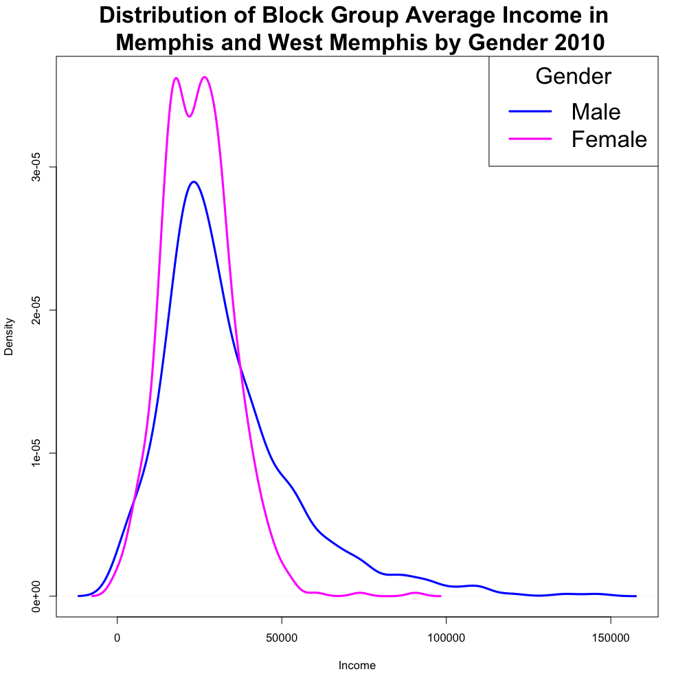
In examining income by block group in Memphis and West Memphis, it was determined that males tend to earn more than females and had a far wider range of salary. The discrepancy is far larger than the separation of any other variables into most categories, and so a graphic that would best show this large discrepancy was used. The density plot is powerful in that it is immediately apparent that males earn far more than females on average. One possible explanation to this could be that men have many more career options available to them, assuming that no businesses are illegally paying females less for the same jobs. Boxplots, box-percentile plots, and violin plots, could have showed this information, but the density curves on the same plot best reflect the second point regarding career options. However, a box plot or violin plot, which clearly mark the center of each distribution, would have been more useful to show the first point. In balancing the relative value of each point and the plots abilities to show each point a density plot was selected.
To examine any possible correlation between income and block group total population, a contour map on top of a heat map were used, each representing female and male income respectively. Unsurprisingly, the block group total population levels at which densities of female and male income are the highest appear to be the same. This is because whereas block group average income is categorized by gender, block group total population is not. This intrinsic limitation of the raw data to a certain extent limited the amount of useful and interesting information that can be explored and conveyed by the graphs. For instance, if possible, it would be more interesting to compare how block group female income correlates with block group female total population, with how block group male income correlates with block group male total population. Furthermore, at a given block group total population level, the income level at which 2D density is the highest is highr for male than for female. This is indicated by the fact that the spot with the greatest red intensity in the heat map is vertically higher than the innermost contour line. Last but not least, it is noteworthy that while the contour map suggests that female average income tends to occupy a range from 0 to 50,000, male average income tend to vary much more widely, from 0 to as high as 110,000, as indicated by the lighter blue region in the heat map. This difference in male and female income range is generally consistent with the trend indicated by the 1D density plot. This graphic takes longer to interpret, but provides more insight into the quantitative values of the effects portrayed in the first plot. This could have also been done reversing the contour and heat map for each gender without the loss of much information. The choice was fairly arbitrary, except that the range was larger for males and the use of colors in the heat map made it prettier. In choosing the amount of contours, the balance between the amount of noise on the graphic and the clarity of the point was considered. The amount of contours and sensitivity of the heat map was chosen so that the point would be clear, with the least amount of noise. Points could have also been used to compare the heat map and the contour map, though this would add a lot of noise and make the genders harder to compare.