Under the Spotlight
How does income correlate to race in 2010?
Visualization
2D Heat Maps (click on image to enlarge)
Captions
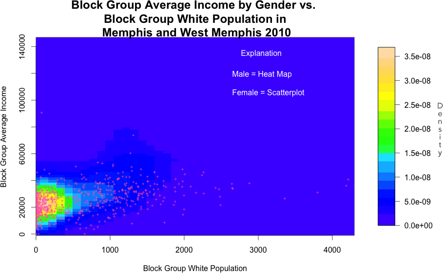
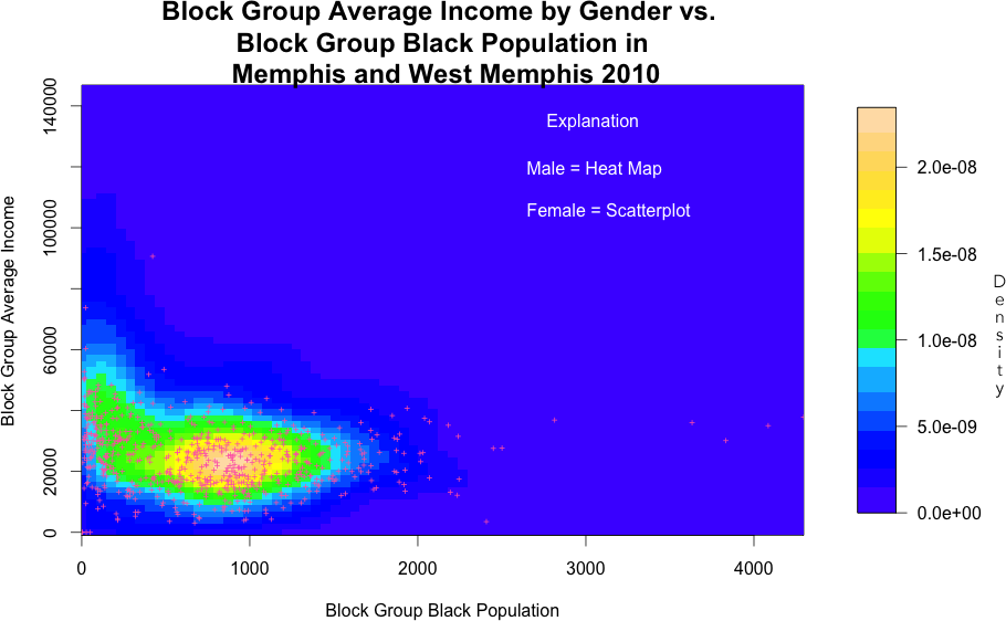
After the takeaways of the first four graphs, the viewer is undoubtedly wondering about the difference in income along racial variables. As shown in the pervious graphics this could be done with boxplots, box-percentile plots, density plots, and violin plots across each category or a heat map and contour plot—or with the use of points in a scatterplot. By using points in a scatterplot, the effect is not as clear, though a general difference can be noticed. In the previous income comparison a heat map with an added contour plot had already been used to hit home the large discrepancy between genders. There is still a very large discrepancy among the races, and so two heat maps with the same scales on the axes were used to show the large differences in income between races. The disadvantage of this is that the takeaway is now spread across two graphs, whereas in the previous series, the viewer could understand the main point in the first graph and was provided with more detail in the second. The advantage is that no techniques were repeated and the magnitude of the differences in income is comparable.
From the side-by-side 2D KDEs, the axes of which have been standardized, we see that the income-population correlation for whites and blacks are quite different. For whites, density tends to be highest where male income is around 18,000 to 30,000 and where block group white population is around 0-400. For black, density tends to be highest where male income is similarly around 18,000 to 30,000 but where block group black population is around 500-1,200. In general, black male income-population tends to have more variability than that of the white, as indicated by the heat map for the blacks having a larger area of the heat map where varying colors are observed. Female income-population correlations for whites and blacks largely agree with male income-population correlations, as indicated by the fact that density of the female scatterplot points tend to agree with density of the heat map.