Under the Spotlight
How does the population distribution compare over time, from 2000 to 2010, particularly by race?
Visualization
1D EDA
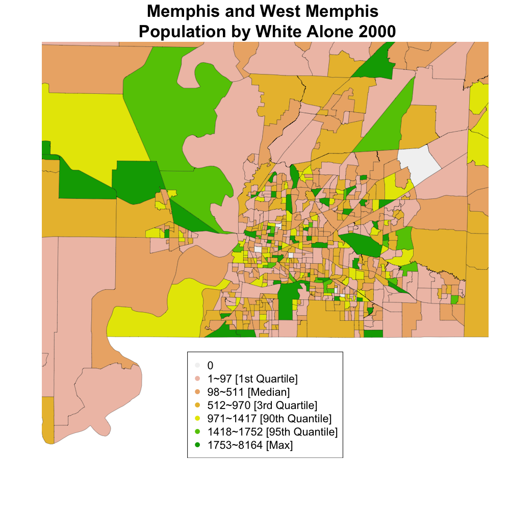
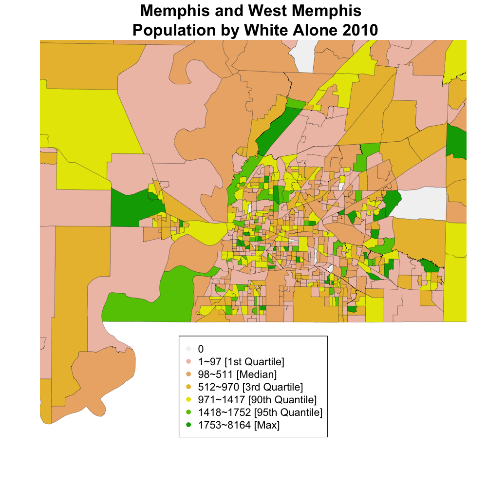
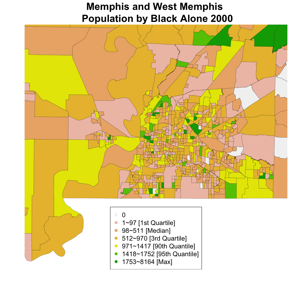
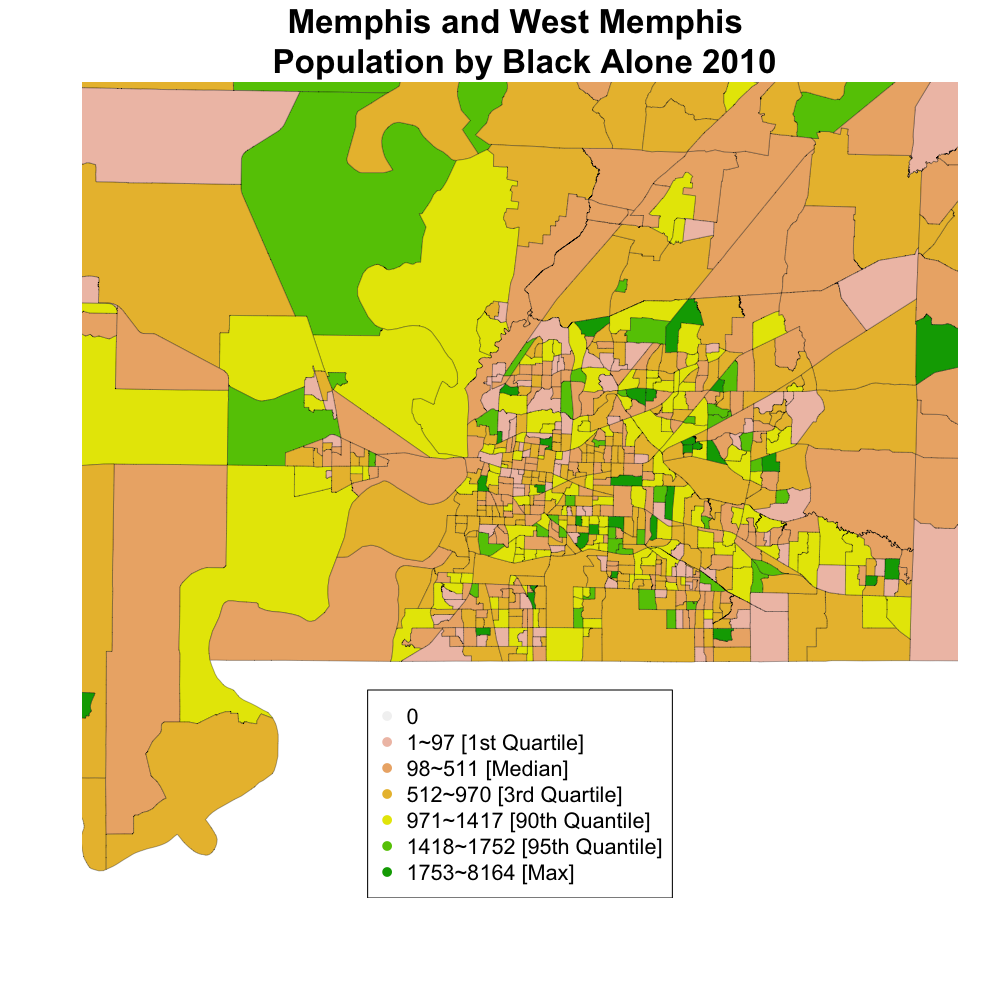
Choropleths (click on image to enlarge)
Alternative Arrangement
Captions
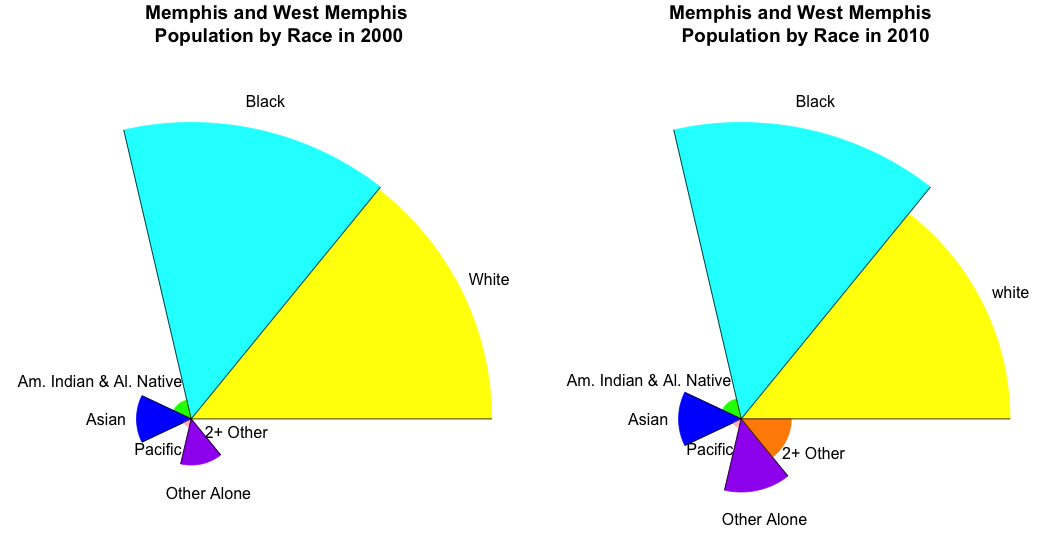
These charts are meant to show that the Memphis, West Memphis area is made up primarily of blacks and whites and that the proportion of blacks is growing, while the proportion of whites is shrinking. To show the distribution of race in Memphis and West Memphis, spine charts, bar graphs, pie charts, and rose diagrams can be used. Because proportion is more interpretable than counts, the axis of a bar graph should be changed. The bar graph is easy to interpret exact counts, though the message of the plot does not require specificity. The spine chart can be difficult to compare, though would be feasible for the key point. The rose diagram does not provide measures of exact counts or proportions, but is faster to compare than the pie chart. The advantages of the rose diagram are that it gets across the key message and is pretty. However, there are some disadvantages of a rose diagram and that is the difference in proportions between blacks and whites is understated in the rose plot, because of the geometry associated with circles (as the radius increases, the area of the circle/pie slice increases at an even faster rate. Comparing the rose diagrams over time, we see an increase in the amount of blacks and minorities who identified themselves with 2 or more other races, as represented in black and orange respectively.
Before introducing our choropleths, it is worth mentioning that West Memphis, AR, occupies around 2/5 of the plotted area on the left, while Memphis, TN, occupies the other 3/5 area on the right. In the choropleths we observe the same trend that the black population is increasing while the white population is shrinking. This effect is strongest in West Memphis, as indicated by the fact that a few block groups in West Memphis who were colored green in 2000 (indicating higher white population) became brownish in 2010 (indicating lower white population), while many block groups in West Memphis that were colored brownish in 2000 became yellowish or green in 2010. Another way to show this change would have been to plot the difference in proportion or counts for each race over time. However, this would not have provided information regarding the relative proportion of each race in Memphis and West Memphis. Furthermore, without a map it is very hard, if not impossible, to represent the spatial component of the changes in population that took place over time.