Under the Spotlight
How does age correlate to population distribution 2010?
Visualization
1D EDA
2D EDA (click on image to enlarge)
Captions
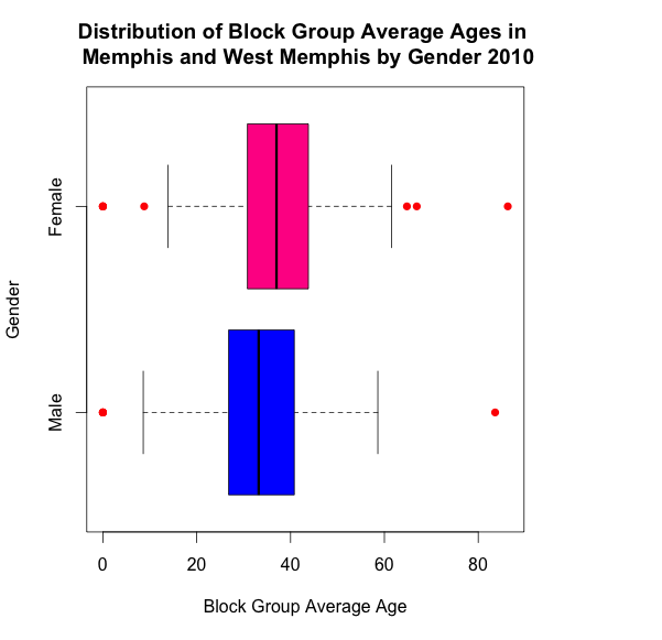
The main point of the boxplot is that females tend to be slightly older than males, and that the average of both male and female in the Memphis and West Memphis area is about 35 to 40 years old. Disadvantages of the boxplot are that it does not show information regarding modality or shape, whereas a violin plot, bean-plot, and box-percentile plot could have all shown the distribution of age, and provided more detail as to the modality and shape (though it is generally assumed age is normally distributed). Also, since this data came from the Census, we know that the population is represented by all of the people in Memphis and West Memphis. Therefore, we are not just getting a random sample from the population but we are actually getting the whole population. If age was found to follow an abnormal distribution, the information regarding its shape would have been valuable, but that requires using one of the alternatives abovementioned rather than the boxplot. The advantage of the boxplot is that it easily identifies the outlier of interest: block groups containing average male age and average female age that are over 80. In particular, if time permitting, it would be interesting to see if the two outliers over 80 for both males and females came from the same block group. In addition, suggestions to the Census for future work would be to see where nursing homes, universities, etc. are located. With this potential additional information, we could make even more conclusions.
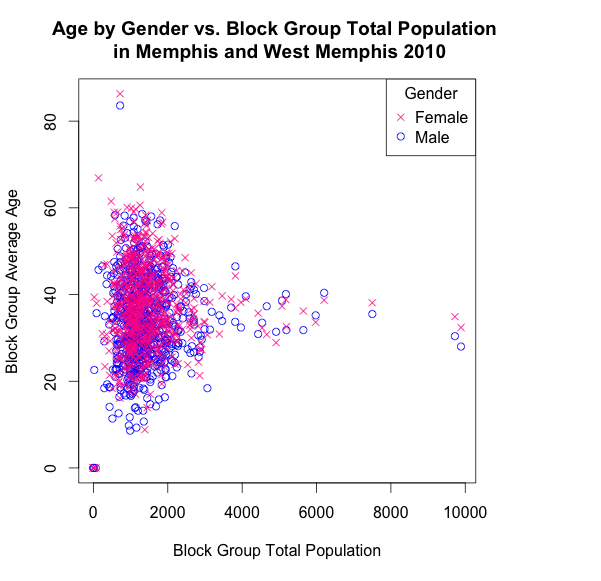
The second plot is extremely noisy and somewhat overwhelming at first glance. Examining it from a further perspective it is very clear that females are generally older than men (the pink is higher than the blue blob). The use of X’s and O’s is valuable to those who can not see color, while not disadvantaging those who can as the same amount of ink is used in each shape. A heat map and contour plot could have shown the same information, but they take slightly longer to interpret, and given the key message—this level of detail was not necessary. In addition, there would have been much more ink on the heat map than was actually needed to interpret the simple story from this graph.