Under the Spotlight
Is there a correlation between household size and age?
Visualization
Perspective Plots (click on image to enlarge)
Alternative Arrangement
Captions
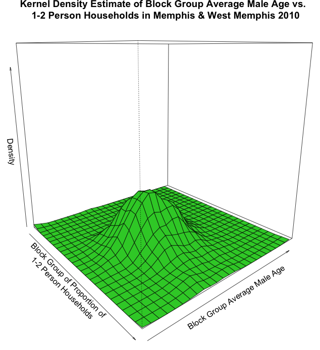
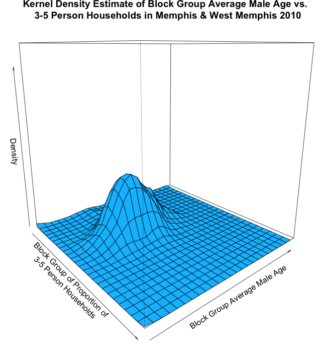
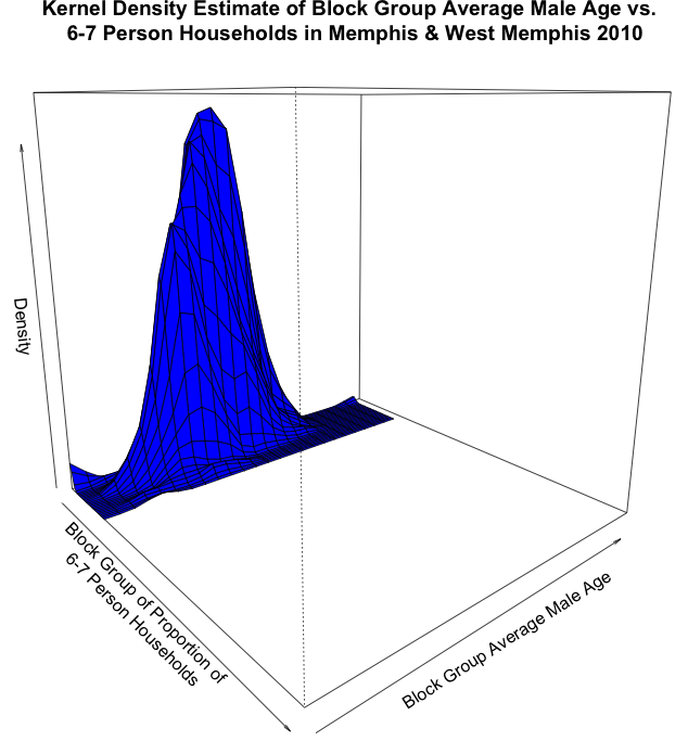
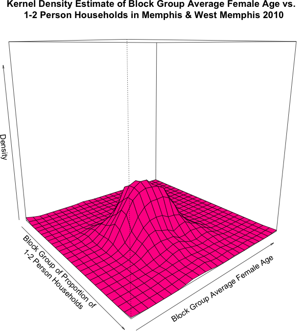
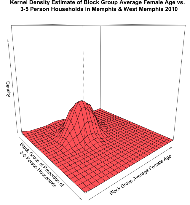
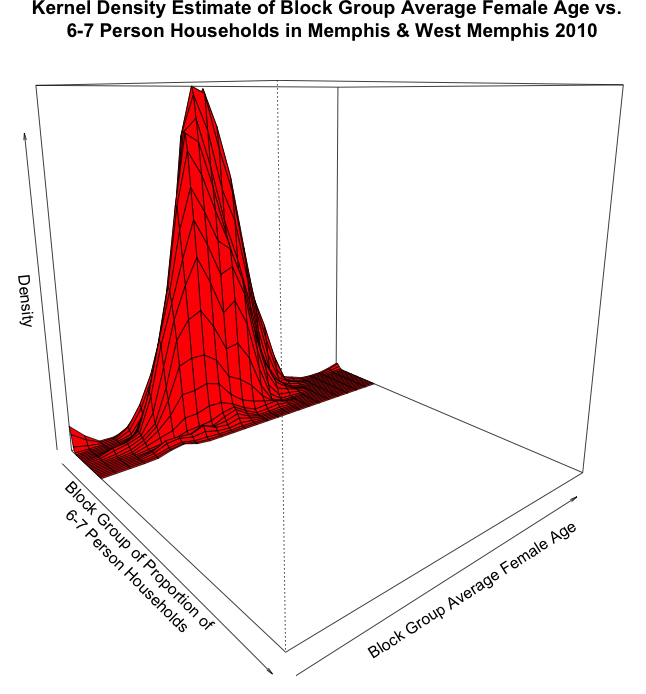
In order to show if there is a correlation between household size and age, we will take a look at some 3D perspective plots. These plots show the average age of persons by gender in a block group in relation to the proportion of households of a certain size in that block group. For both genders, 1-2 person households tend to be older than 3-5 person, and then 6-7 has much younger. This makes sense. One would imagine nobody is really living on their own until at least age 18, and in most cases much older than that. A house with lots of people living in it could be for a variety of reasons, but in many cases it is because of numerous children, and they make the average age much younger. As well, lots of seniors live either by themselves or with their husband/wife, so it makes sense that 1-2 person households would be oldest category. Women seem to be older in 1-2 and 3-5, but it is hard to see much of a difference in the highest category. This could be because children are the same age regardless of gender, and because there may be a smaller sample of 6-7 person homes. Women may be older overall in those categories because they have a higher life expectancy, so their average is slightly shifted.
Advantages of the perspective plot are that we can easily see particular stories on the graph that we predicted based on previous plots. They are also pretty to look at and can be rotated to see different parts of the graphs. Disadvantages are that we have no sense for numerical measure on the graphs and we also cannot adjust theta, the degree of rotation, on the graph without rerunning the code and re-plotting the graphs. Shiny could have been something to incorporate in our graphs to make it easier to adjust theta right in front of the viewer. Other options we could have used include heat maps and contour maps – the usual 2D kernel density estimate visualization. In fact, these two might have been even more advantageous in that both provide numerical measures along the axes. The decision to refrain from using heat maps and contour was simply to avoid excessive repetition.