Into the tidyverse with the Browns and Patriots
The tidyverse
For today’s workshop, we will be working within the tidyverse, which consists of several R packages for data manipulation, exploration, and visualization. They are all based on a common design philosophy, mostly developed by Hadley Wickham (whose name you will encounter a lot as you gain more experience with R). To access all of these packages, you first need to install them (if you have not already) with the following code:
The install.packages() function is one way of installing packages in R. You can also click on the Packages tab in your RStudio view and then click on Install to type in the package you want to install.
Now with the tidyverse suite of packages installed, we can load them with the following code:
When you do that, you’ll see a lot of output to the console, most of which you can safely ignore for now.
Reading in data
Within the tidyverse, the standard way to store and manipulate tabular data like this is to use what is known as a tbl (pronounced tibble), synonymous with a spreadsheet or data.frame. At a high-level, a tbl is a two-dimensional array whose columns can be of different data types. The first column might be characters (e.g. the names of teams) and the second column can be numeric (e.g. the number of yards gained).
All of the datasets we will be using today are saved on the workshop’s website with the necessary links provided in the code chunks below. These were all generated with the nflscrapR package and are saved as comma-separated files, which have extension ‘.csv’.
We can use the function read_csv() to read in a csv file from the workshop website that contains play-by-play data from the recent Browns vs Patriots game (Patriots won 27-13, but more importantly the Browns lost). We will read it into R with the read_csv() function like so:
Chaining commands together with pipes
When dealing with data, we often want to chain multiple commands together. People will often describe the entire process of reading in data, wrangling it with commands like group_by and summarize, then creating visuals and models, as the data analysis pipeline. The pipe operator %>% is a convenient tool in the tidyverse that allows us to create a sequence of code to analyze data, such as the following code to group_by the team and count their number of plays:
> ne_cle_pbp_data %>%
+   group_by(posteam, play_type) %>%
+   count()
# A tibble: 15 x 3
# Groups:   posteam, play_type [15]
   posteam play_type       n
   <chr>   <chr>       <int>
 1 CLE     extra_point     1
 2 CLE     field_goal      2
 3 CLE     kickoff         6
 4 CLE     no_play        14
 5 CLE     pass           36
 6 CLE     punt            4
 7 CLE     run            22
 8 NE      extra_point     3
 9 NE      field_goal      4
10 NE      kickoff         4
11 NE      no_play         8
12 NE      pass           39
13 NE      punt            5
14 NE      run            27
15 <NA>    <NA>            6
Let’s break down what’s happening here. First, R “pipes” the tbl ne_cle_pbp_data into group_by to tell R to perform operations at the posteam and play_type level. Then it pipes the result of this group_by into count to simply count the number of rows corresponding to each combination of posteam and play_type.
The sequence of analysis flow naturally top-to-bottom and puts the emphasis on the actions being carried out by the analyst (like the functions group_by and count) and the final output rather than a bunch of temporary tbl’s that may not be of much interest.
We will be using the pipe %>% operator for the remainder of today, and you will see how convenient it is to use when making visualizations.
Filtering data
We just want to focus on run and pass plays. The filter() function is used to pull out subsets of observations that satisfy some logical condition like posteam == "NE". To make such comparisons in R, we have the following operators available at our disposal:
==for “equal to”!=for “not equal to”<and<=for “less than” and “less than or equal to”>and>=for “greater than” and “greater than or equal to”&,|,!for “AND” and “OR” and “NOT”%in%for "is in the
The code below filters to only look at pass or run plays, then groups by the team, play type, and down:
> ne_cle_pbp_data %>%
+   filter(play_type %in% c("pass", "run")) %>%
+   group_by(posteam, play_type, down) %>%
+   count()
# A tibble: 14 x 4
# Groups:   posteam, play_type, down [14]
   posteam play_type  down     n
   <chr>   <chr>     <dbl> <int>
 1 CLE     pass          1    14
 2 CLE     pass          2    11
 3 CLE     pass          3    10
 4 CLE     pass          4     1
 5 CLE     run           1    12
 6 CLE     run           2     8
 7 CLE     run           3     2
 8 NE      pass          1    13
 9 NE      pass          2    11
10 NE      pass          3    13
11 NE      pass          4     2
12 NE      run           1    14
13 NE      run           2    10
14 NE      run           3     3
Introduction to ggplot2
Enough with printing tables! We will use visualizations to answer some questions about the data. Specifically, we will be using the popular ggplot2 package (again created by Hadley Wickham and a member of the tidyverse) for all of our data visualizations. The gg stands for the grammar of graphics, an intuitive framework for data visualization. Given a dataset, such as ne_cle_pbp_data, we want to map the columns to certain aesthetics of a visualization, such as the x-axis, y-axis, size, color, etc. Then a geometric object is used to represent the aesthetics visually such as a barchart or scatterplot. This framework separates the process of visualization into different components: data, aesthetic mappings, and geometric objects. These components are then added together (or layered) to produce the final graph. The ggplot2 package is the most popular implementation of the grammar of graphics and is relatively easy to use.
We’ll start with making a barchart of the types of plays by each team:
> ne_cle_pbp_data %>%
+   filter(play_type %in% c("pass", "run")) %>%
+   group_by(posteam, down, play_type) %>%
+   count() %>%
+   # Looking at counts really isn't appropriate, let's compare the proportions:
+   group_by(posteam, down) %>%
+   # We're going to mutate the data! As in create a new column:
+   mutate(n_plays = sum(n),
+          prop_plays = n / n_plays) %>%
+   # Now actually create the chart!
+   ggplot(aes(x = posteam, y = prop_plays, fill = play_type)) +
+   geom_bar(stat = "identity", position = "dodge") +
+   facet_wrap(~down, ncol = 2) +
+   labs(x = "Team", y = "Proportion of plays", fill = "Play type")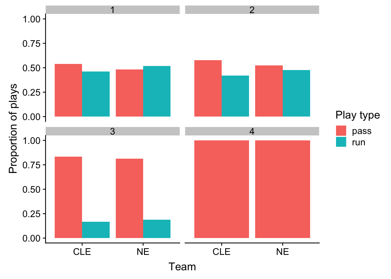
What about the performance of these plays?
> ne_cle_pbp_data %>%
+   filter(play_type %in% c("pass", "run")) %>%
+   group_by(posteam, down, play_type) %>%
+   # Now use the summarize function, generate the average yards gained:
+   summarize(yards_per_play = mean(yards_gained)) %>%
+   ggplot(aes(x = posteam, y = yards_per_play, fill = play_type)) +
+   geom_bar(stat = "identity", position = "dodge") +
+   facet_wrap(~down, ncol = 2) +
+   labs(x = "Team", y = "Yards gained per play",
+        fill = "Play type",
+        title = "Comparison of CLE and NE yards gained per play\nby type and down") +
+   theme_bw() +
+   theme(strip.background = element_blank(),
+         axis.title = element_text(size = 14),
+         axis.text = element_text(size = 10),
+         plot.title = element_text(size = 18),
+         legend.text = element_text(size = 12),
+         strip.text = element_text(size = 14))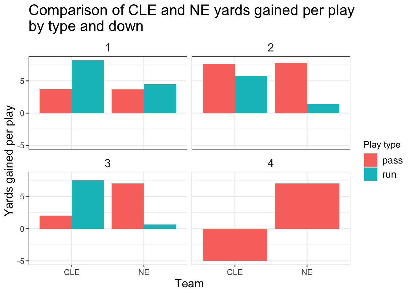
What about the distribution of these plays instead, just one point doesn’t tell us the full story:
> ne_cle_pbp_data %>%
+   filter(play_type %in% c("pass", "run")) %>%
+   ggplot(aes(x = posteam, y = yards_gained, fill = play_type)) +
+   geom_violin() +
+   facet_wrap(~down, ncol = 2) +
+   labs(x = "Team", y = "Yards gained",
+        fill = "Play type",
+        title = "Comparison of CLE and NE yards gained\nby play type and down") +
+   theme_bw() +
+   theme(strip.background = element_blank(),
+         axis.title = element_text(size = 14),
+         axis.text = element_text(size = 10),
+         plot.title = element_text(size = 18),
+         legend.text = element_text(size = 12),
+         strip.text = element_text(size = 14))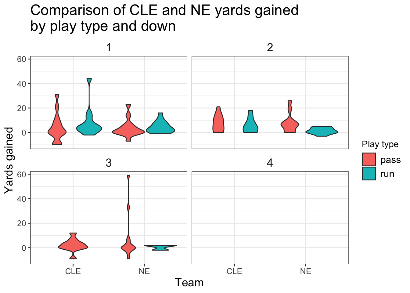
We can improve upon this plot with another layer - a beeswarm plot that displays the individual points in our data:
> # Access the ggbeeswarm package:
> # install.packages('ggbeeswarm')
> library(ggbeeswarm)
>
> # Let's add points on top:
> ne_cle_pbp_data %>%
+   filter(play_type %in% c("pass", "run")) %>%
+   ggplot(aes(x = posteam, y = yards_gained, fill = play_type)) +
+   geom_violin(alpha = 0.3) +
+     # Display the individual points on top of the violin plots:
+   geom_beeswarm(aes(color = play_type), dodge.width = 1) +
+   # Add a reference line marking 0 yards gained:
+   geom_hline(yintercept = 0, linetype = "dotted", color = "darkred",
+              size = 1) +
+   facet_wrap(~down, ncol = 2) +
+   labs(x = "Team", y = "Yards gained",
+        fill = "Play type", color = "Play type",
+        title = "Comparison of CLE and NE yards gained\nby play type and down") +
+   scale_color_manual(values = c("darkblue", "darkorange")) +
+   scale_fill_manual(values = c("darkblue", "darkorange")) +
+   theme_bw() +
+   theme(strip.background = element_blank(),
+         axis.title = element_text(size = 14),
+         axis.text = element_text(size = 10),
+         plot.title = element_text(size = 18),
+         legend.text = element_text(size = 12),
+         strip.text = element_text(size = 14))
Expected points and win probability
All yards are not created equal! We should really be looking at the impact in terms of the expected points added (EPA) or win probability added (WPA) instead to get a better understanding of what impacted the game.
> ne_cle_pbp_data %>%
+   filter(play_type %in% c("pass", "run")) %>%
+   ggplot(aes(x = posteam, y = epa, fill = play_type)) +
+   geom_violin(alpha = 0.3) +
+   geom_beeswarm(aes(color = play_type), dodge.width = 1) +
+   geom_hline(yintercept = 0, linetype = "dotted", color = "darkred",
+              size = 1) +
+   facet_wrap(~down, ncol = 2) +
+   labs(x = "Team", y = "EPA",
+        fill = "Play type", color = "Play type",
+        title = "Comparison of CLE and NE EPA by play type and down") +
+   scale_color_manual(values = c("darkblue", "darkorange")) +
+   scale_fill_manual(values = c("darkblue", "darkorange")) +
+   theme_bw() +
+   theme(strip.background = element_blank(),
+         axis.title = element_text(size = 14),
+         axis.text = element_text(size = 10),
+         plot.title = element_text(size = 18),
+         legend.text = element_text(size = 12),
+         strip.text = element_text(size = 14))
Now we see a big difference between the Browns and Patriots, which plays are the most costly for the Browns?
> ne_cle_pbp_data %>%
+   filter(posteam == "CLE",
+          play_type %in% c("pass", "run")) %>%
+   arrange(epa) %>%
+   select(desc, ep, epa, down, yardline_100, qtr) %>%
+   slice(1:5)
# A tibble: 5 x 6
  desc                                    ep   epa  down yardline_100   qtr
  <chr>                                <dbl> <dbl> <dbl>        <dbl> <dbl>
1 (5:55) (Shotgun) N.Chubb right gua…  0.193 -7.19     2           77     1
2 (2:36) (Shotgun) B.Mayfield pass s…  0.632 -5.31     1           79     1
3 (6:17) (Shotgun) B.Mayfield sacked… -1.77  -2.58     4           81     4
4 (2:44) (Shotgun) B.Mayfield pass i…  3.25  -1.47     3           24     4
5 (5:17) (Shotgun) B.Mayfield pass i… -0.775 -1.43     3           75     3
To contrast, what went right for the Patriots?
> ne_cle_pbp_data %>%
+   filter(posteam == "NE",
+          play_type %in% c("pass", "run")) %>%
+   arrange(desc(epa)) %>%
+   select(desc, ep, epa, down, yardline_100, qtr) %>%
+   slice(1:5)
# A tibble: 5 x 6
  desc                                    ep   epa  down yardline_100   qtr
  <chr>                                <dbl> <dbl> <dbl>        <dbl> <dbl>
1 (8:26) (Shotgun) T.Brady pass sho… -1.66    5.93     3           84     3
2 (11:04) (Shotgun) T.Brady pass de…  0.0102  3.78     3           69     1
3 (9:12) (Shotgun) T.Brady pass sho…  1.54    2.79     4           33     1
4 (1:53) (Shotgun) T.Brady pass sho…  4.41    2.59     2            8     1
5 (6:20) (Shotgun) T.Brady pass sho…  4.60    2.40     1           14     3
More resources
Ben Baldwin’s
nflscrapRtutorial: https://gist.github.com/guga31bb/5634562c5a2a7b1e9961ac9b6c568701Thomas Mock’s incredible data visualization guide: https://jthomasmock.github.io/nfl_plotting_cookbook/
Lee Sharpe’s nfldata GitHub repo: https://github.com/leesharpe/nfldata
THE Mike Lopez’s
Rfor NFL analysis: https://statsbylopez.netlify.com/post/r-for-nfl-analysis/