The representation is useful for comparison but cannot recover word order or syntax.
Remove stop words
Common function words often overwhelm a frequency table, so analysts remove a stop-word list. But domain-specific meaning can be lost:
negation words such as “not”;
timing words such as “before” and “after”;
warning language such as “under” or “until.”
Inspect the removed terms rather than treating the list as universally correct.
Apply stemming
Stemming reduces related forms to a common root, such as damage, damaged, and damaging. This can improve counting, but the stem may not be a real word and unrelated terms can be merged.
Lemmatization uses vocabulary and grammar to return dictionary forms, but requires more language modeling.
Checkpoint 1 · Name the lost information
After converting narratives to individual words, list three kinds of information that have been discarded. Which loss matters most for interpreting warnings or impacts?
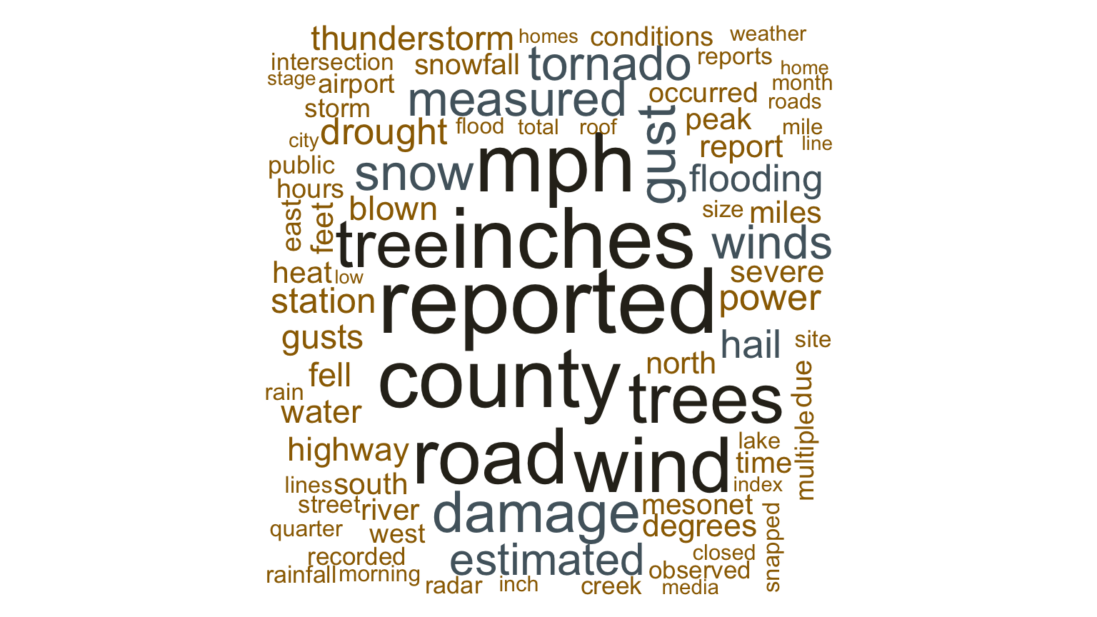
Create a word cloud using term frequencies
Code
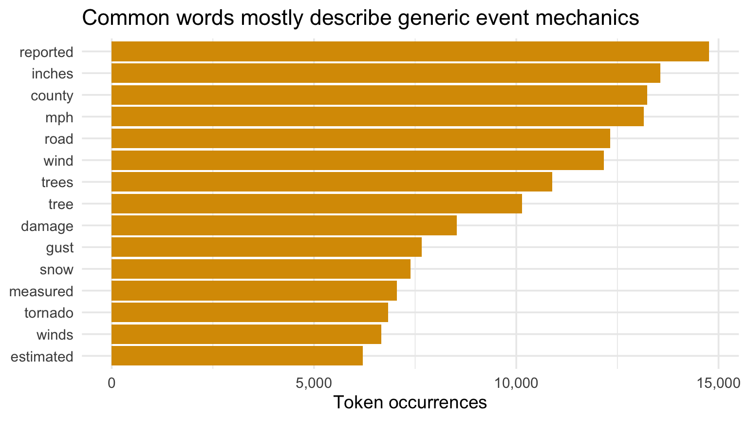
tokens |>count(word, sort =TRUE) |>slice_head(n =15) |>mutate(word =fct_reorder(word, n)) |>ggplot(aes(n, word)) +geom_col(fill = gold) +scale_x_continuous(labels = comma) +labs(title ="Common words mostly describe generic event mechanics", x ="Token occurrences", y =NULL)
Frequency is not importance
Frequent terms can be:
boilerplate,
documentation conventions,
location language,
common meteorological vocabulary.
Counts describe the corpus; interpretation requires context.
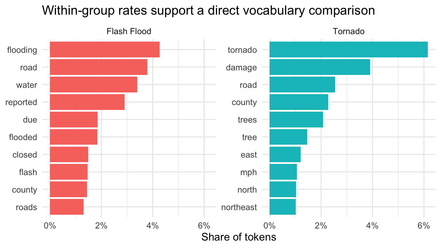
Comparison clouds
Word clouds make exact frequency and group comparison difficult. Font size is imprecise, placement is arbitrary, and long words attract attention.
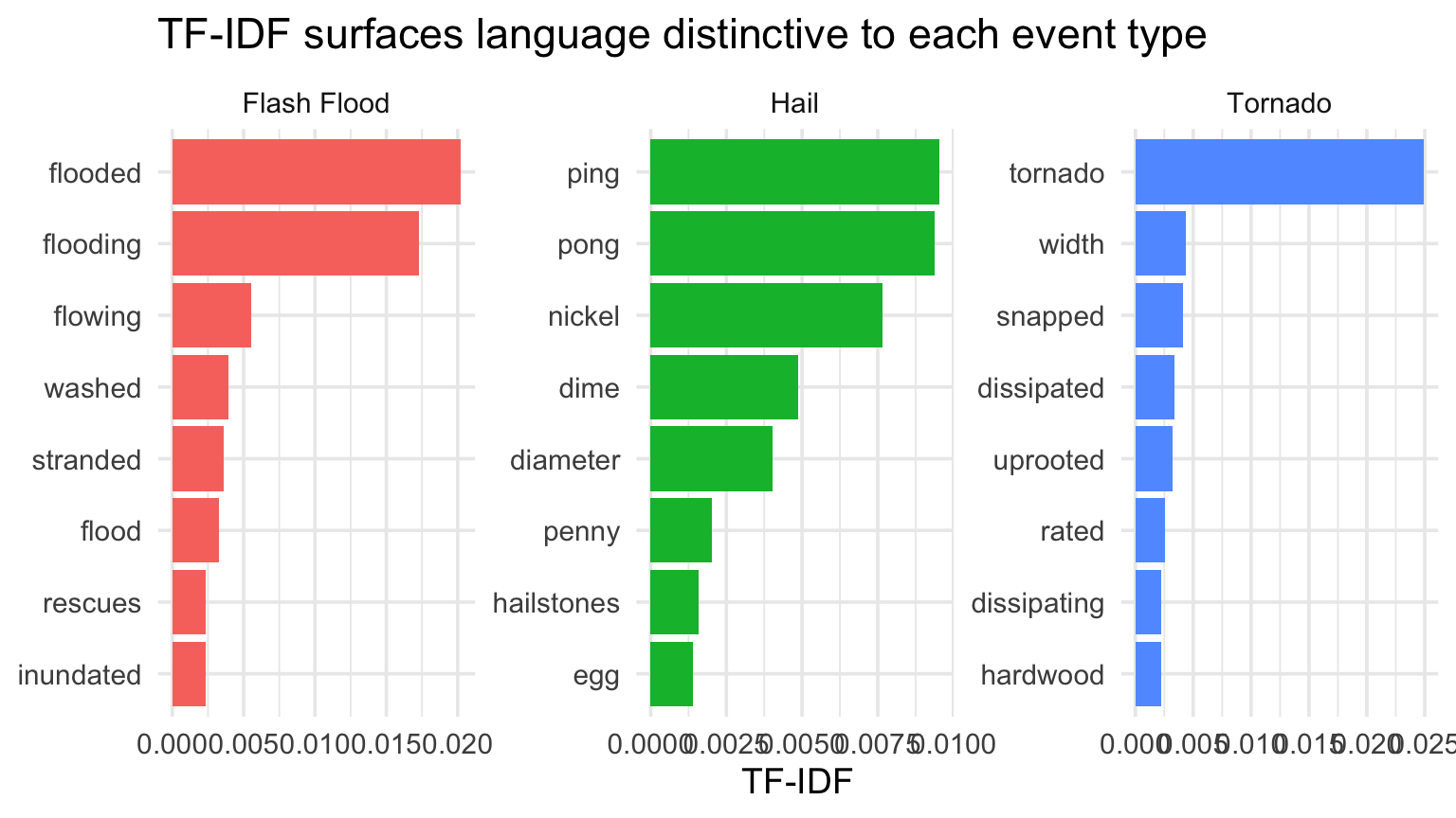
Terms score highly when common in one group but uncommon across groups.
Top words by TF-IDF for each NOAA event type
Code
tfidf_terms <- tokens |>filter(event_type %in%c("Flash Flood", "Tornado", "Hail")) |>count(event_type, word) |>bind_tf_idf(word, event_type, n) |>group_by(event_type) |>slice_max(tf_idf, n =8, with_ties =FALSE) |>ungroup()tfidf_terms |>mutate(word =reorder_within(word, tf_idf, event_type)) |>ggplot(aes(tf_idf, word, fill = event_type)) +geom_col(show.legend =FALSE) +facet_wrap(~event_type, scales ="free") +scale_y_reordered() +labs(title ="TF-IDF surfaces language distinctive to each event type", x ="TF-IDF", y =NULL)
Checkpoint 2 · Audit a distinctive term
Choose one high-TF-IDF word. Read three source narratives containing it. Does the word mean what the chart seems to imply? Report one context the token display hid.
Sentiment Analysis
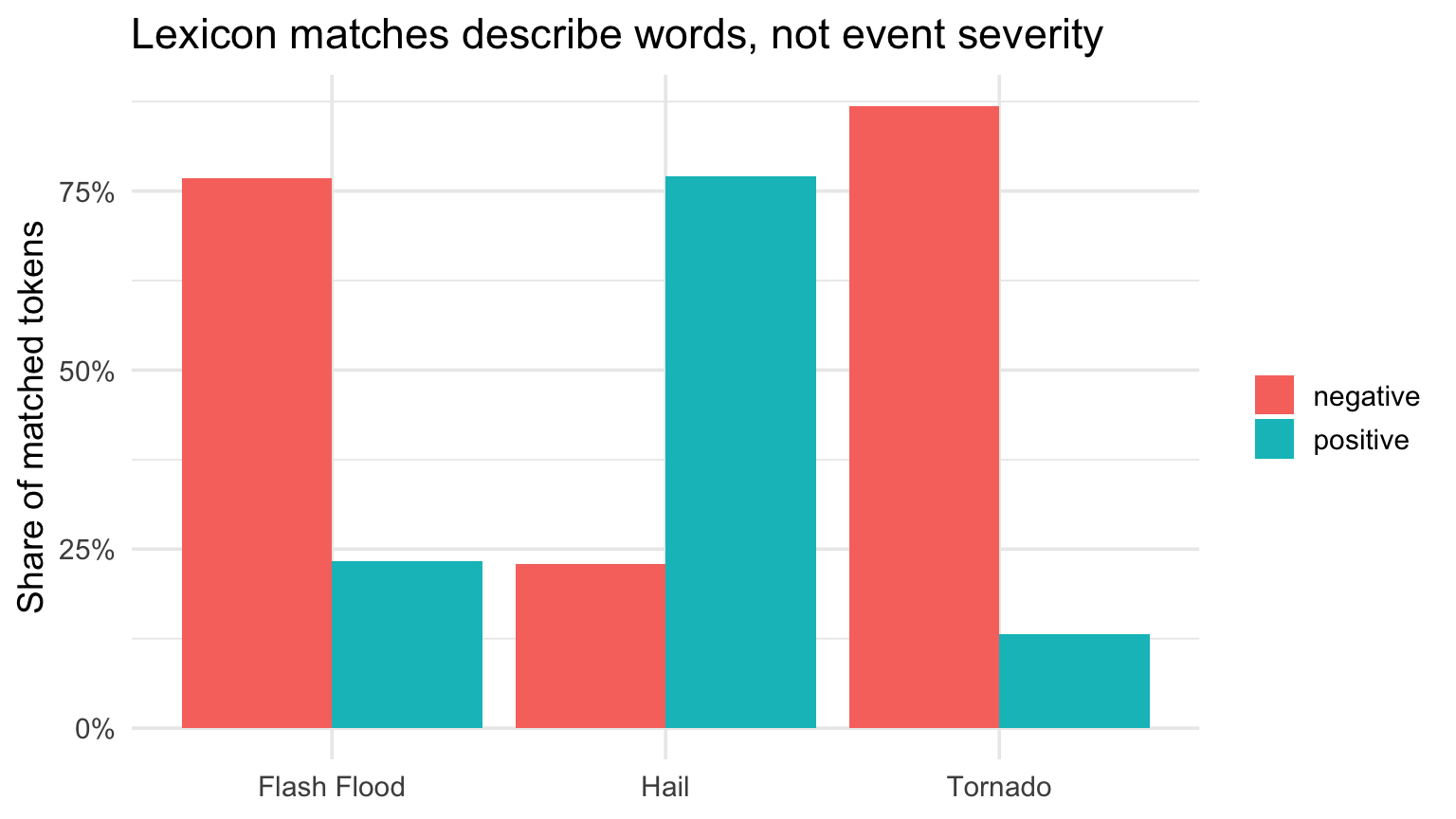
A lexicon maps words to labels or scores. It does not understand:
negation,
technical language,
irony,
narrative structure,
the severity of the actual event.
“Fatal” may be informative, but a sentiment score is not a measure of harm.
NOAA narrative sentiment analysis
Code
sentiment_terms <- tokens |>filter(event_type %in%c("Tornado", "Flash Flood", "Hail")) |>inner_join(get_sentiments("bing"), by ="word") |>count(event_type, sentiment)sentiment_terms |>group_by(event_type) |>mutate(share = n /sum(n)) |>ggplot(aes(event_type, share, fill = sentiment)) +geom_col(position ="dodge") +scale_y_continuous(labels = percent) +labs(title ="Lexicon matches describe words, not event severity", x =NULL, y ="Share of matched tokens", fill =NULL)