source("_setup.R")us <- ggplot2::map_data("state")state_key <-tibble(region =str_to_lower(state.name), state = state.name)state_counts <- events |>count(state, name ="event_records")map_counts <- us |>left_join(state_key, by ="region") |>left_join(state_counts, by ="state")
Reminders, previously, and today…
join areal data to map geometry safely,
distinguish totals from normalized rates,
choose color scales that match the quantity,
combine and annotate graphics without turning them into decoration.
Thinking about areal data
You need:
one row per geographic unit,
a stable geographic key,
polygon geometry for the same units,
a successful join,
an explicit treatment of unmatched regions.
High-level overview of steps
summary_by_region <- records |>group_by(region_id) |>summarise(value = ...)map_data <- geometry |>left_join(summary_by_region, by ="region_id")ggplot(map_data, aes(long, lat, group = group, fill = value)) +geom_polygon()
Do the aggregation and validate the join before choosing colors.
Typical workflow for plotting areal data
Code
state_counts |>anti_join(state_key, by ="state")
# A tibble: 18 × 2
   state                event_records
   <chr>                        <int>
 1 American Samoa                  23
 2 Atlantic North                 673
 3 Atlantic South                 582
 4 District Of Columbia            28
 5 E Pacific                        5
 6 Guam                            57
 7 Guam Waters                      1
 8 Gulf Of Alaska                   2
 9 Gulf Of Mexico                 877
10 Lake Erie                      111
11 Lake Huron                      21
12 Lake Michigan                  154
13 Lake Ontario                    29
14 Lake St Clair                   31
15 Lake Superior                   72
16 Puerto Rico                    746
17 St Lawrence R                    3
18 Virgin Islands                  27
Territories and non-state codes are legitimate data. They simply are not in the contiguous-state polygon table.
Create a choropleth map with geom_polygon()
Code
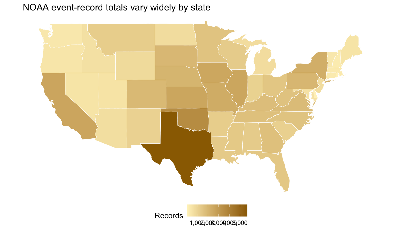
ggplot(map_counts, aes(long, lat, group = group, fill = event_records)) +geom_polygon(color ="white", linewidth =0.2) +coord_quickmap() +scale_fill_gradient(low = pale_gold, high = deep_gold, labels = comma, na.value ="gray90") +labs(title ="NOAA event-record totals vary widely by state", fill ="Records") +theme_void() +theme(legend.position ="bottom")
Raw totals answer a narrow question
The map shows where many records were reported. It does not directly show:
resident risk,
land-area-adjusted frequency,
probability of an event,
reporting completeness,
causal climate differences.
Checkpoint 1 · Pick the denominator
Choose a denominator for each question: risk to residents, event concentration by land area, and share of national records. Which denominator cannot be obtained from NOAA alone?
Never map counts when the question asks for rates
A rate needs a defensible numerator and denominator measured for compatible geography and time.
Examples:
deaths per million residents,
events per 10,000 square miles,
damaging events per 1,000 event records.
Each rate answers a different question.
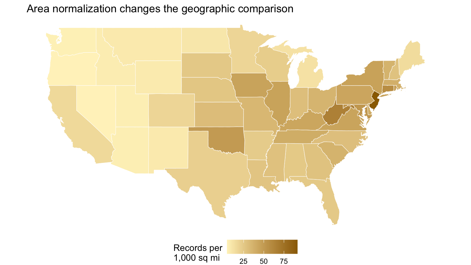
Normalize by land area when concentration is the question
Code
area_lookup <-tibble(state = state.name, area_sq_miles = state.area)area_rates <- state_counts |>left_join(area_lookup, by ="state") |>mutate(records_per_1000_sq_miles =1000* event_records / area_sq_miles)map_rates <- us |>left_join(state_key, by ="region") |>left_join(area_rates, by ="state")ggplot(map_rates, aes(long, lat, group = group, fill = records_per_1000_sq_miles)) +geom_polygon(color ="white", linewidth =0.2) +coord_quickmap() +scale_fill_gradient(low = pale_gold, high = deep_gold, na.value ="gray90") +labs(title ="Area normalization changes the geographic comparison", fill ="Records per\n1,000 sq mi") +theme_void() +theme(legend.position ="bottom")
This is still record concentration, not risk to people or property.
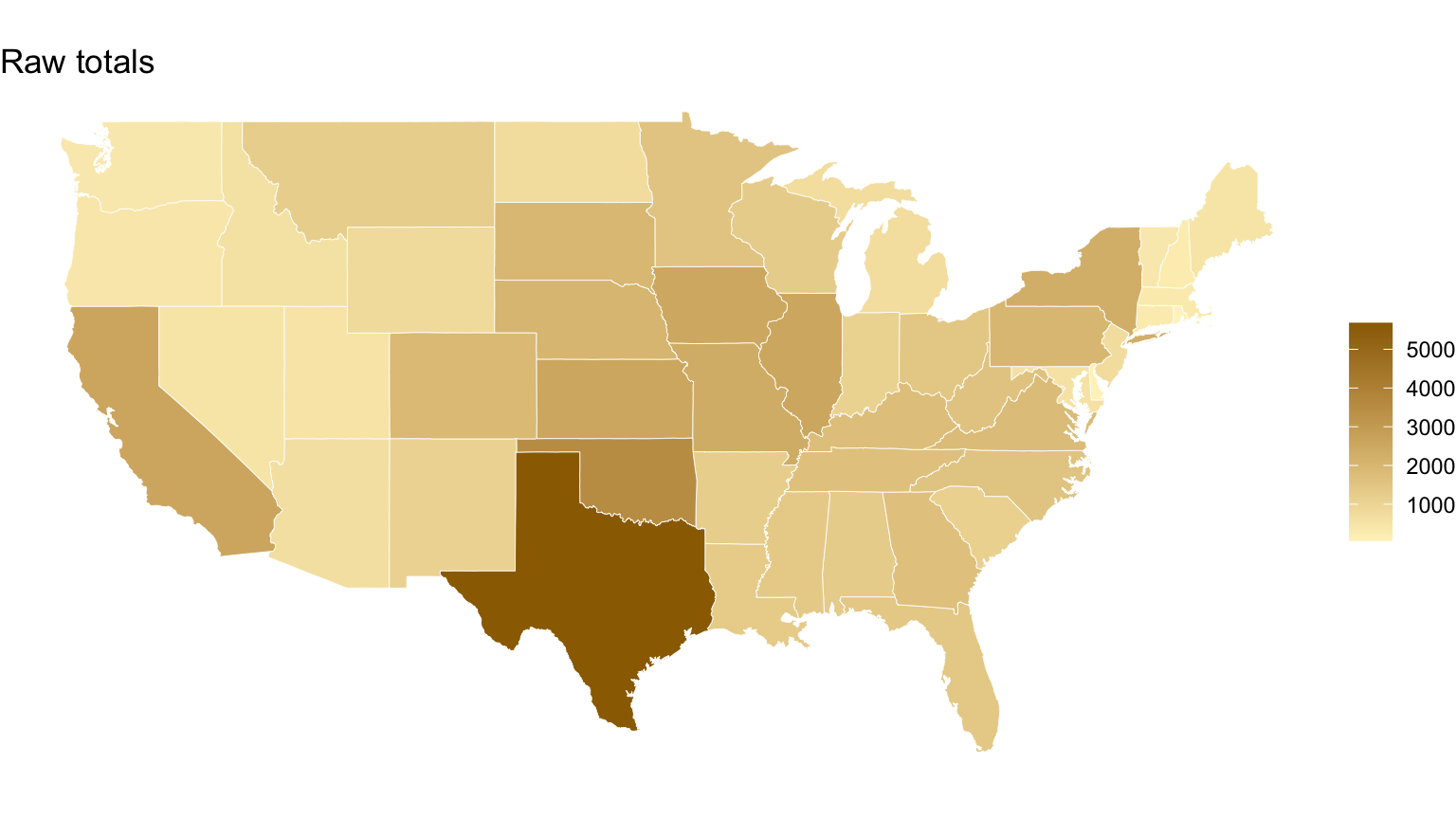
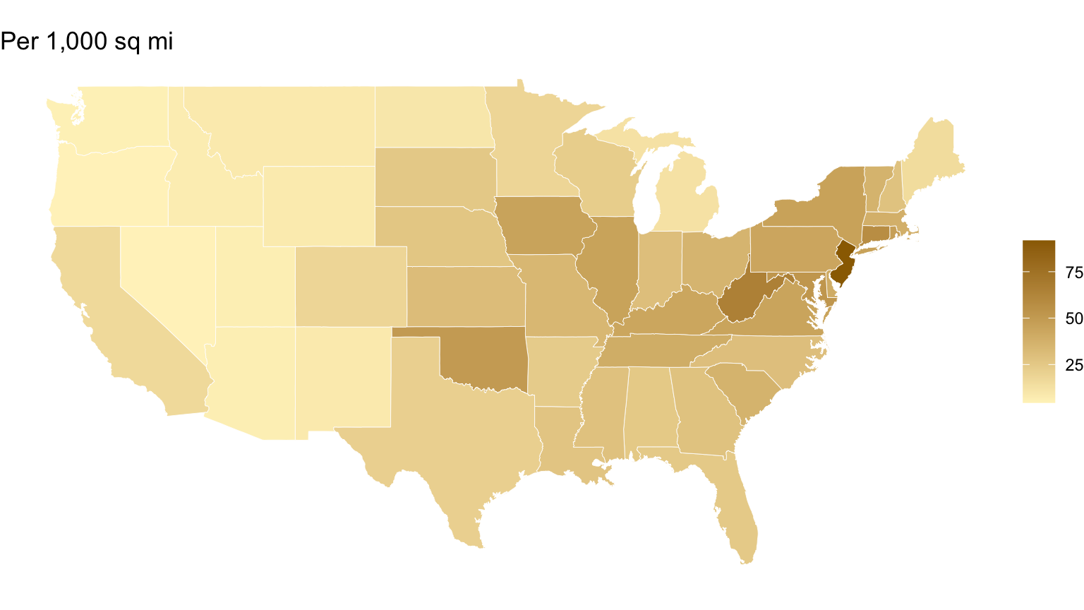
Put totals and rates side by side
Code
ggplot(map_counts, aes(long, lat, group = group, fill = event_records)) +geom_polygon(color ="white", linewidth =0.15) +coord_quickmap() +scale_fill_gradient(low = pale_gold, high = deep_gold, na.value ="gray90") +labs(title ="Raw totals", fill =NULL) +theme_void()ggplot(map_rates, aes(long, lat, group = group, fill = records_per_1000_sq_miles)) +geom_polygon(color ="white", linewidth =0.15) +coord_quickmap() +scale_fill_gradient(low = pale_gold, high = deep_gold, na.value ="gray90") +labs(title ="Per 1,000 sq mi", fill =NULL) +theme_void()
Color scale follows meaning
sequential scale: low to high quantity,
diverging scale: deviations around a meaningful center,
categorical palette: distinct unordered groups.
Rainbow scales manufacture boundaries and are difficult to read accurately.
Bins or continuous color?
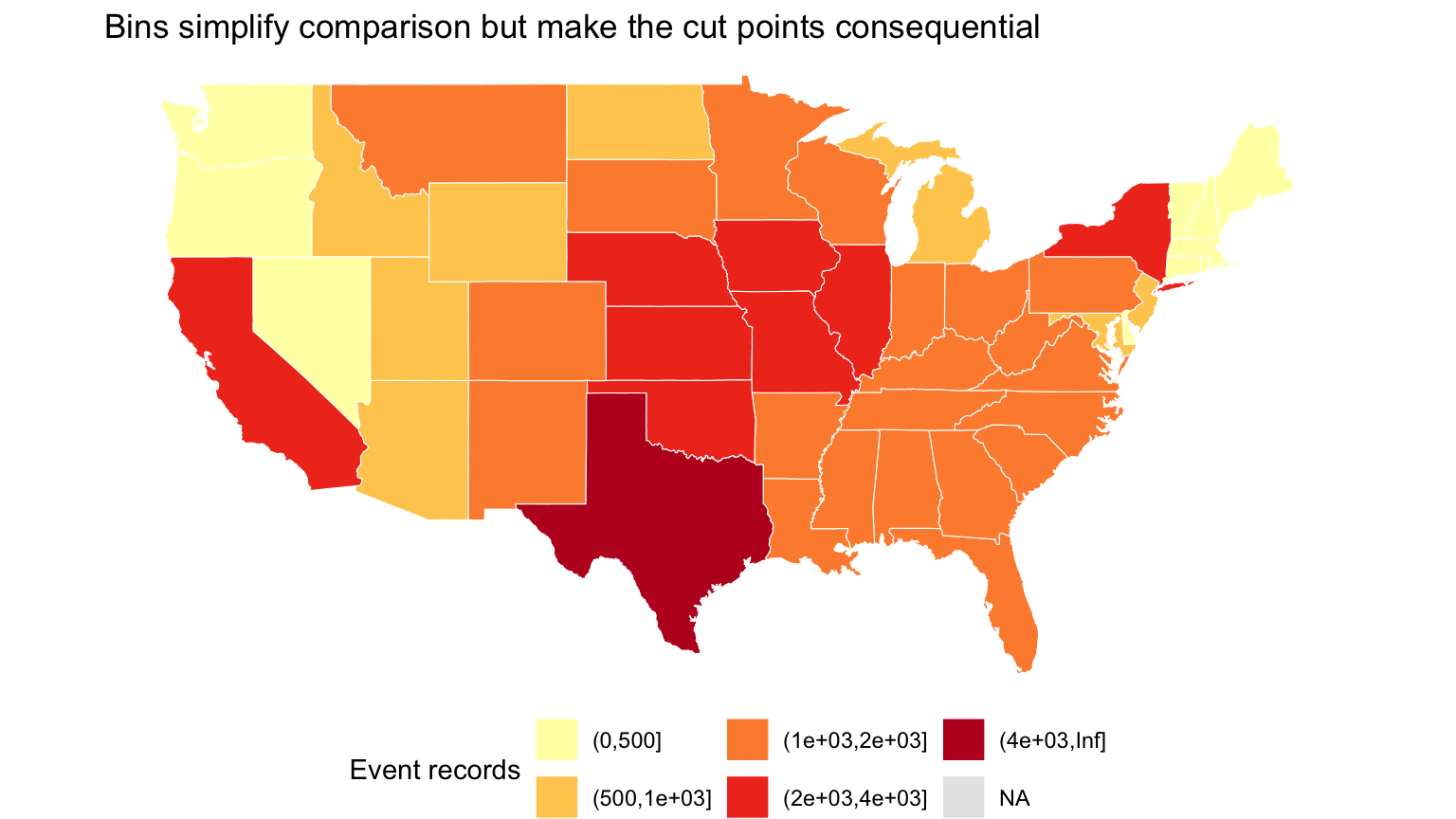
Bins can make policy thresholds visible, but boundary choices become part of the claim. Continuous scales preserve ordering but can make exact comparisons difficult.
Show the legend. State the transformation. Explain missing values.
A binned scale makes thresholds explicit
Code
ggplot(map_counts, aes(long, lat, group = group, fill =cut(event_records, breaks =c(0, 500, 1000, 2000, 4000, Inf)))) +geom_polygon(color ="white", linewidth =0.2) +coord_quickmap() +scale_fill_brewer(palette ="YlOrRd", na.value ="gray90", drop =FALSE) +labs(title ="Bins simplify comparison but make the cut points consequential", fill ="Event records") +theme_void() +theme(legend.position ="bottom")
Visual randomization test
Code
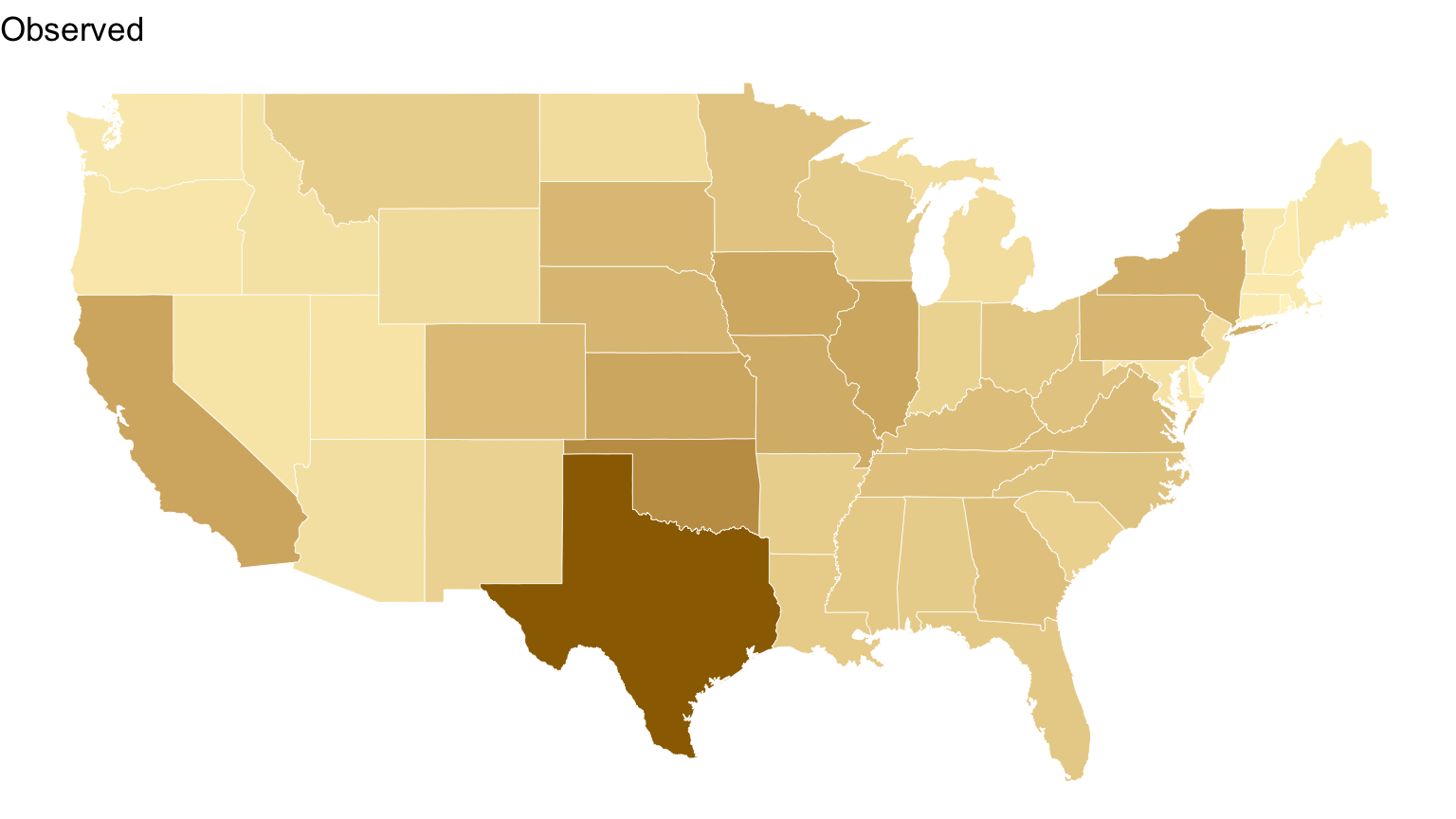
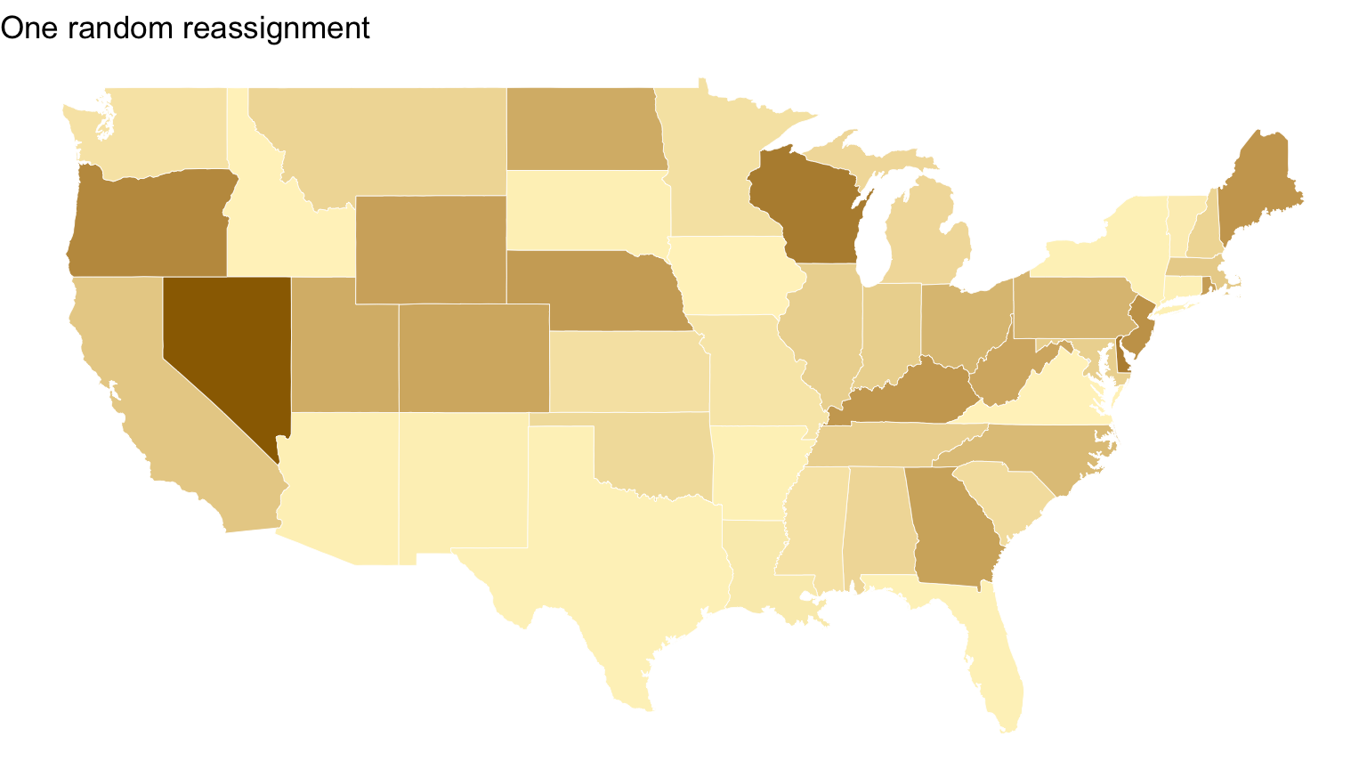
set.seed(36613)shuffled_counts <- state_counts |>mutate(event_records =sample(event_records))shuffled_map <- us |>left_join(state_key, by ="region") |>left_join(shuffled_counts, by ="state")ggplot(map_counts, aes(long, lat, group = group, fill = event_records)) +geom_polygon(color ="white", linewidth =0.15) +coord_quickmap() +scale_fill_gradient(low = pale_gold, high = deep_gold, na.value ="gray90") +labs(title ="Observed") +theme_void() +theme(legend.position ="none")ggplot(shuffled_map, aes(long, lat, group = group, fill = event_records)) +geom_polygon(color ="white", linewidth =0.15) +coord_quickmap() +scale_fill_gradient(low = pale_gold, high = deep_gold, na.value ="gray90") +labs(title ="One random reassignment") +theme_void() +theme(legend.position ="none")
The comparison asks whether the observed spatial arrangement looks unusual relative to a deliberately chosen null mechanism.
Checkpoint 2 · Audit the legend
For the raw-count map, propose a better title, a missing-data label, and either a continuous or binned scale. Explain the decision your legend helps the reader make.
Infographics vs. figures in papers/reports
A client graphic should make the reading order obvious:
finding-oriented title,
visual evidence,
annotation for the key comparison,
units and source,
caveat or scope note.
Everything else competes for attention.
Annotation
Use direct labels and short notes to point to:
a change point,
an outlier,
a threshold,
the comparison that supports the conclusion.
Do not annotate every data point.
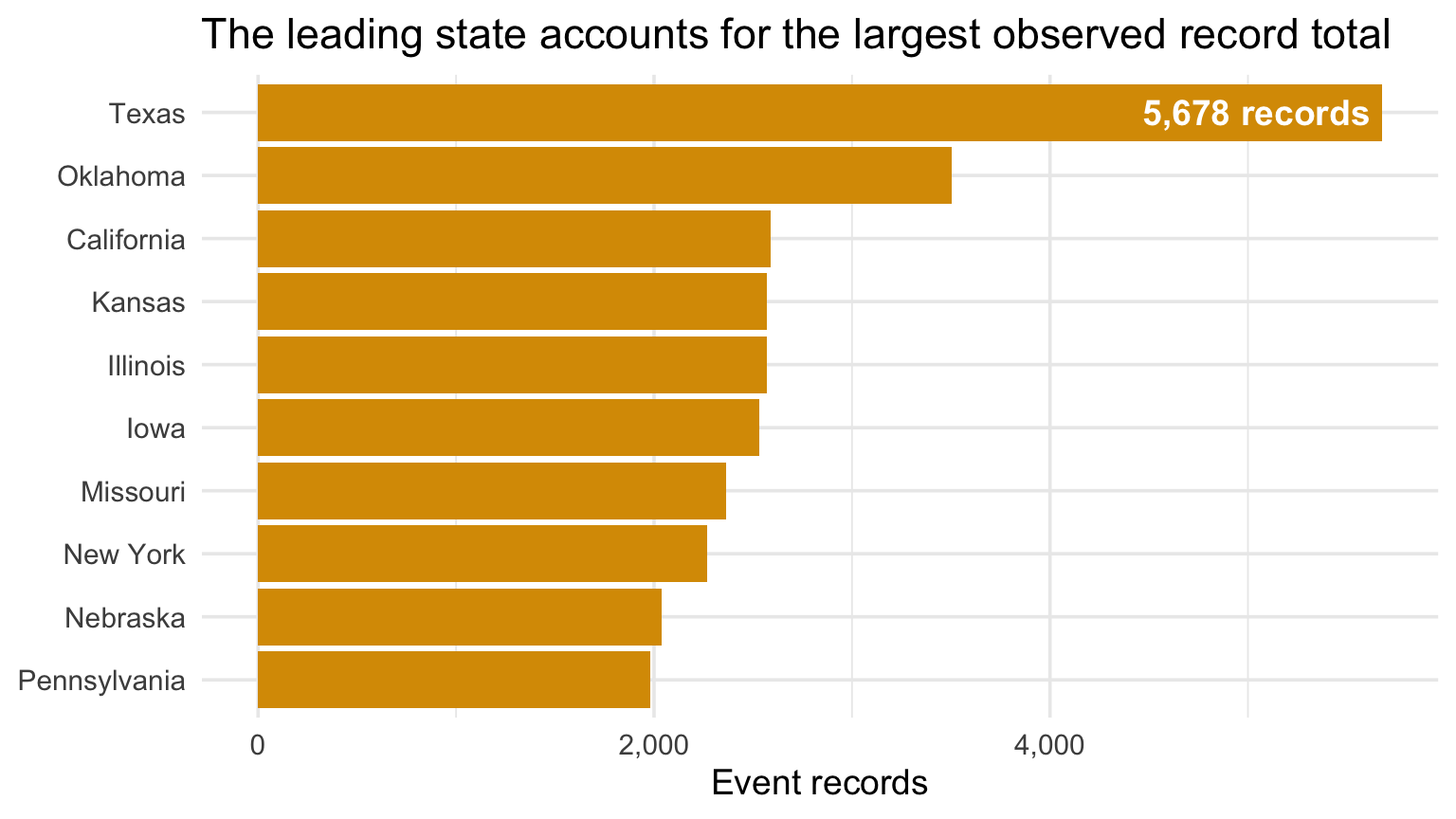
Annotate the comparison that matters
Code
top_states <- state_counts |>slice_max(event_records, n =10) |>mutate(state =fct_reorder(state, event_records))focus <- top_states |>slice_max(event_records, n =1)ggplot(top_states, aes(event_records, state)) +geom_col(fill = gold) +geom_text(data = focus, aes(label =paste(comma(event_records), "records")), hjust =1.05, color ="white", fontface ="bold") +scale_x_continuous(labels = comma) +labs(title ="The leading state accounts for the largest observed record total", x ="Event records", y =NULL)
Creating compound figures
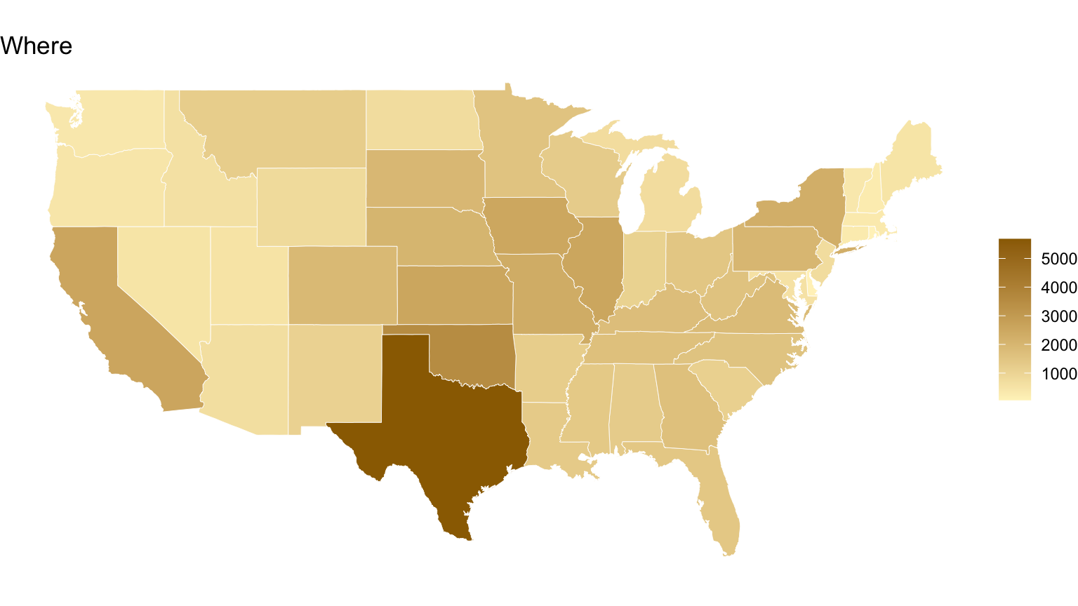
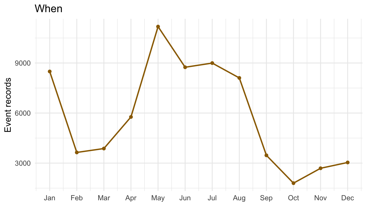
Two panels belong together when they answer complementary parts of one question—for example, a map showing where and a time series showing when.
A dashboard of unrelated charts is not automatically a story.
Combine where and when
Code
ggplot(map_counts, aes(long, lat, group = group, fill = event_records)) +geom_polygon(color ="white", linewidth =0.15) +coord_quickmap() +scale_fill_gradient(low = pale_gold, high = deep_gold, na.value ="gray90") +labs(title ="Where", fill =NULL) +theme_void()events |>count(month) |>ggplot(aes(month, n)) +geom_line(color = deep_gold, linewidth =1) +geom_point(color = deep_gold) +scale_x_continuous(breaks =1:12, labels = month.abb) +labs(title ="When", x =NULL, y ="Event records")
A function keeps axes, labels, and styling consistent across repeated figures.
Thinking about themes…
Use one text family and a small number of sizes.
Keep grid lines only when they aid comparison.
Reserve saturated color for the main evidence.
Align titles, panels, and captions.
Preserve enough whitespace to separate ideas.
Consistency makes differences in the data—not accidental formatting—the primary signal.
Checkpoint 3 · Remove one thing
Take one graphic from prior work. Identify the single element the reader should notice first, then remove or mute one element that competes with it. Explain your revision.