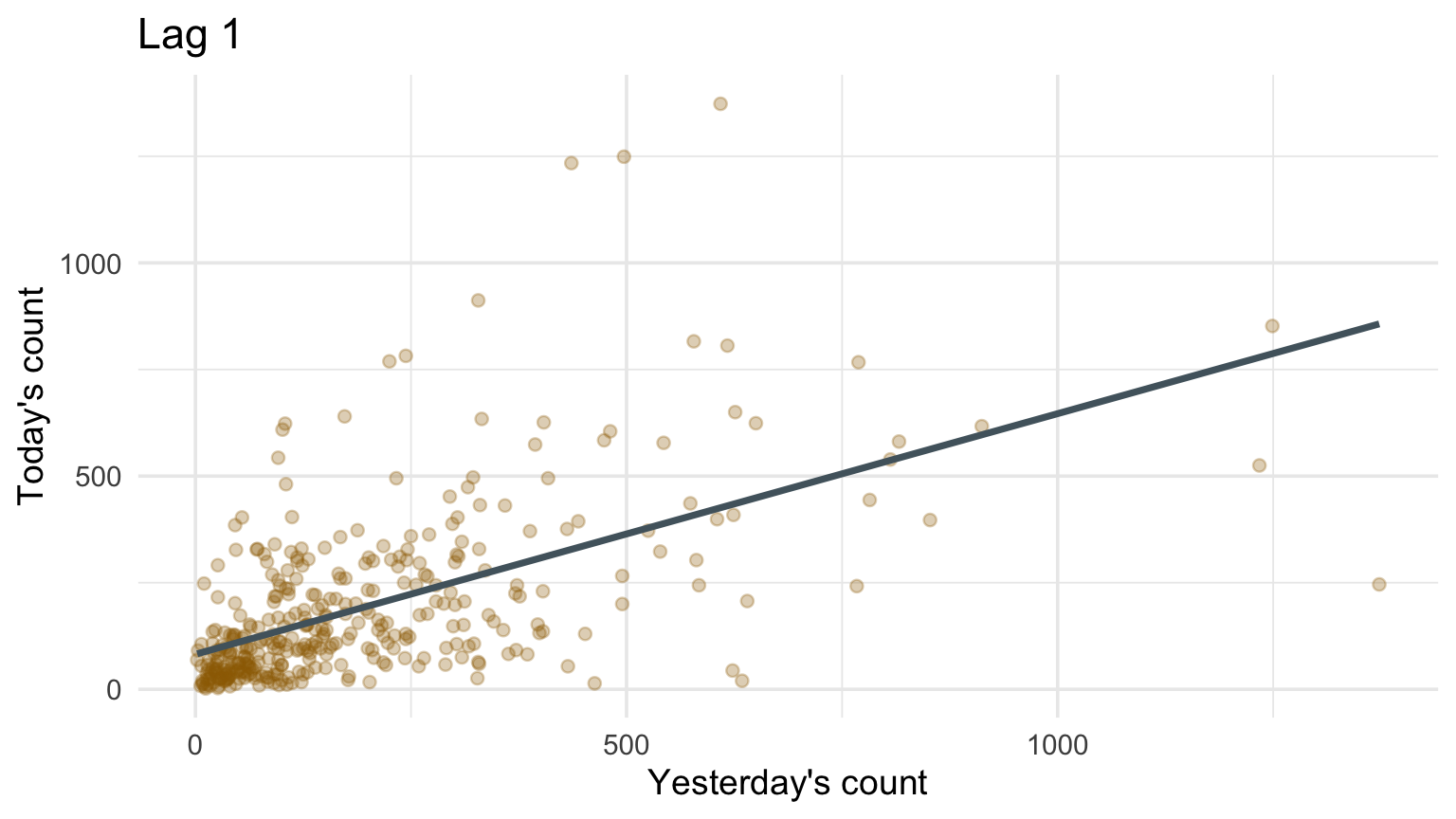
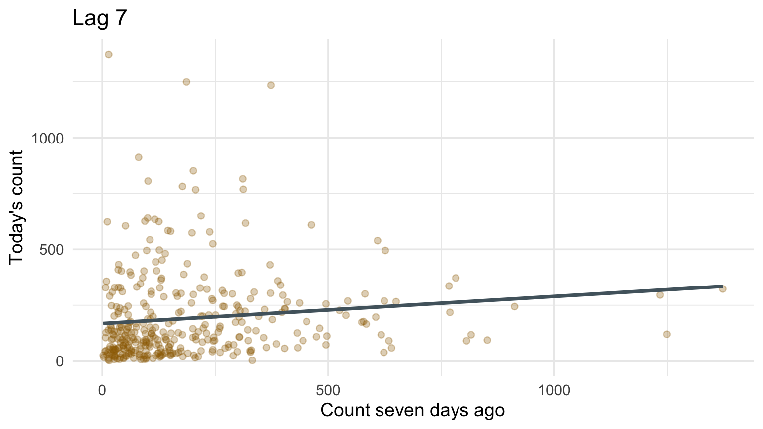
lagged <- daily |>mutate(lag1 =lag(n), lag7 =lag(n, 7))ggplot(lagged, aes(lag1, n)) +geom_point(alpha =0.3, color = deep_gold) +geom_smooth(method ="lm", se =FALSE, color = blue_gray) +labs(title ="Lag 1", x ="Yesterday's count", y ="Today's count")ggplot(lagged, aes(lag7, n)) +geom_point(alpha =0.3, color = deep_gold) +geom_smooth(method ="lm", se =FALSE, color = blue_gray) +labs(title ="Lag 7", x ="Count seven days ago", y ="Today's count")
Autocorrelation
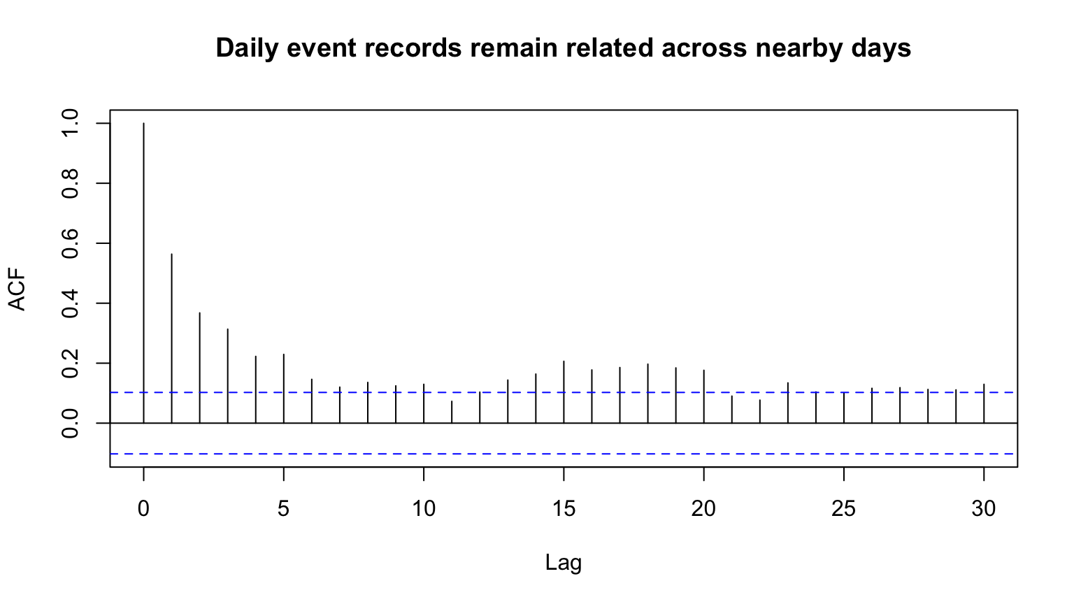
Autocorrelation measures linear similarity between a series and a lagged version of itself.
Code
acf(daily$n, lag.max =30, main ="Daily event records remain related across nearby days")
This dependence reflects multi-day weather systems, reporting, seasonality, and other processes—not one simple mechanism.
Autocorrelation plots
The x-axis is lag \(k\).
The vertical segment is the sample correlation between \(y_t\) and \(y_{t-k}\).
Values near one indicate similar high/low movement at that lag.
Values near minus one indicate opposite movement.
Reference bands are rough sampling guides, not a causal threshold.
Autocorrelation plots and seasonality
Code
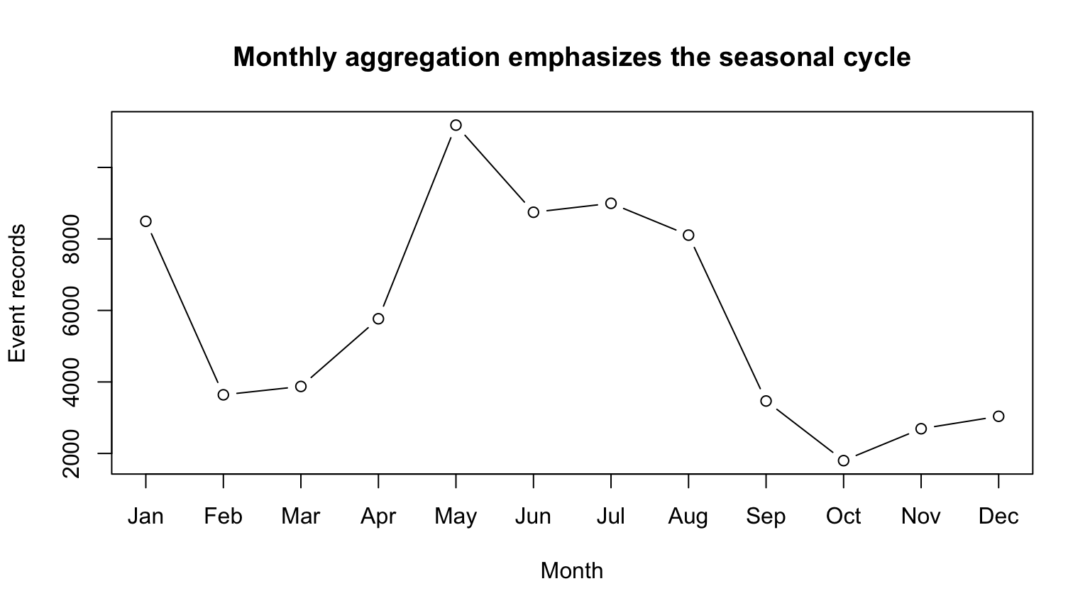
monthly <- events |>count(month) |>complete(month =1:12, fill =list(n =0)) |>arrange(month)plot(monthly$month, monthly$n, type ="b", xaxt ="n",xlab ="Month", ylab ="Event records", main ="Monthly aggregation emphasizes the seasonal cycle")axis(1, at =1:12, labels = month.abb)
One year is enough to display a seasonal pattern but not enough to estimate a stable annual autocorrelation at lag 12.
Checkpoint 2 · Interpret a lag
If lag-1 autocorrelation is positive, what does that say? Write one defensible sentence and one causal sentence that the plot does not justify.
NOAA historical trends need care
Storm Events categories, collection practices, and reporting coverage changed over time.
An upward record count can reflect:
more hazards,
greater exposure,
new event categories,
better detection or reporting,
administrative changes.
How should we think about spatial data?
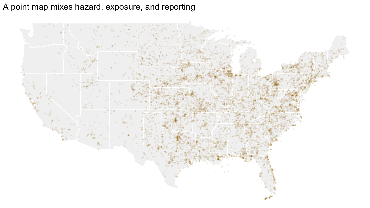
Point pattern: event locations themselves are the outcome.
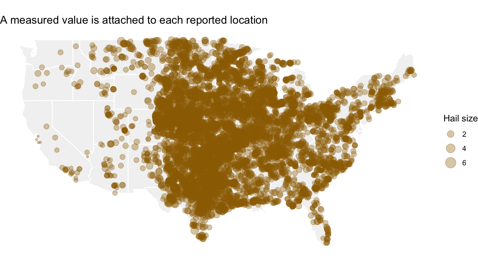
Point referenced: a measured value occurs at a location.
Areal: a value summarizes a region such as a state or county.
The right display depends on which structure you have.
Latitude and Longitude
They are not ordinary x and y variables on a flat plane.
Earth is curved; a map projection converts the surface to a plane. Every projection distorts some combination of area, shape, distance, or direction.
Map Projections
A conformal projection preserves local angles and shapes.
An equal-area projection preserves relative areas.
An equidistant projection preserves selected distances.
No flat map preserves area, shape, distance, and direction everywhere.
For state-level choropleths, area distortion can alter the visual weight assigned to regions even when the data values are unchanged.
Point-Pattern data
The event locations are themselves the observations. Questions include:
Where are reports concentrated?
Do events appear clustered?
Does intensity vary over space?
Interpreting concentration requires exposure, geography, and reporting context.
Point-Referenced data
Code
events |>filter(event_type =="Hail", has_begin_coords, magnitude >0, begin_lon >=-125, begin_lon <=-66, begin_lat >=24, begin_lat <=50) |>ggplot() +geom_polygon(data = us, aes(long, lat, group = group), fill ="gray95", color ="white") +geom_point(aes(begin_lon, begin_lat, size = magnitude), alpha =0.35, color = deep_gold) +coord_quickmap() +labs(title ="A measured value is attached to each reported location", size ="Hail size", x =NULL, y =NULL) +theme_void()
Here the location is known and hail magnitude is the measured attribute.
Areal data
An areal value summarizes a region such as a state or county. Examples include total events, total damage, or a normalized rate.
The region is the observational unit. A choropleth should not be interpreted as showing within-region point locations.
Inference for Spatial Data
Nearby observations can be more similar than distant observations. That violates the independence assumption behind many familiar analyses.
Spatial inference requires choices about neighborhood, distance, trend, and covariance; a smooth map alone does not provide those choices.
Kriging
At a new location, kriging forms a weighted combination of nearby observed values. The weights reflect the fitted spatial covariance and the geometry of the observed sites.
The resulting surface is a model-based prediction, not observed data between stations. Prediction uncertainty should accompany the interpolated map.
NOAA point-pattern example
Code
us <- ggplot2::map_data("state")events |>filter(has_begin_coords, begin_lon >=-125, begin_lon <=-66, begin_lat >=24, begin_lat <=50) |>slice_sample(n =8000) |>ggplot() +geom_polygon(data = us, aes(long, lat, group = group), fill ="gray95", color ="white") +geom_point(aes(begin_lon, begin_lat), alpha =0.08, size =0.5, color = deep_gold) +coord_quickmap() +labs(title ="A point map mixes hazard, exposure, and reporting", x =NULL, y =NULL) +theme_void()
Checkpoint 3 · Name the spatial claim
What does a dense cluster of points on this map mean? List three plausible explanations, then identify one denominator or additional dataset needed to distinguish them.
Recap and next steps
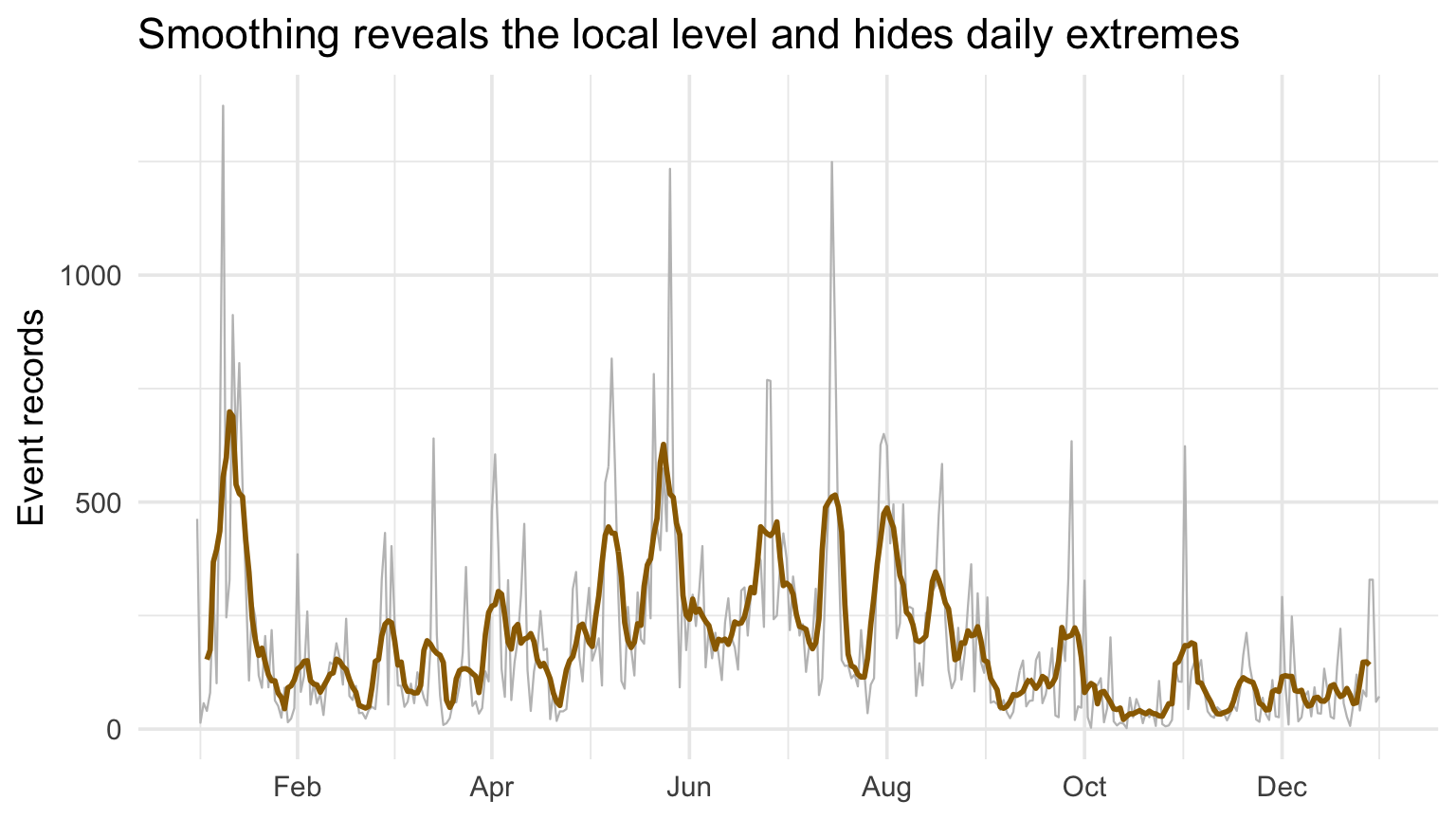
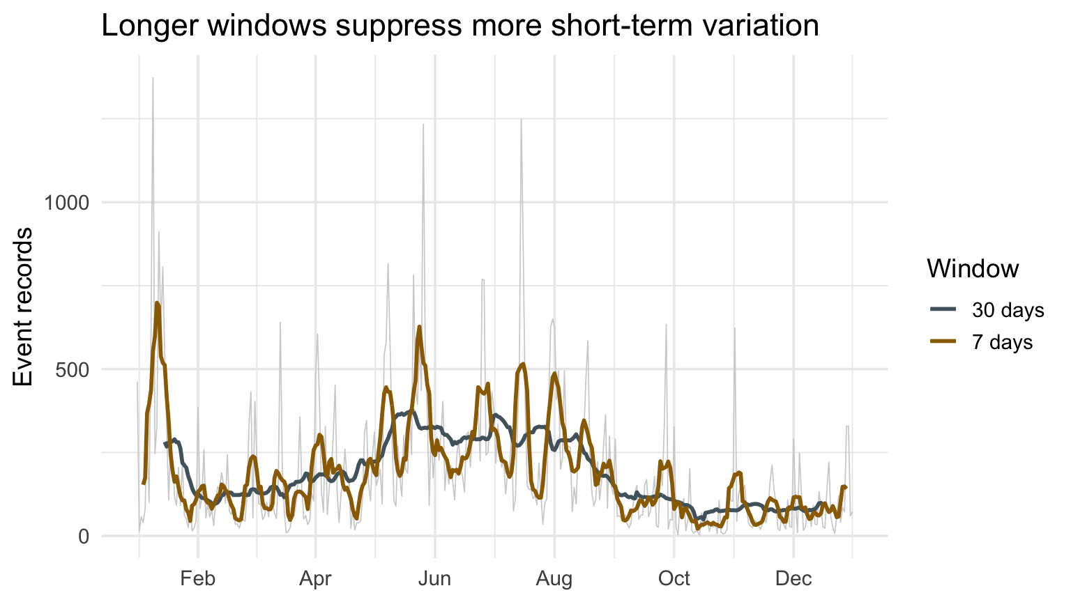
Smoothing trades local detail for a clearer level.
Autocorrelation describes dependence, not cause.
Historical NOAA trends require reporting caveats.
Point and areal spatial data support different claims.
Next: choropleths, normalization, and high-quality composition.