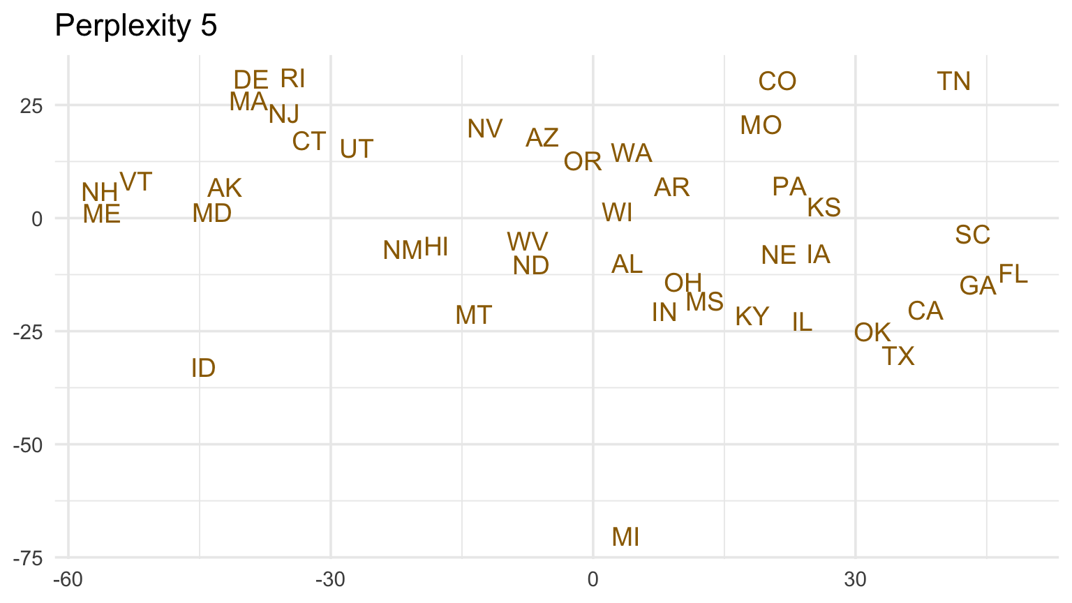
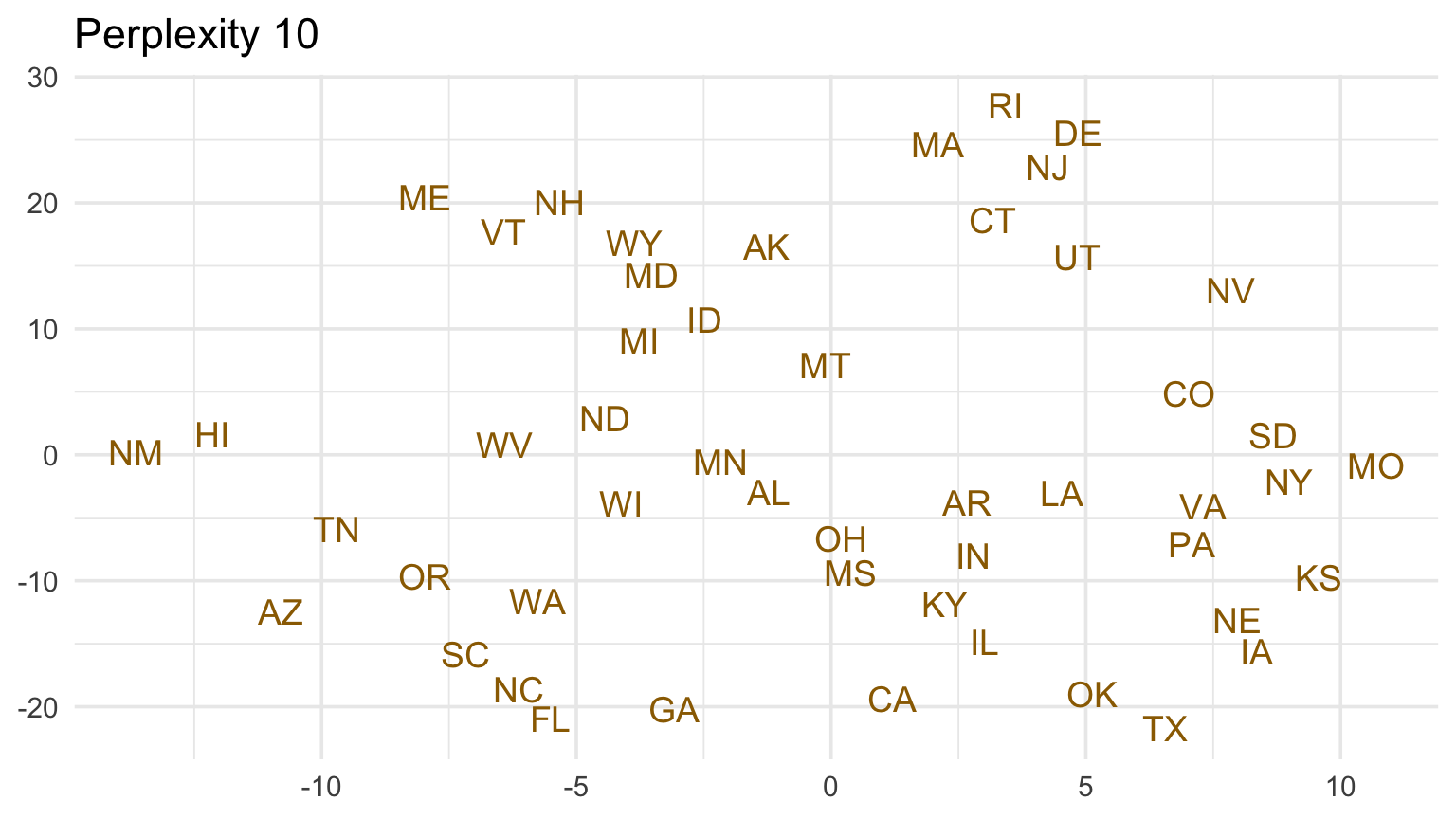
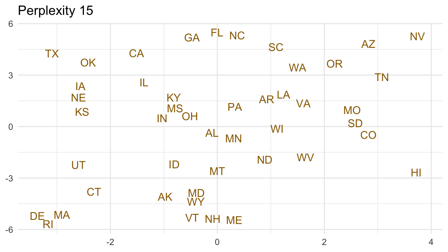
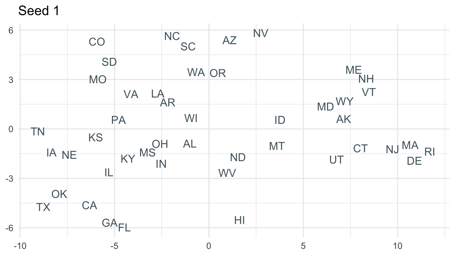
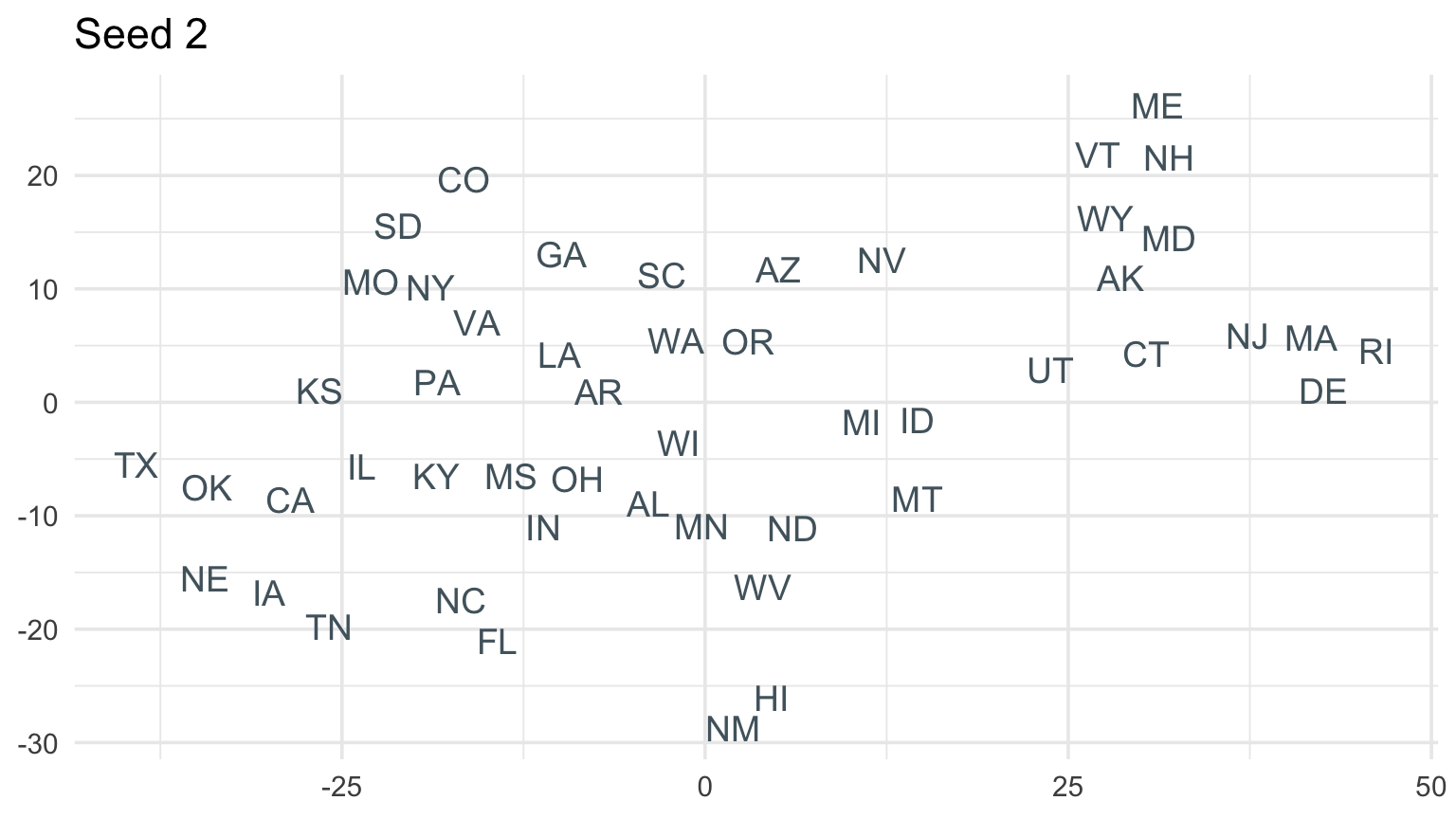
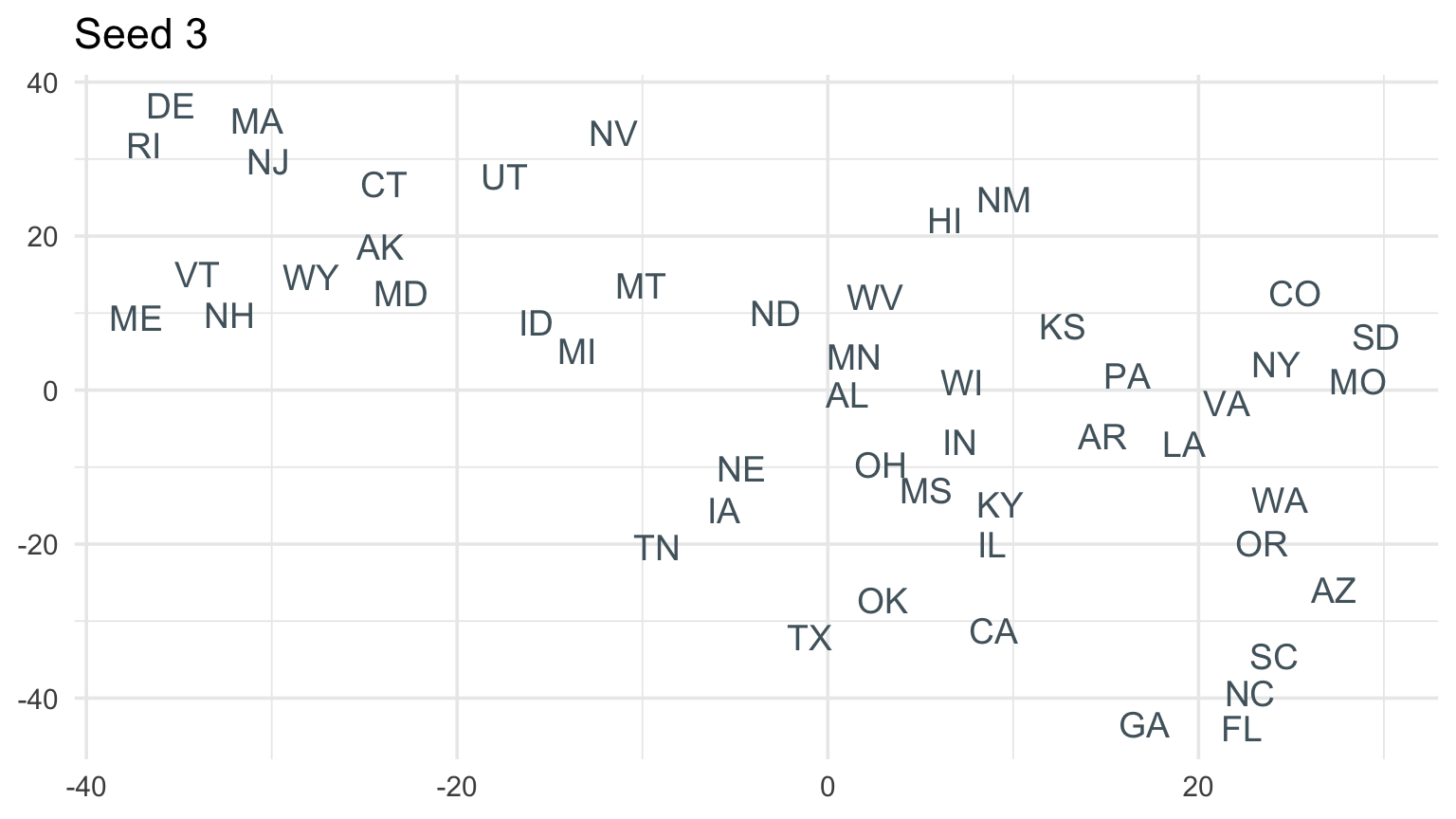
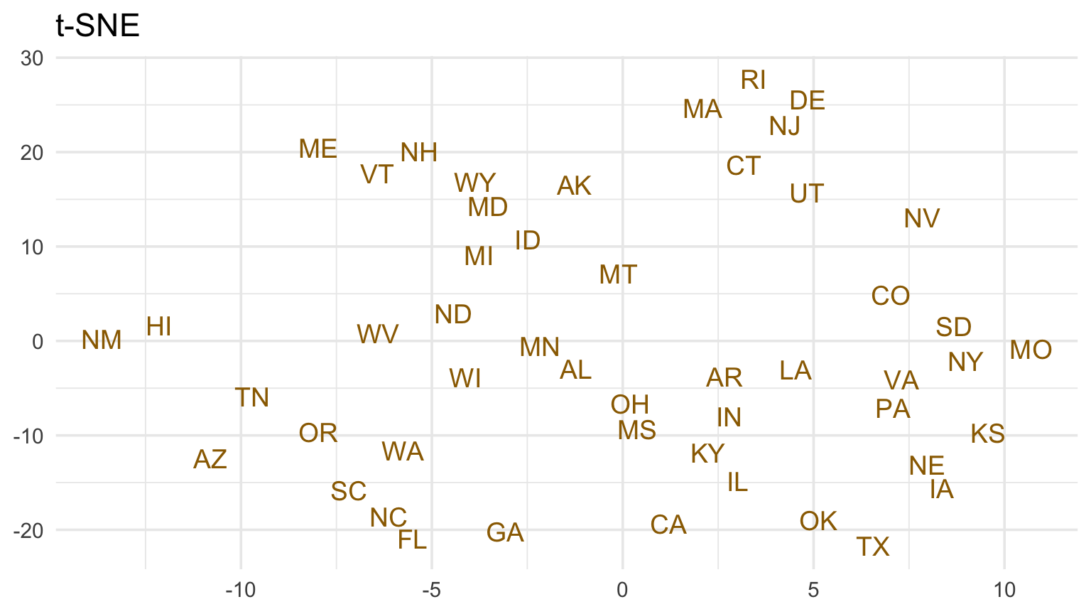
fit$Y is a 50 × 2 matrix: one row per state and one column per plotted dimension.
Compare several settings on the NOAA state profiles
Checkpoint 1 · Read with restraint
Someone says, “Cluster A is twice as far from B as from C on the t-SNE plot.” Explain why that claim is unsafe and propose a defensible statement instead.
Random starts change the embedding
t-SNE commonly begins from a random arrangement. Repeated runs can differ.
A pattern that disappears across reasonable seeds or settings is not strong evidence. Stability checks belong beside the visualization.
Compare repeated runs
UMAP also starts with local neighborhoods
UMAP builds a weighted graph that connects each observation to nearby observations.
It searches for a low-dimensional layout with similar local connections.
UMAP often runs faster than t-SNE as the number of observations grows.
The axes, orientation, and absolute distances still have no direct interpretation.
UMAP may retain more broad structure than t-SNE, but neither method guarantees a faithful global map.
UMAP settings
Neighborhood size
n_neighbors
lower values emphasize smaller neighborhoods
higher values consider broader structure
similar role to perplexity, but not the same quantity
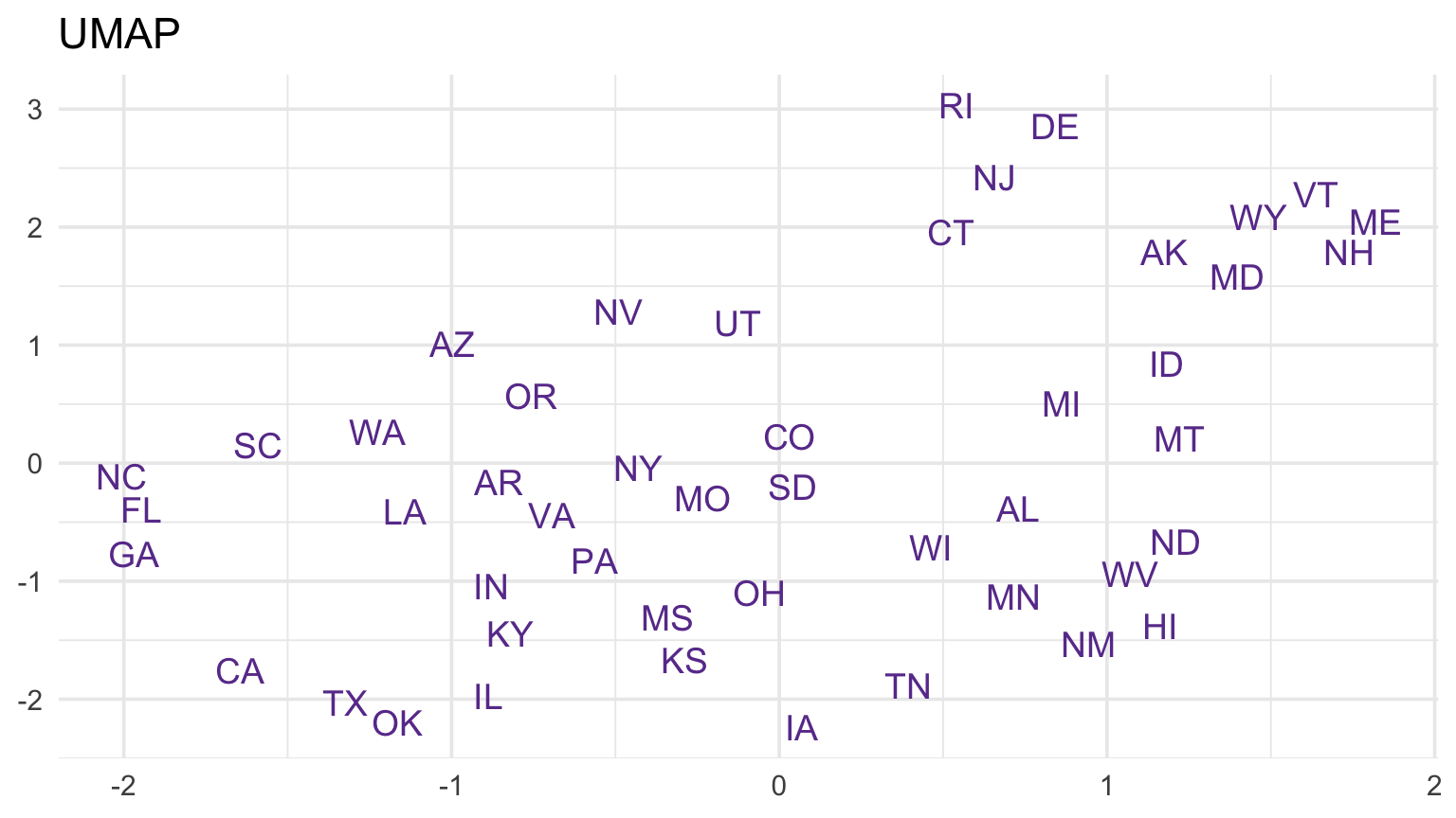
umap_fit is a 50 × 2 matrix. Install the package once with install.packages("uwot").
t-SNE and UMAP on the same state profiles
Look for neighborhoods that appear in both maps. Do not compare coordinates, axis scales, or the size of empty spaces across the panels.
A responsible nonlinear embedding workflow
Clean and scale variables deliberately.
Try several seeds and neighborhood settings.
Compare with PCA or the original variables.
Investigate apparent groups in the source data.
Label the embedding as exploratory.
Checkpoint 2 · Stability plan
Design a three-run stability check for an embedding of state impact profiles. What would need to remain similar before you trusted an apparent group?
From neighborhoods to temporal order
An embedding uses position to show similarity among unordered observations. Time series already have a meaningful order, and a line makes that order visible.
Before drawing it, identify:
time unit,
aggregation rule,
missing intervals,
whether the series measures events, observations, or people.
Example: NOAA event reports by day
Code
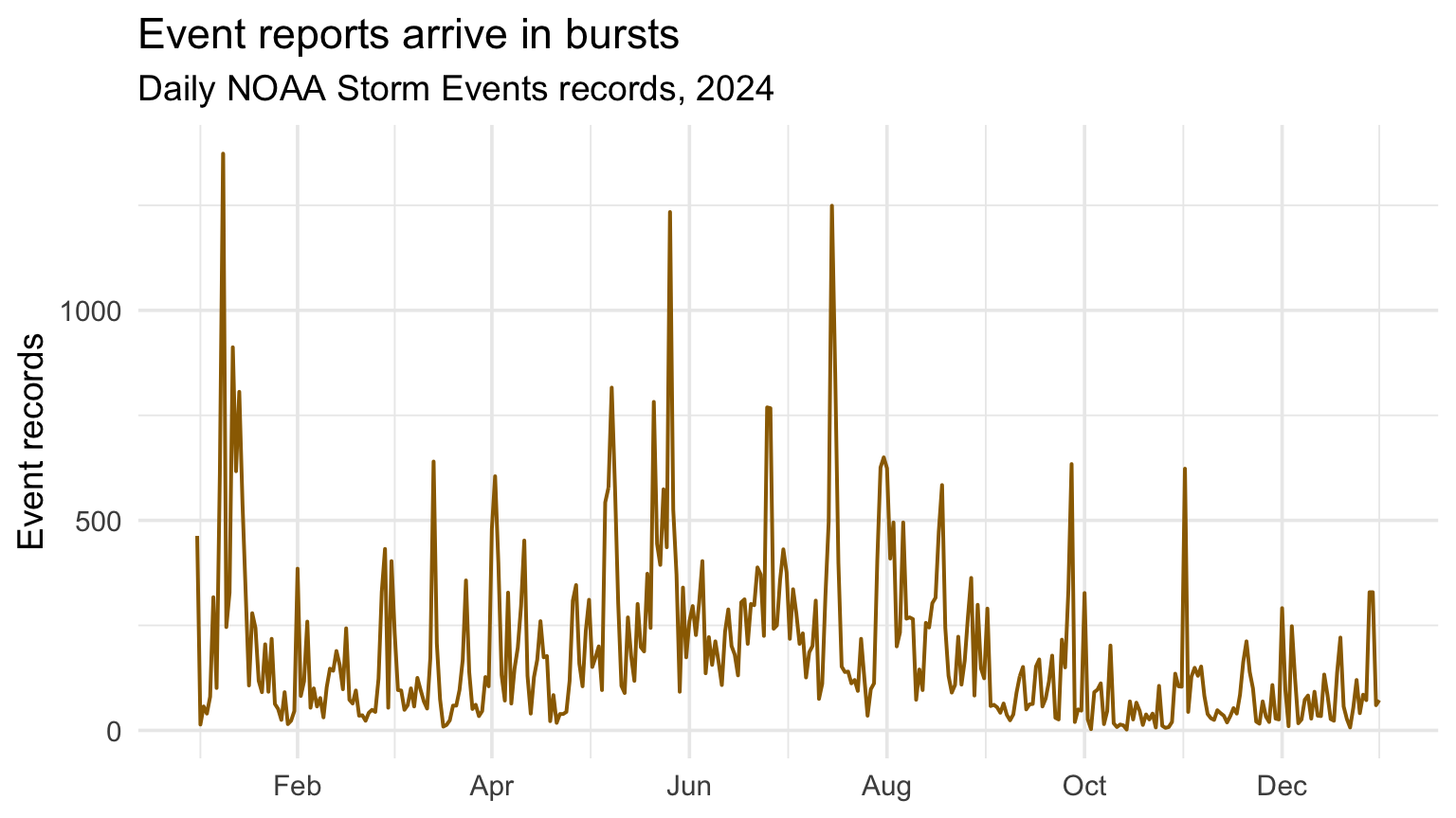
daily <- events |>mutate(day =as.Date(begin_dt)) |>count(day) |>complete(day =seq(min(day), max(day), by ="day"), fill =list(n =0))daily |>ggplot(aes(day, n)) +geom_line(color = deep_gold, linewidth =0.7) +scale_x_date(date_breaks ="2 months", date_labels ="%b") +labs(title ="Event reports arrive in bursts", subtitle ="Daily NOAA Storm Events records, 2024", x =NULL, y ="Event records")
Add lines to emphasize order
Code
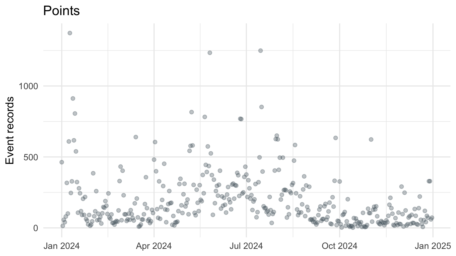
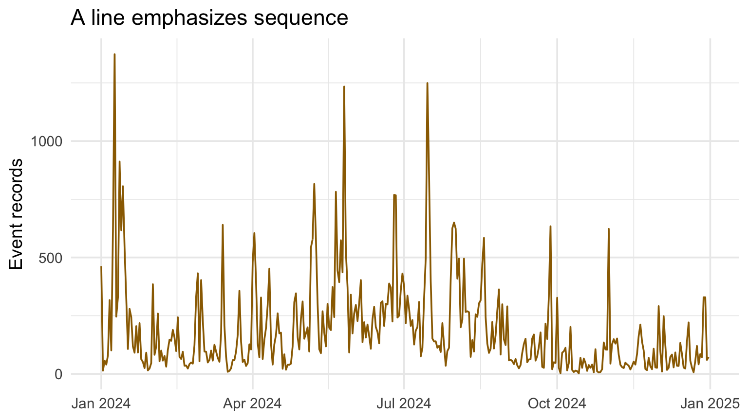
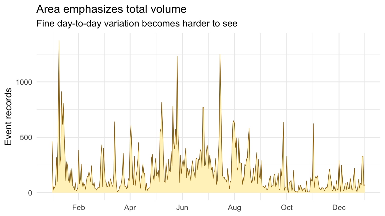
daily |>ggplot(aes(day, n)) +geom_point(alpha =0.35, color = blue_gray) +labs(title ="Points", x =NULL, y ="Event records")daily |>ggplot(aes(day, n)) +geom_line(color = deep_gold) +labs(title ="A line emphasizes sequence", x =NULL, y ="Event records")
Connecting daily counts helps reveal sequence and bursts. It does not imply that the underlying hazard changes smoothly between days.
For sparse or irregular observations, points, steps, or explicit gaps may be more honest.
Several time series
Code
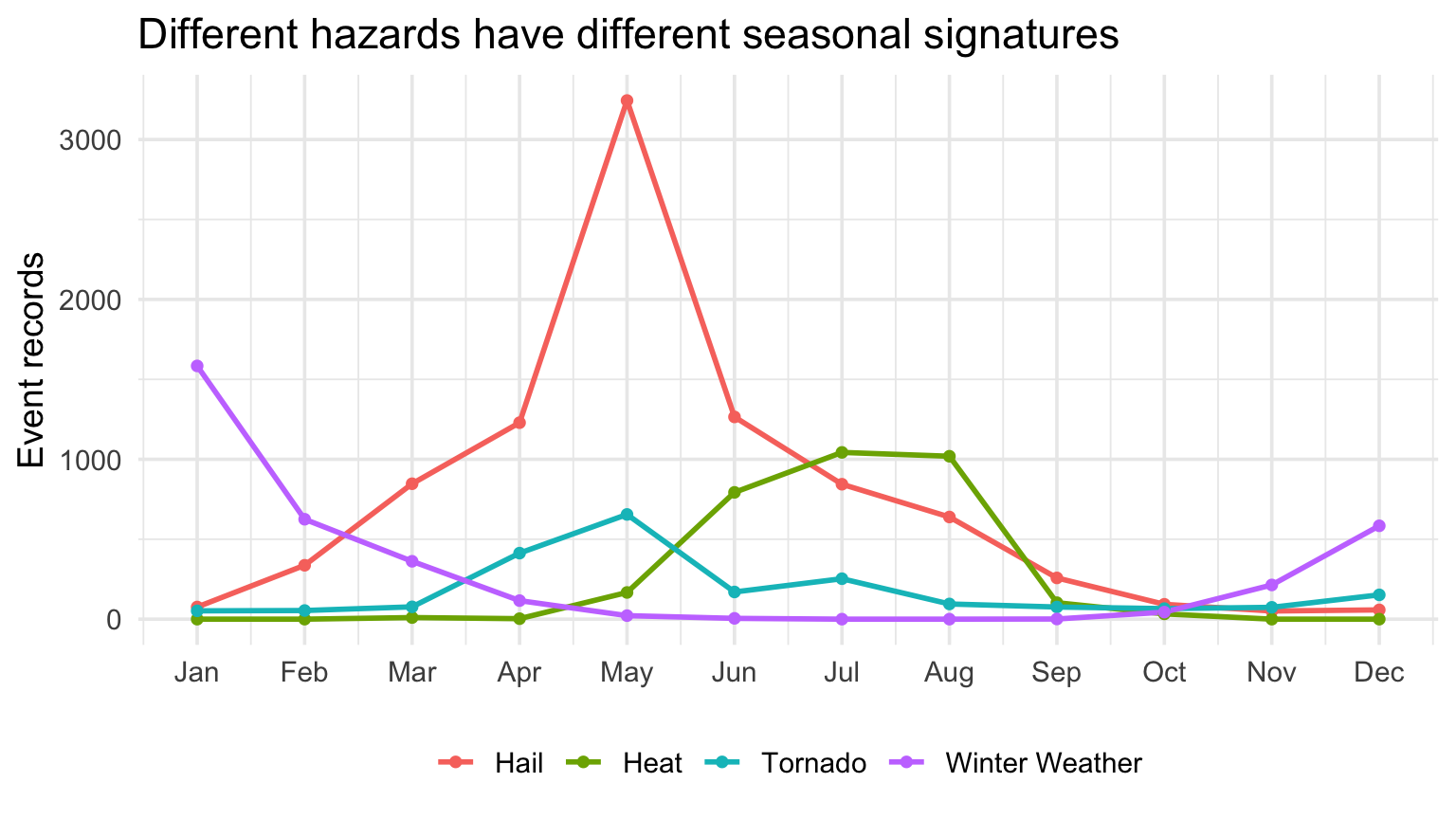
events |>filter(event_type %in%c("Hail", "Tornado", "Heat", "Winter Weather")) |>count(month, event_type) |>complete(month =1:12, event_type, fill =list(n =0)) |>ggplot(aes(month, n, color = event_type)) +geom_line(linewidth =1) +geom_point(size =1.5) +scale_x_continuous(breaks =1:12, labels = month.abb) +labs(title ="Different hazards have different seasonal signatures", x =NULL, y ="Event records", color =NULL) +theme(legend.position ="bottom")
Directly label lines
Code
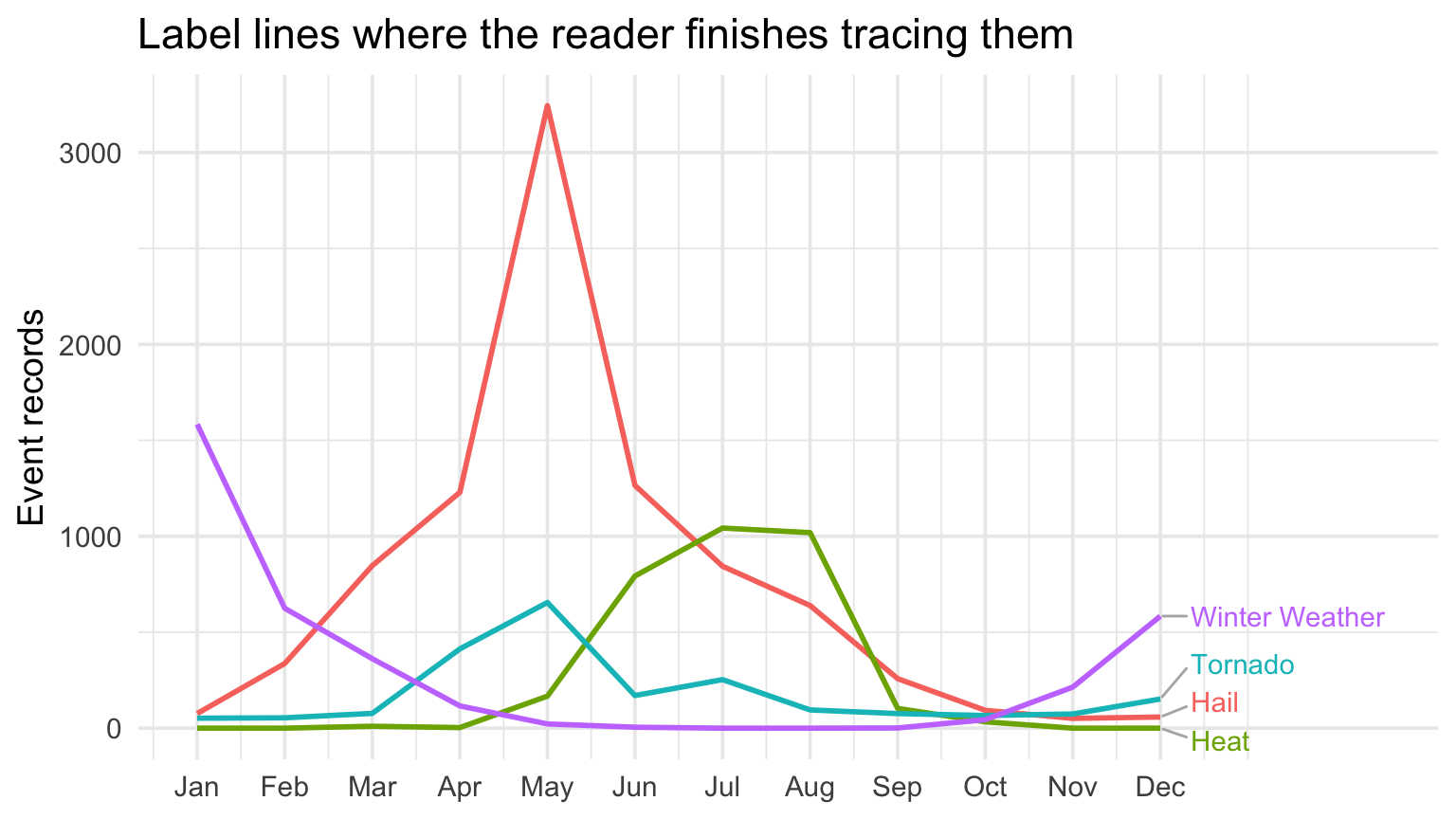
series <- events |>filter(event_type %in%c("Hail", "Tornado", "Heat", "Winter Weather")) |>count(month, event_type) |>complete(month =1:12, event_type, fill =list(n =0))ggplot(series, aes(month, n, color = event_type)) +geom_line(linewidth =1) + ggrepel::geom_text_repel(data =filter(series, month ==12),aes(label = event_type),direction ="y",hjust =0,nudge_x =0.35,segment.color ="gray70",min.segment.length =0,max.overlaps =Inf,seed =36613,show.legend =FALSE ) +scale_x_continuous(breaks =1:12, labels = month.abb, limits =c(1, 14.5)) +labs(title ="Label lines where the reader finishes tracing them", x =NULL, y ="Event records", color =NULL) +theme(legend.position ="none")
Highlighting one series among many
Code
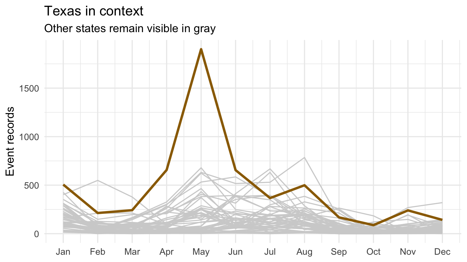
state_series <- events |>mutate(state = state.abb[match(str_to_title(state_upper), state.name)]) |>filter(!is.na(state)) |>count(state, month) |>complete(state, month =1:12, fill =list(n =0))ggplot(state_series, aes(month, n, group = state)) +geom_line(color ="gray82") +geom_line(data =filter(state_series, state =="TX"), color = deep_gold, linewidth =1.4) +scale_x_continuous(breaks =1:12, labels = month.abb) +labs(title ="Texas in context", subtitle ="Other states remain visible in gray", x =NULL, y ="Event records")
Time axes and missing intervals
Show the full relevant time window.
Make missing intervals explicit.
Avoid unequal spacing that visually implies equal time.
Use zero when magnitude comparison requires it; explain justified truncation.
Separate seasonal patterns from changes in coverage or reporting.
Checkpoint 3 · What is the series?
For the multi-series plot, write what one point represents. Then identify one reporting or exposure issue that prevents the line from being interpreted as pure weather frequency.
Recap and next steps
Nonlinear embeddings are exploratory neighborhood views.
t-SNE and UMAP use different objectives and settings.
Settings, seeds, and preprocessing are part of the result.
Time adds order and makes missing intervals consequential.
A line chart is only as meaningful as its aggregation rule.
Next: time-series structure and spatial foundations.