The matrix is symmetric, has zero on the diagonal, and contains one distance for every pair of observations.
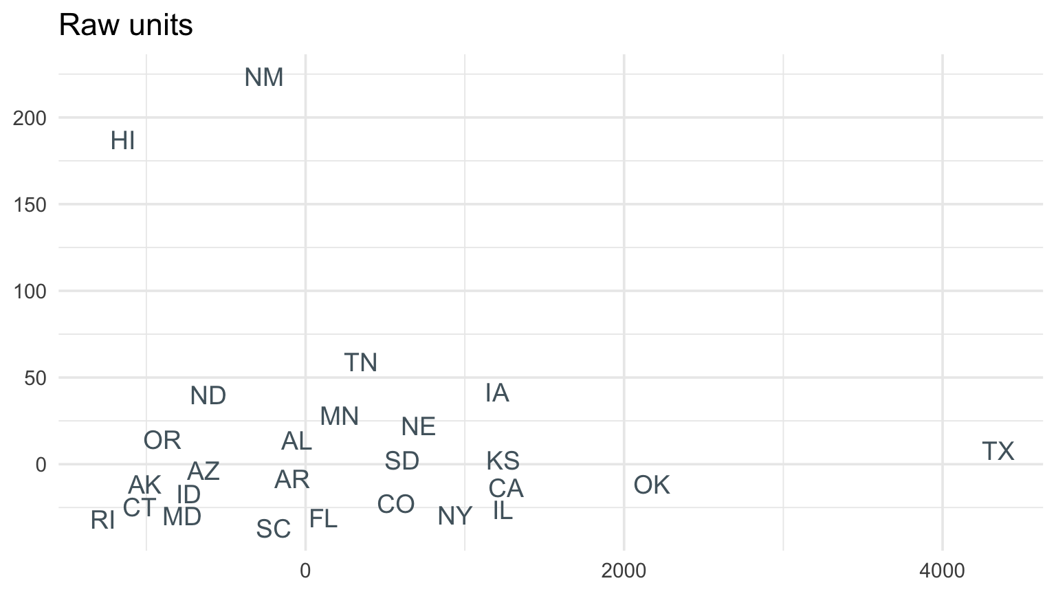
Dollars dominate without scaling
If we combine raw event counts, deaths, hours, and billions of dollars, damage controls almost every distance.
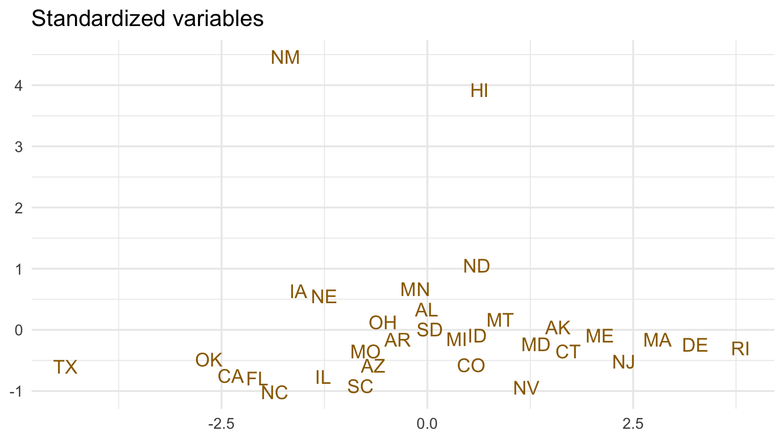
Standardization makes one standard deviation count equally in each variable—but that is also a substantive choice.
Checkpoint 1 · Define “similar”
Two states have similar total damage but very different deaths and event counts. Are they similar? Choose the variables and scaling that match one plausible client question.
Multi-dimensional scaling (MDS)
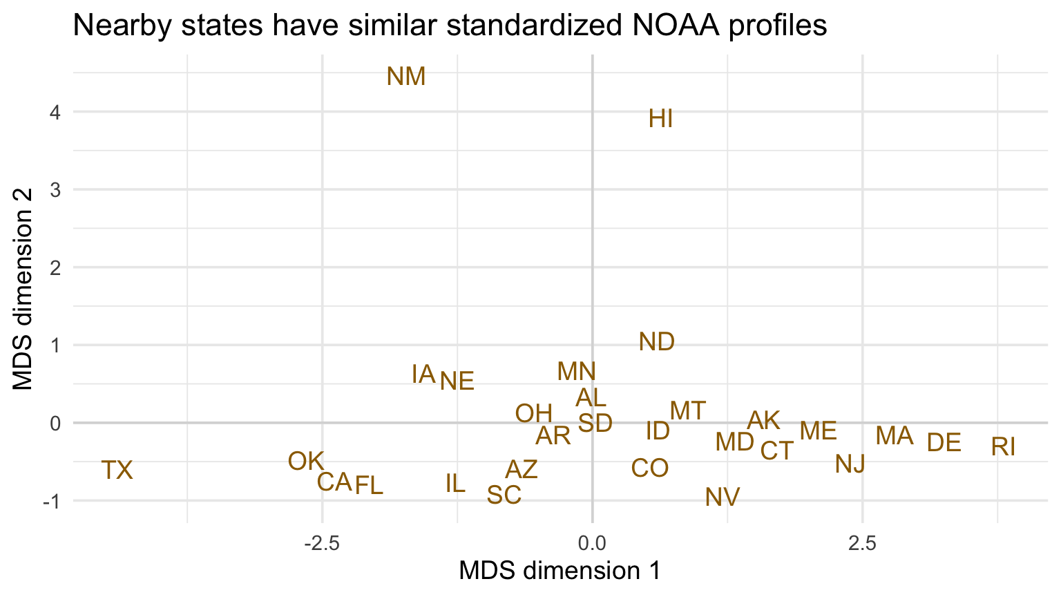
MDS starts from pairwise distances and finds a low-dimensional arrangement that preserves those distances as closely as possible.
Nearby points are similar under the chosen distance. Axis directions usually have no standalone meaning.
MDS example with NOAA state profiles
Code
mds <-cmdscale(dist(x), k =2)mds_df <-tibble(state = metrics$state, dim1 = mds[, 1], dim2 = mds[, 2])ggplot(mds_df, aes(dim1, dim2, label = state)) +geom_hline(yintercept =0, color ="gray85") +geom_vline(xintercept =0, color ="gray85") +geom_text(color = deep_gold, check_overlap =TRUE) +labs(title ="Nearby states have similar standardized NOAA profiles", x ="MDS dimension 1", y ="MDS dimension 2")
View structure with additional variables
Code
raw_x <- metrics |>select(-state)raw_mds <-cmdscale(dist(raw_x), k =2)ggplot(tibble(state = metrics$state, x = raw_mds[, 1], y = raw_mds[, 2]), aes(x, y, label = state)) +geom_text(color = blue_gray, check_overlap =TRUE) +labs(title ="Raw units", x =NULL, y =NULL)ggplot(mds_df, aes(dim1, dim2, label = state)) +geom_text(color = deep_gold, check_overlap =TRUE) +labs(title ="Standardized variables", x =NULL, y =NULL)
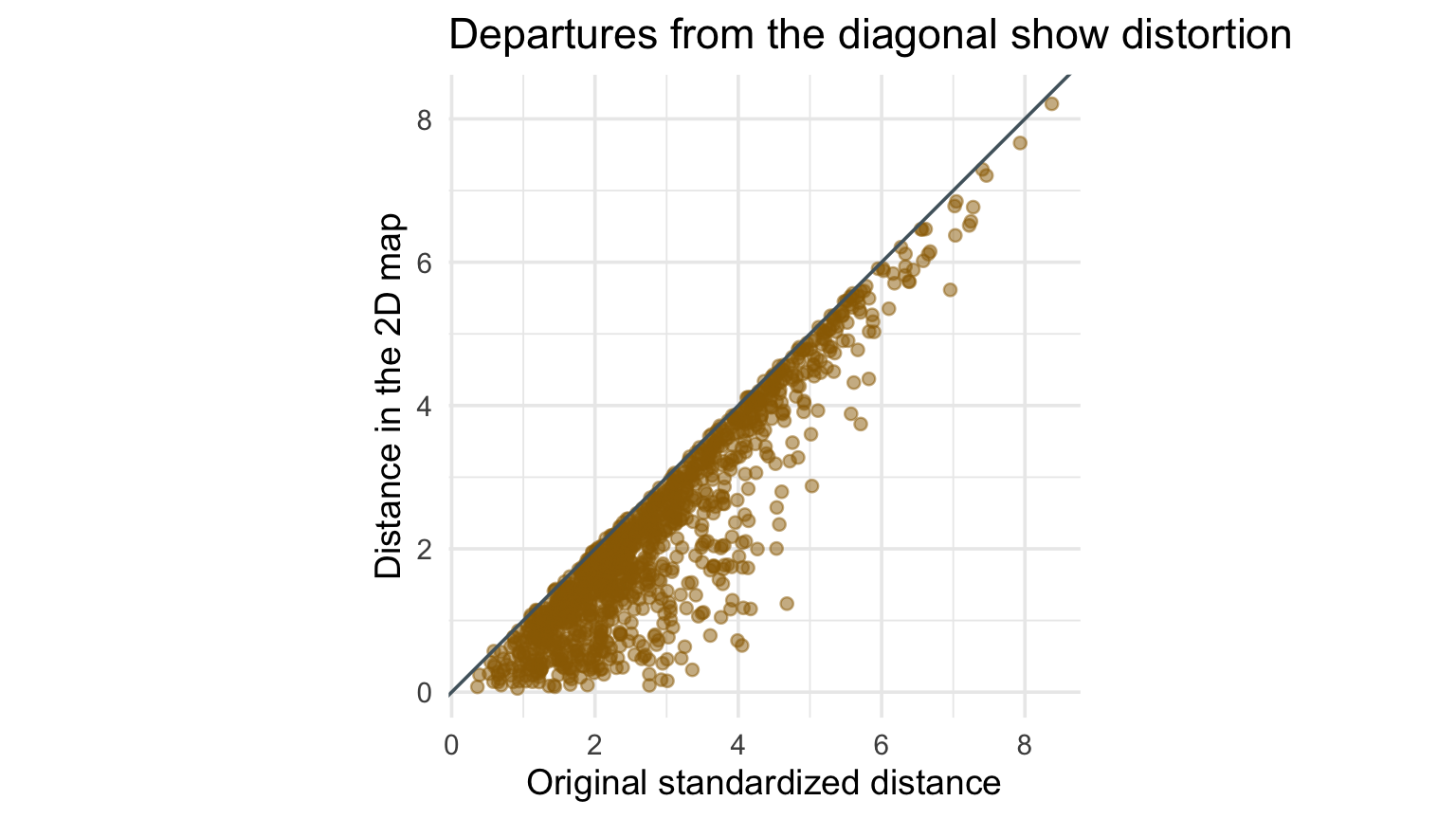
Evaluate how well two dimensions preserve distance
Code
embedded_distance <-as.vector(dist(mds))original_distance <-as.vector(dist(x))tibble(original_distance, embedded_distance) |>ggplot(aes(original_distance, embedded_distance)) +geom_point(alpha =0.5, color = deep_gold) +geom_abline(slope =1, intercept =0, color = blue_gray) +coord_equal() +labs(title ="Departures from the diagonal show distortion", x ="Original standardized distance", y ="Distance in the 2D map")
What MDS does not say
It does not identify causal groups.
The axes may rotate or flip without changing the solution.
A two-dimensional view necessarily loses information.
Clusters can depend strongly on distance and preprocessing.
Dimension reduction—searching for variance
Principal component analysis finds directions that:
are linear combinations of the original variables,
capture as much variance as possible,
are mutually orthogonal.
PCA rotates the coordinate system; it does not discover truth.
Principal Component Analysis (PCA)
For centered variables, the first component has the form
\[
PC_1=a_{11}X_1+a_{21}X_2+\cdots+a_{p1}X_p.
\]
The weights are chosen so that the scores on \(PC_1\) have maximum variance, subject to the loading vector having length one. Later components maximize remaining variance while remaining orthogonal to earlier components.
What are principal components?
Centering moves every variable to mean zero.
Scaling gives every variable unit standard deviation.
PCA on a covariance matrix preserves original-unit variance.
PCA on a correlation matrix treats standardized variables equally.
With counts, deaths, hours, and dollars together, scaling is essential unless the units are intentionally weighted.
Computing Principal Components
Code
pca <-prcomp(x, center =FALSE, scale. =FALSE)summary(pca)
Importance of components:
                          PC1    PC2    PC3     PC4     PC5
Standard deviation     1.5895 1.0039 0.8378 0.70626 0.51494
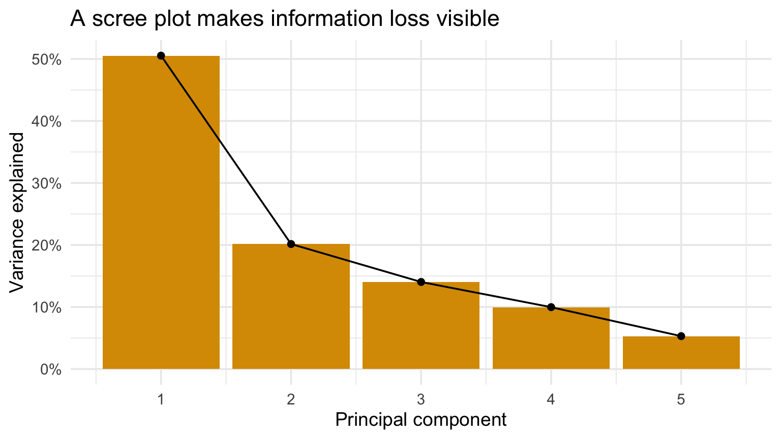
Proportion of Variance 0.5053 0.2016 0.1404 0.09976 0.05303
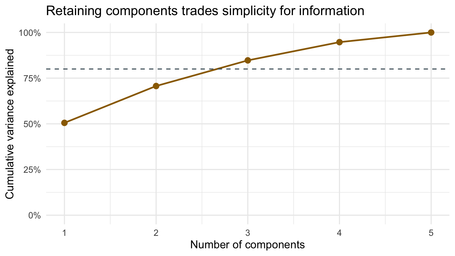
Cumulative Proportion  0.5053 0.7068 0.8472 0.94697 1.00000
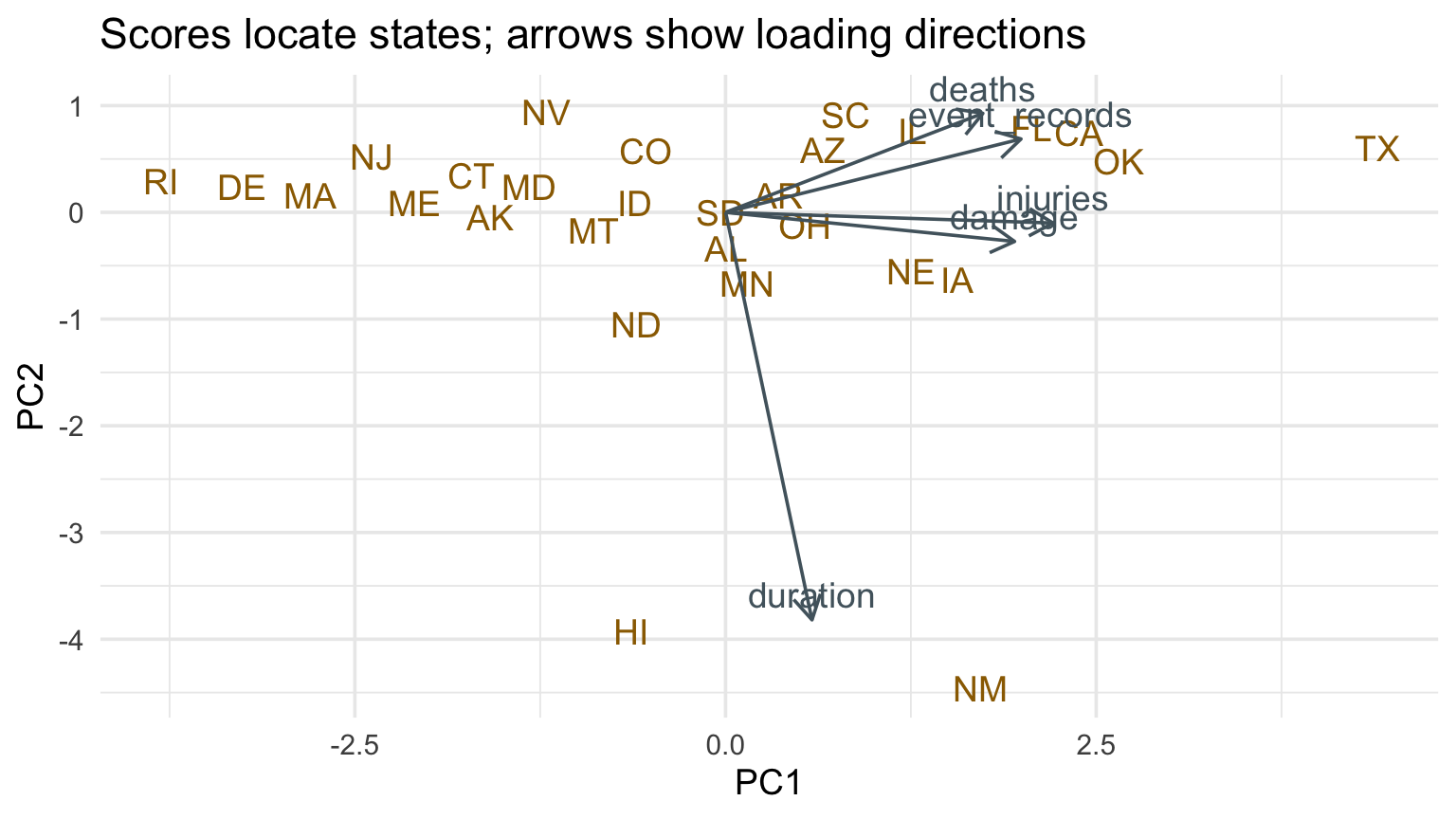
Arrows pointing together indicate variables that contribute similarly to these two components. Their displayed length depends on the biplot scaling convention.
Checkpoint 2 · Name PC1
Read the PC1 loadings. Propose a plain-language name for the component, then list one reason your name is incomplete or potentially misleading.
NOAA state profiles: PC1 and PC2
Code
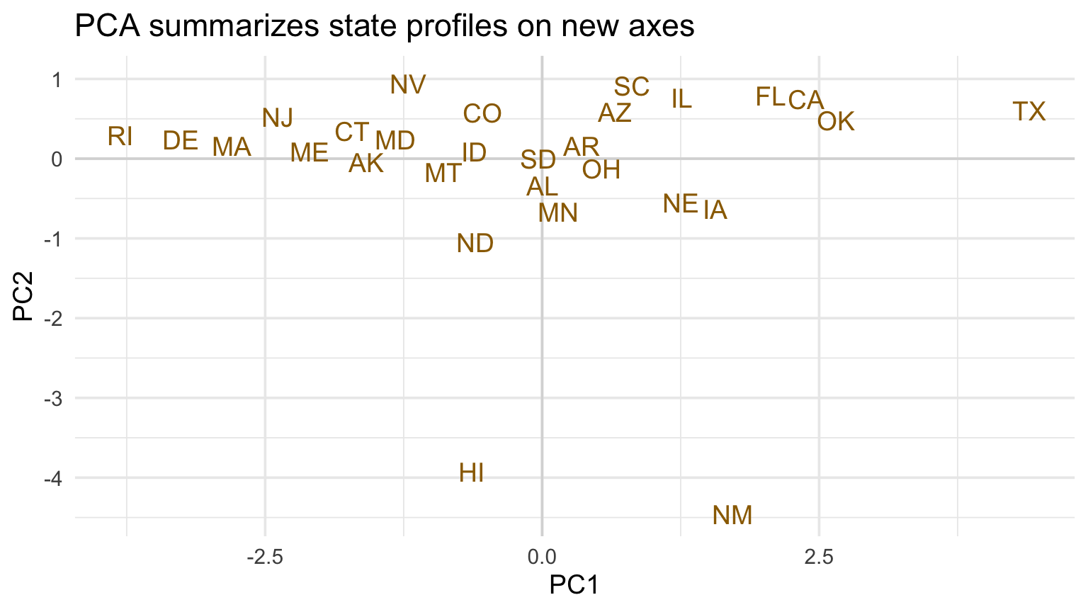
scores <-as_tibble(pca$x[, 1:2]) |>mutate(state = metrics$state)ggplot(scores, aes(PC1, PC2, label = state)) +geom_hline(yintercept =0, color ="gray85") +geom_vline(xintercept =0, color ="gray85") +geom_text(color = deep_gold, check_overlap =TRUE) +labs(title ="PCA summarizes state profiles on new axes")
How many principal components should we use?
Code
variance <- pca$sdev^2/sum(pca$sdev^2)tibble(component =seq_along(variance), variance) |>ggplot(aes(component, variance)) +geom_col(fill = gold) +geom_line() +geom_point() +scale_y_continuous(labels = percent) +labs(title ="A scree plot makes information loss visible", x ="Principal component", y ="Variance explained")
Create a scree plot (aka “elbow plot”) to choose
Code
tibble(component =seq_along(variance), cumulative =cumsum(variance)) |>ggplot(aes(component, cumulative)) +geom_line(color = deep_gold, linewidth =1) +geom_point(color = deep_gold, size =3) +geom_hline(yintercept =0.8, linetype =2, color = blue_gray) +scale_y_continuous(labels = percent, limits =c(0, 1)) +labs(title ="Retaining components trades simplicity for information", x ="Number of components", y ="Cumulative variance explained")
This connection makes PCA computationally stable and links it to many other matrix methods.
Checkpoint 3 · Keep how many?
Using the scree plot, choose how many components you would retain for exploration. Report the cumulative variance and one important reason variance explained is not the only criterion.
Recap and next steps
Distance encodes a definition of similarity.
MDS preserves pairwise distances; its axes are usually not interpreted directly.
PCA preserves variance along linear directions.
Loadings, scores, and information loss must be read together.
Next: nonlinear embeddings and the transition to time.