# A tibble: 6 × 6
  state_upper event_records log_injuries log_deaths log_damage mean_duration
  <chr>               <int>        <dbl>      <dbl>      <dbl>         <dbl>
1 AL                   1273         3.43       1.79       16.7          52.3
2 AK                    319         1.61       1.10       16.2          25.2
3 AZ                    688         2.40       5.59       17.5          33.8
4 AR                   1246         3.09       2.40       18.6          30.0
5 CA                   2588         4.82       4.38       18.8          27.0
6 CO                   1896         1.95       2.08       15.4          16.7
Meaningful plots begin with meaningful rows: each row should represent the thing we want to compare.
What are we comparing?
The table mixes:
volume: number of event records,
human impact: injuries and deaths,
monetary impact: reported property damage,
duration: mean hours per record.
These are not interchangeable measures of “risk.”
Checkpoint 1 · What can these rows support?
An emergency-management client asks, “Which states have the greatest storm risk for residents?” Our table contains state totals rather than rates.
What can the current rows tell the client?
Why might a large or highly exposed state rank high even when an individual resident’s risk is modest?
What additional variable would let us calculate a rate per resident?
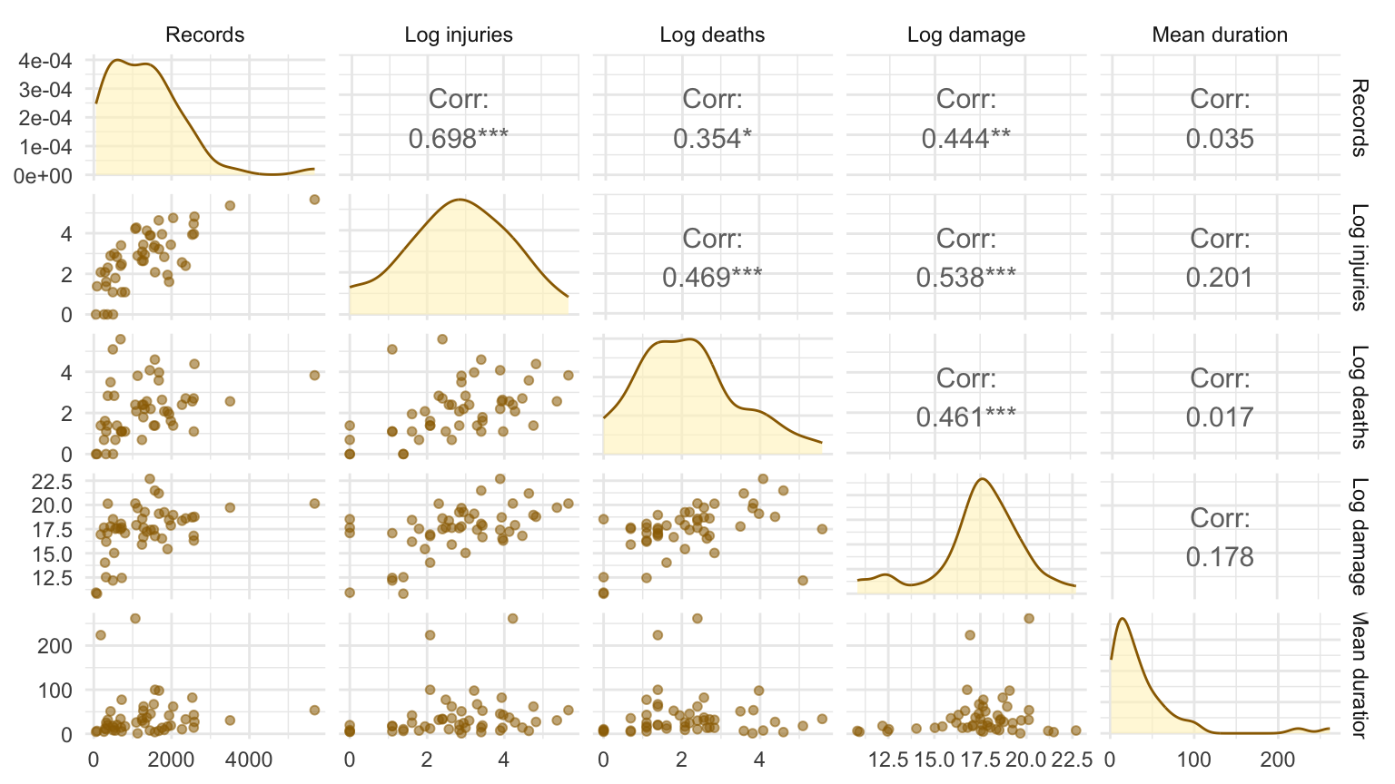
Create pairs plots with GGally
With \(p\) variables, a full pairs plot has \(p^2\) panels.
Pairs plots are useful for:
scanning for strong relationships,
seeing nonlinear patterns,
spotting outliers.
Use the matrix to find relationships worth following up. For a client, usually replace it with one focused graphic and keep the full matrix in the working analysis or appendix.
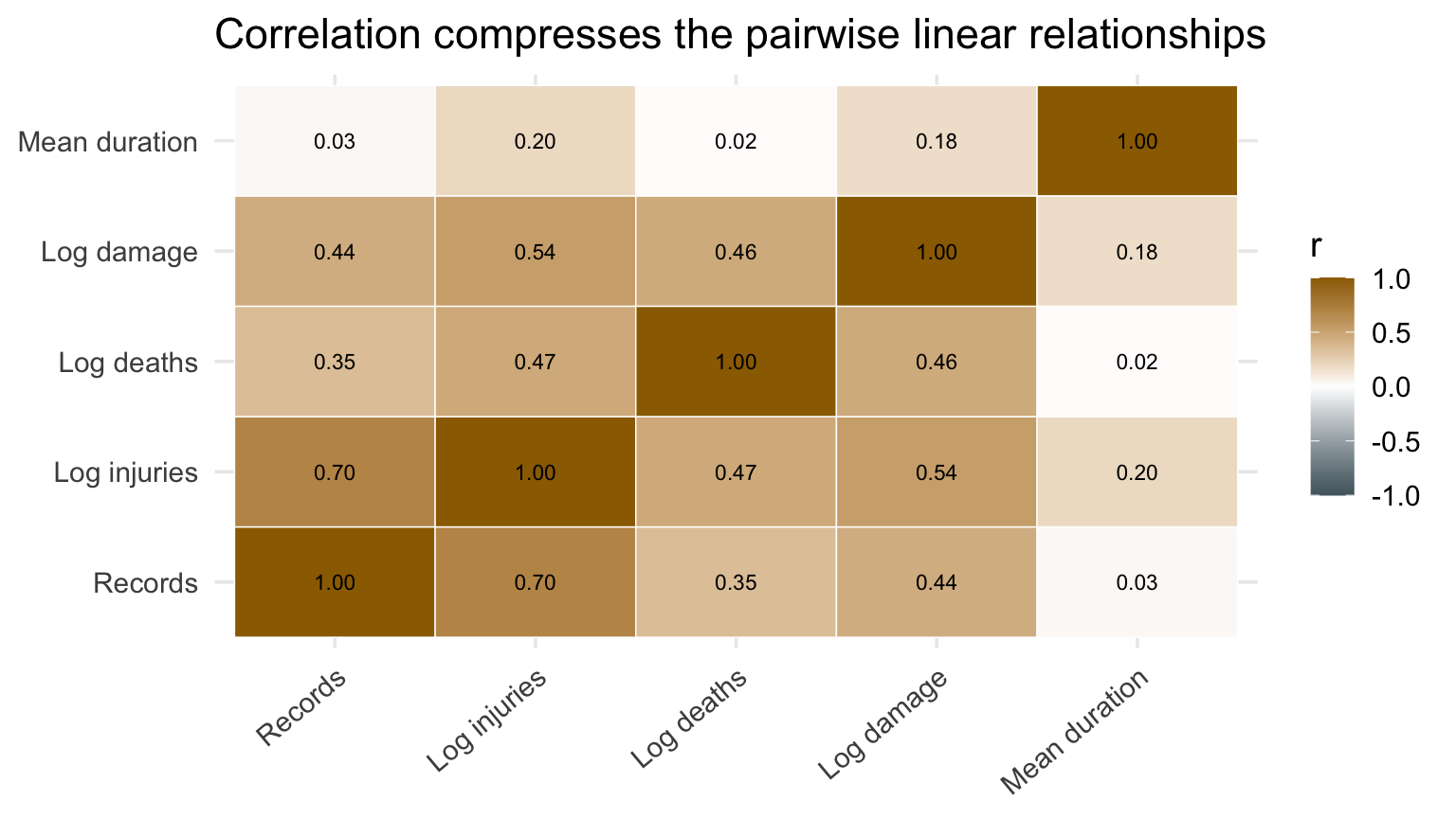
Correlation summarizes linear association. It can miss curvature and can be dominated by one unusual state.
Correlogram to visualize a correlation matrix
Code
cor_long <-as.data.frame(as.table(cor_mat)) |>mutate(across(c(Var1, Var2),~factor(as.character(.x),levels =names(metric_labels),labels =unname(metric_labels) ) ) )cor_long |>ggplot(aes(Var1, Var2, fill = Freq)) +geom_tile(color ="white") +geom_text(aes(label =sprintf("%.2f", Freq)), size =3) +scale_fill_gradient2(low = blue_gray, mid ="white", high = deep_gold, limits =c(-1, 1)) +labs(title ="Correlation compresses the pairwise linear relationships",x =NULL, y =NULL, fill ="r" ) +theme(axis.text.x =element_text(angle =40, hjust =1))
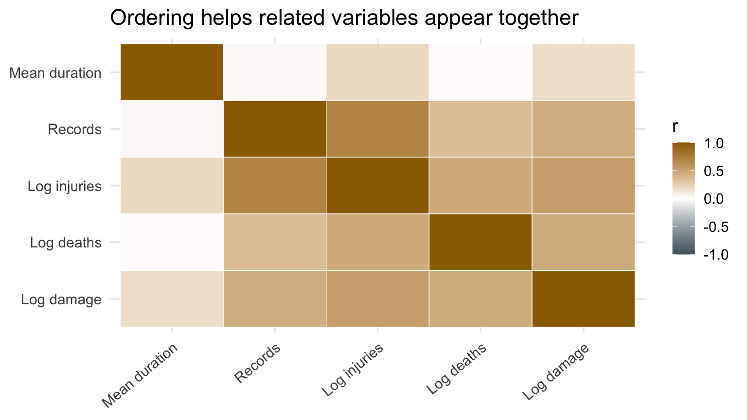
Reorder variables based on correlation
Code
correlation_distance <-as.dist(1-abs(cor_mat))clustered_variables <-hclust(correlation_distance)variable_order <- clustered_variables$labels[clustered_variables$order]ordered_labels <-unname(metric_labels[variable_order])cor_long |>mutate(Var1 =factor(as.character(Var1), levels = ordered_labels),Var2 =factor(as.character(Var2), levels =rev(ordered_labels)) ) |>ggplot(aes(Var1, Var2, fill = Freq)) +geom_tile(color ="white") +scale_fill_gradient2(low = blue_gray, mid ="white", high = deep_gold, limits =c(-1, 1)) +labs(title ="Ordering helps related variables appear together", x =NULL, y =NULL, fill ="r") +theme(axis.text.x =element_text(angle =40, hjust =1))
Checkpoint 2 · Why are the correlations positive?
Nearly every correlation among our state-level metrics is positive. Why does aggregating injuries, deaths, damage, and event records by state tend to produce this pattern? Would you necessarily expect the same result from rates per resident or severity per event?
Answer: States with more recorded storms have more opportunities to accumulate every type of total. That shared exposure pushes the correlations upward. Rates remove some of the exposure effect and may show weaker or negative relationships. Count variables can also be negatively correlated when categories compete or must add to a fixed total.
Heatmap displays of observations
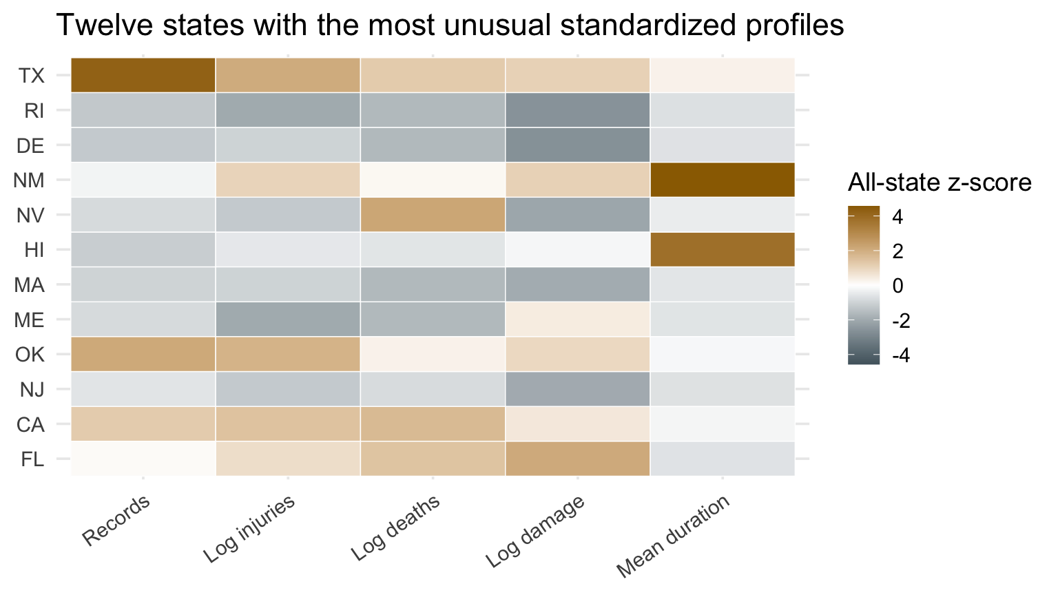
Variables measured in dollars, counts, and hours cannot share a color scale directly.
Standardizing converts each column across all 50 states to:
\[z = \frac{x - \bar{x}}{s}\]
Now color means low or high relative to that variable’s distribution across states. To show both kinds of departure, we will display the states whose profiles differ most from zero across the five metrics.
Manual version of heatmaps
Code
standardized_profiles <- metrics |>mutate(across(-state_upper, ~as.numeric(scale(.x)))) |>rowwise() |>mutate(profile_score =mean(abs(c_across(all_of(names(metric_labels))))) ) |>ungroup()selected_states <- standardized_profiles |>slice_max(profile_score, n =12, with_ties =FALSE) |>arrange(profile_score) |>pull(state_upper)selected_long <- standardized_profiles |>filter(state_upper %in% selected_states) |>select(-profile_score) |>pivot_longer(-state_upper, names_to ="metric", values_to ="z") |>mutate(state_upper =factor(state_upper, levels = selected_states),metric =factor( metric,levels =names(metrics)[-1],labels =unname(metric_labels) ) )z_limit <-max(abs(selected_long$z))selected_long |>ggplot(aes(metric, state_upper, fill = z)) +geom_tile(color ="white") +scale_fill_gradient2(low = blue_gray, mid ="white", high = deep_gold,midpoint =0, limits =c(-z_limit, z_limit),breaks =c(-4, -2, 0, 2, 4) ) +labs(title ="Twelve states with the most unusual standardized profiles",x =NULL, y =NULL, fill ="All-state z-score" ) +theme(axis.text.x =element_text(angle =35, hjust =1))
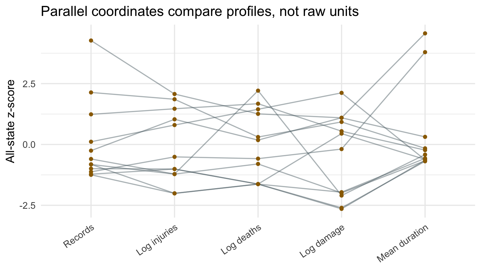
Parallel coordinates plots
A parallel-coordinates plot draws one line per observation across standardized variables.
Useful for:
inspecting profiles,
highlighting a few cases,
seeing tradeoffs across variables.
With many lines, it becomes spaghetti.
Manual parallel-coordinates display
Code
parallel_data <- selected_longparallel_data |>ggplot(aes(metric, z, group = state_upper)) +geom_line(alpha =0.45, color = blue_gray) +geom_point(size =1.5, color = deep_gold) +labs(title ="Parallel coordinates compare profiles, not raw units",x =NULL, y ="All-state z-score" ) +theme(axis.text.x =element_text(angle =35, hjust =1))
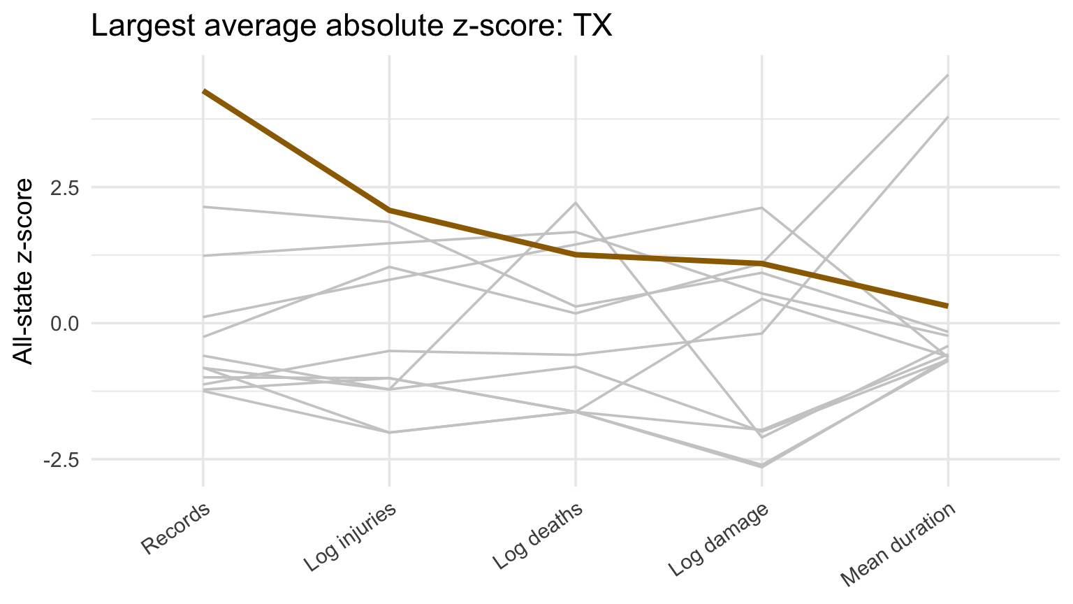
Highlight before presenting
Code
focus_state <- parallel_data |>distinct(state_upper) |>left_join( standardized_profiles |>select(state_upper, profile_score),by ="state_upper" ) |>slice_max(profile_score, n =1, with_ties =FALSE) |>pull(state_upper) |>as.character()parallel_data |>ggplot(aes(metric, z, group = state_upper)) +geom_line(color ="gray80") +geom_line(data =~filter(.x, state_upper == focus_state), color = deep_gold, linewidth =1.4) +labs(title =paste("Largest average absolute z-score:", focus_state),x =NULL, y ="All-state z-score" ) +theme(axis.text.x =element_text(angle =35, hjust =1))
Checkpoint 3 · Choose what to show
Your client asks, “Which states look unusual across several impact measures?” Choose a pairs plot, correlogram, heatmap, or parallel-coordinates plot. State what you would show in the meeting and what you would keep in the appendix.
Recap and next steps
Aggregation changes the observational unit.
High-dimensional views are usually for exploration.
Scaling is necessary but changes interpretation.
A correlation matrix should send you back to the raw pairs.
Next: distance, multidimensional scaling, and principal components.
Homework 3 is your project launch
Problem 1 begins the final project for the executive-search steering committee.
Propose three client questions that could guide a recruiting decision. (10 pts)
Plan a different plot type for each question, naming the variables, subset, units, and one limitation or sample-size check. (20 pts)
Make one of those plots, with complete labels and no claim that record counts measure employer demand. (10 pts)
Today, we will use the archive and rubric to pressure-test those choices.
What decision should the report support?
The client is considering whether and where to build a stronger Data and AI recruiting practice.
Your analysis should help the steering committee decide:
which employer should be the first recruiting target,
which roles and experience levels deserve attention,
what directional pay benchmarks are defensible, and
what evidence the client should collect next.
The goal is not a generic tour of the labor market. It is a recommendation supported by careful visual evidence.
employee_residence, company_location, company_size, remote_ratio: worker and employer setting
Each row is one compensation observation. It may not be a unique person, job posting, employer, or opening.
What the archive cannot establish
Record frequency is not employer demand. We do not know the archive’s sampling process or whether repeated records represent distinct openings.
Employer identity and row-level provenance are absent. Exact duplicates therefore require an explicit audit and sensitivity choice.
salary_in_usd is not total compensation. It is not adjusted for inflation or local cost of living.
Associations are descriptive. The archive cannot identify the causal effect of experience, remote work, location, or firm size on pay.
Before choosing a plot, ask: Can these rows actually answer my client question?
How the rubric allocates 100 points
Rubric section
Points
What the rubric looks for
Visual portfolio
48
Six honest, readable graphics with purposeful comparisons
Cohesive visual story
25
Three client questions that build to a defensible recommendation
Data scope and evidence boundaries
10
Coverage, duplicates, denominators, and limits on what the data can show
Statistical support
10
Careful interpretation of uncertainty or model evidence
Reproducibility and submission
7
A self-contained report that another analyst can check and reproduce
Seventy-three points reward the graphics and the story they build together.
Use the rubric to revise Homework 3
For each proposed client question, check:
Does the answer change a recruiting decision?
Is the proposed plot type a good match for the comparison?
Have you named the variables, subset, units, and sample-size check?
What limitation must appear beside the visual?
If this became one of your six scored graphics, what would make it client-ready?
Your report ultimately needs 6–10 graphics, including at least three foundational forms, three advanced or later-course forms, and one statistical or uncertainty component. Only the written HTML report and its reproducibility materials count toward the 36-613 grade.