2D Quantitative Data

Lecture 5

Shannon Gallagher

September 9, 2026

Logistics and final-project reminders

Due dates and feedback

  • Checkpoint: tonight, Wednesday, September 9, at 11:59 p.m. ET
  • HW 3: Tuesday, September 15, at 11:59 p.m. ET
  • HW 1 grades: expected in Gradescope by the end of Friday, September 11

Final project

  • Your teammate assignment should now be available.
  • Keep the two rubrics separate: Data Visualization assesses the written report; Professional Skills assesses the companion presentation.
  • Optional inspiration: NOAA Shiny demo. Shiny can help communicate an idea, but it is not required and we will not cover it explicitly.

Reminders, previously, and today…

  • make scatterplots that reveal rather than conceal,
  • use linear and smooth trend lines carefully,
  • read residual plots as diagnostic graphics,
  • replace overplotted points with bins or contours.

2D quantitative data

For hail reports with positive damage:

How does the distribution of reported property damage change with reported maximum hailstone diameter?

  • A marginal distribution describes one variable by itself: all hailstone diameters, or all positive damage reports.
  • A conditional distribution describes damage among reports at a given diameter: \(Y\mid X=x\).
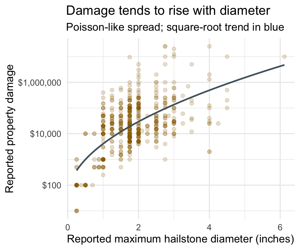
  • The scatterplot shows the joint distribution; a regression will summarize one feature of the conditional distribution, \(E(Y\mid X=x)\).

Making scatterplots with geom_point()

Code
hail |>
  ggplot(aes(diameter, prop_usd)) +
  geom_point(
    alpha = 0.2,
    color = deep_gold
  ) +
  geom_smooth(
    method = "lm",
    formula = y ~ sqrt(x),
    se = FALSE,
    color = blue_gray
  ) +
  scale_y_log10(labels = label_dollar())

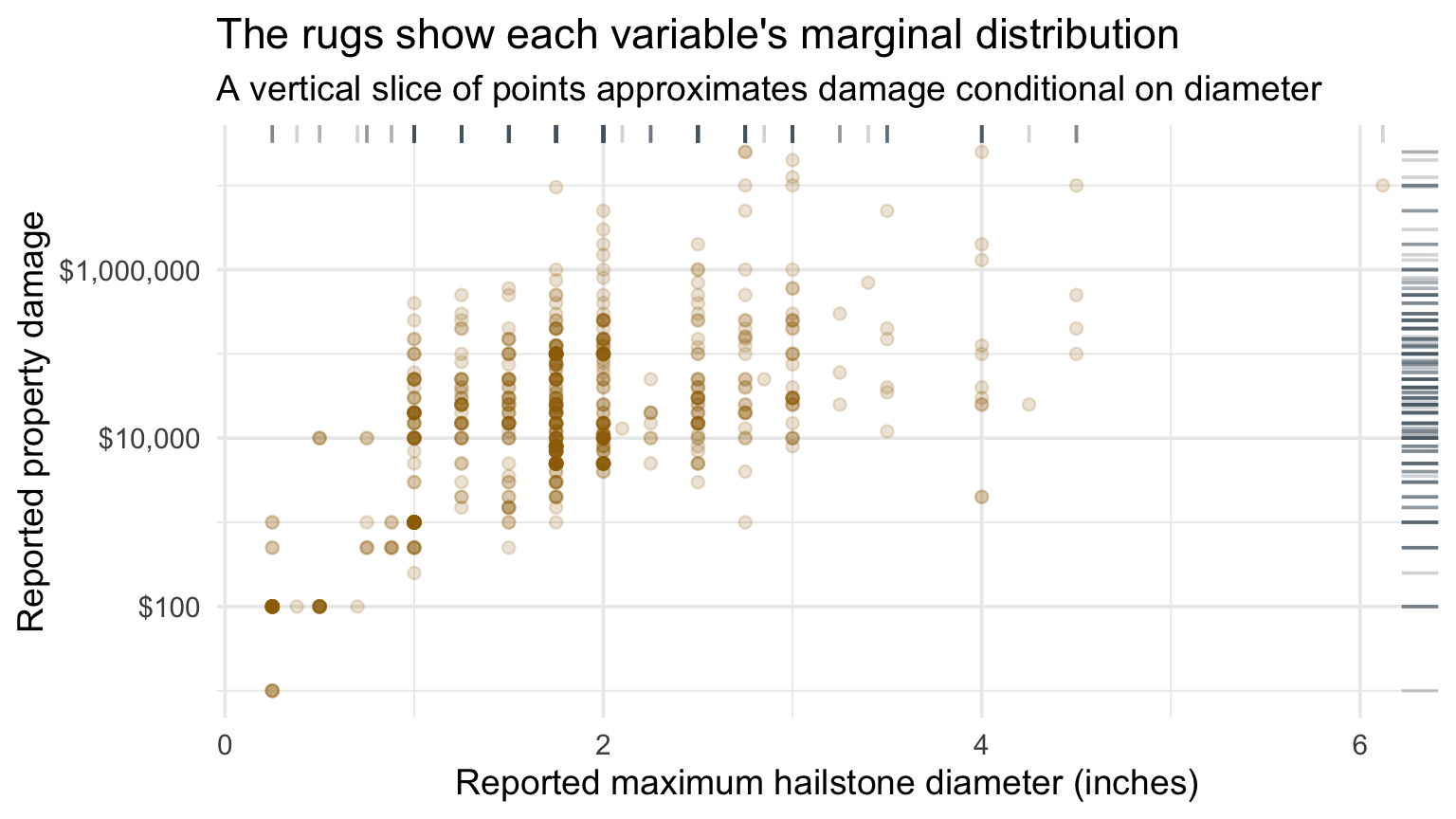
Scatterplot of maximum hailstone diameter and positive property damage, with a square-root trend.

Rugs connect the joint and marginal distributions

Scatterplot of hailstone diameter and positive property damage with rugs along the top and right margins.
  • Top rug: the marginal distribution of reported diameter, \(X\).
  • Right rug: the marginal distribution of positive damage, \(Y\).
  • Vertical point cloud at \(x\): the conditional distribution, \(Y\mid X=x\).

Checkpoint 1 · Audit the scatterplot

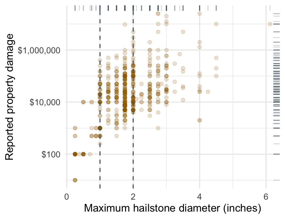
Scatterplot of hailstone diameter and positive property damage with one-inch and two-inch vertical slices highlighted.

Work in three steps:

  1. Use the rugs to describe each marginal distribution.
  2. Compare the conditional damage distributions near 1 inch and 2 inches.
  3. Identify one design choice that reveals structure, one that could mislead, and one omitted variable that could explain the vertical spread.

Displaying trend lines: linear regression

Measurement note: NOAA’s hail magnitude is the reported maximum hailstone diameter in inches—not radius or accumulation. (NOAA recording guidance)

Code
hail |>
  ggplot(aes(diameter, log10(prop_usd))) +
  geom_point(
    alpha = 0.15,
    color = blue_gray
  ) +
  geom_smooth(
    method = "lm",
    se = TRUE,
    color = deep_gold
  )

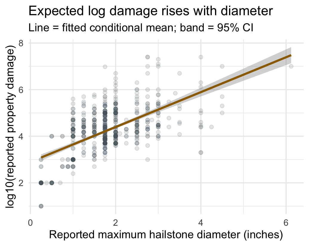
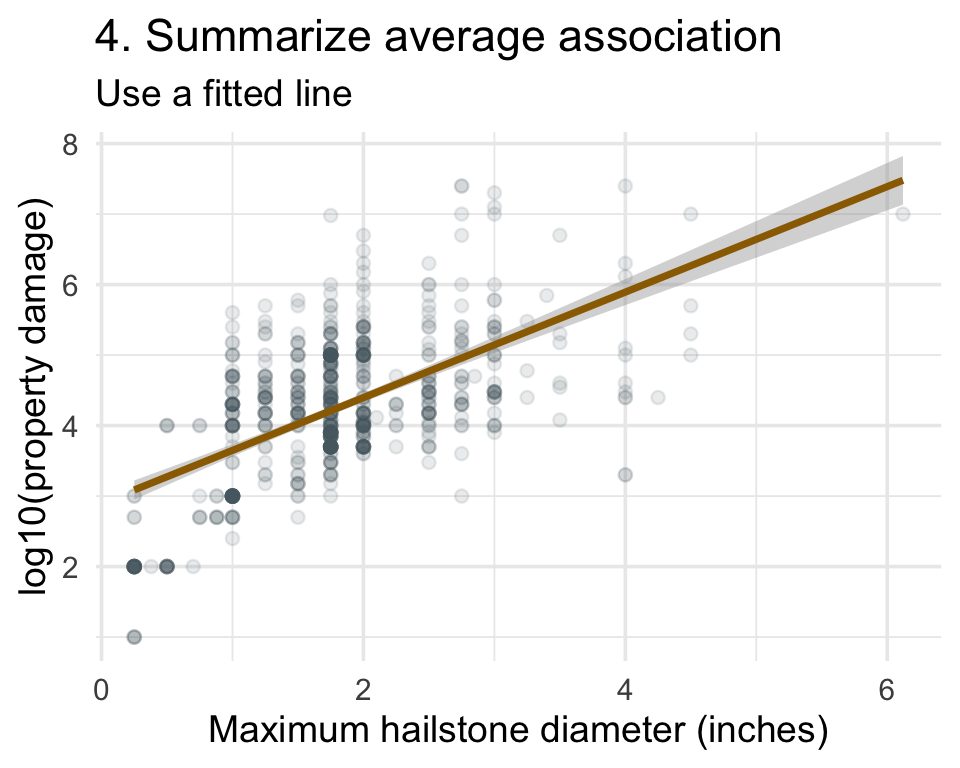
Scatterplot of maximum hailstone diameter and log property damage with a fitted regression line.

Assessing assumptions of linear regression

For outcome \(Y\) and predictor \(X\):

\[ E(Y\mid X=x)=\beta_0+\beta_1x. \]

  • Here, \(Y\) is log property damage and \(X\) is reported maximum hailstone diameter.
  • \(\beta_1\) is the expected change in log damage for a one-inch difference in diameter. It describes association, not causation. See your Linear Models course for the estimation and inferential details.

Interpreting the slope on two scales

Modeled scale: log10 dollars

For reports whose maximum hailstone diameter differs by one inch, we estimate expected log10(property damage) to be 0.748 higher (SE 0.040; 95% CI 0.670–0.827).

Original scale: dollars

Under the regression model, expected property damage is 5.60 times as large (approx. SE 0.52; 95% CI 4.68–6.71).

What the regression model assumes

For \(Y_i=\beta_0+\beta_1X_i+\epsilon_i\), we assume:

  • \(E(\epsilon_i\mid X_i)=0\): errors have conditional mean zero,
  • errors are independent across observations,
  • homoskedasticity: \(Var(\epsilon_i\mid X_i)=\sigma^2\),
  • approximately normal residuals for the usual small-sample inference,
  • a constant error distribution for retransformation to expected dollars.

See your Linear Models course for formal diagnostics and the consequences of each assumption.

Residual vs fit plots

Code
tibble(fitted = fitted(hail_model), residual = resid(hail_model)) |>
  ggplot(aes(fitted, residual)) +
  geom_hline(yintercept = 0, color = "gray60") +
  geom_point(alpha = 0.2, color = deep_gold) +
  geom_smooth(method = "loess", se = FALSE, color = blue_gray) +
  labs(
    title = "Residual structure tests the adequacy of the line",
    x = "Fitted value",
    y = "Residual"
  )
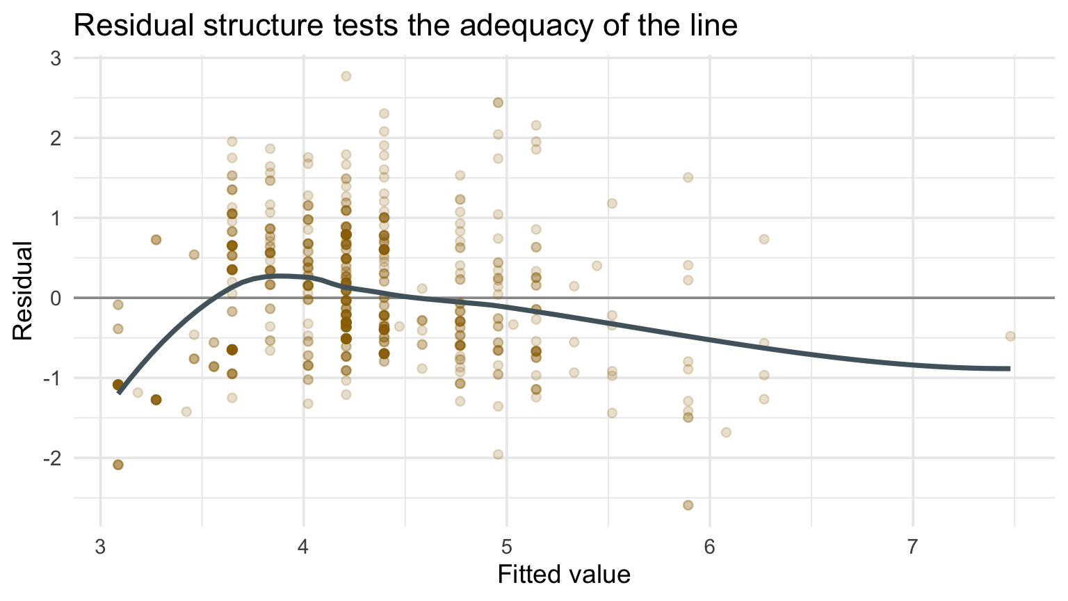
Residual versus fitted plot for a linear regression of log damage on maximum hailstone diameter.

A useful residual plot looks uneventful

Look for:

  • curvature, suggesting the mean function is wrong;
  • a funnel, suggesting nonconstant spread;
  • clusters, suggesting omitted groups;
  • isolated points with unusual residuals;
  • changing patterns across the fitted range.

Ask: Are the linear-model assumptions plausible? An uneventful plot supports plausibility; strong structure is evidence against the model.

Locally weighted smoothing with LOESS

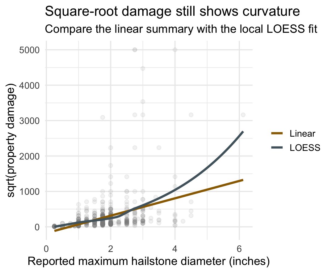
geom_smooth(method = "lm") answers: what linear trend summarizes the data?

geom_smooth(method = "loess") answers: what flexible local pattern appears?

R’s loess() really does use the unusual tricubic distance weight. At each target value \(x_0\), the default fit uses the nearest 75% of observations and weights observation \(i\) by

\[ w_i(x_0)=\left[1-\left(\frac{d_i}{d_{\max}}\right)^3\right]^3. \]

It then fits a weighted local polynomial—degree 2 by default. A degree-1 fit is local linear regression. (R loess() documentation)

Displaying trend lines: LOESS

Code
hail |>
  ggplot(aes(
    diameter,
    sqrt(prop_usd)
  )) +
  geom_point(
    alpha = 0.1,
    color = "gray55"
  ) +
  geom_smooth(
    aes(color = "Linear"),
    method = "lm", se = FALSE
  ) +
  geom_smooth(
    aes(color = "LOESS"),
    method = "loess", se = FALSE
  )

Maximum hailstone diameter and square-root property damage with linear and LOESS trend lines.

Comparing linear and curved models

m_linear <- lm(sqrt(prop_usd) ~ diameter, data = hail)
m_quadratic <- lm(sqrt(prop_usd) ~ poly(diameter, 2), data = hail)

anova(m_linear, m_quadratic)  # nested-model test
AIC(m_linear, m_quadratic)    # fit with a complexity penalty
BIC(m_linear, m_quadratic)    # stronger complexity penalty
  • ANOVA asks whether the added polynomial term improves a nested model.
  • AIC/BIC trade goodness of fit against complexity; lower is preferred.
  • Residual plots reveal where a candidate still misses structure.

These are complementary evidence, not automatic decision rules.

Checkpoint 2 · Line or smoother?

Use the preceding trend and residual plots:

  1. Is a straight-line mean relationship plausible?
  2. Would the curved model add an important feature or mostly complexity?
  3. Defend your choice with one visual diagnostic and one comparison tool: ANOVA, AIC, or BIC.

What about focusing on the joint distribution?

With thousands of observations, a scatterplot can become cluttered, and individual points can distract from where the data concentrate.

Alternatives:

  • two-dimensional bins,
  • hexagonal bins,
  • density contours,
  • small multiples,
  • a representative sample plus a summary.

Visualizing grid heat maps

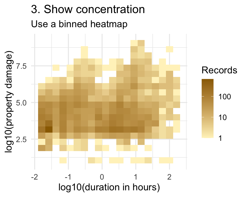
bins = 20 requests about 20 intervals in each direction—up to roughly \(20\times20\) rectangular cells, not 20 cells total.

Code
duration_damage |>
  ggplot(aes(
    log10(duration_hours),
    log10(prop_usd)
  )) +
  geom_bin_2d(bins = 20) +
  scale_fill_gradient(
    low = pale_gold,
    high = deep_gold,
    trans = "log10"
  )

Two-dimensional binned heatmap of event duration and positive property damage.

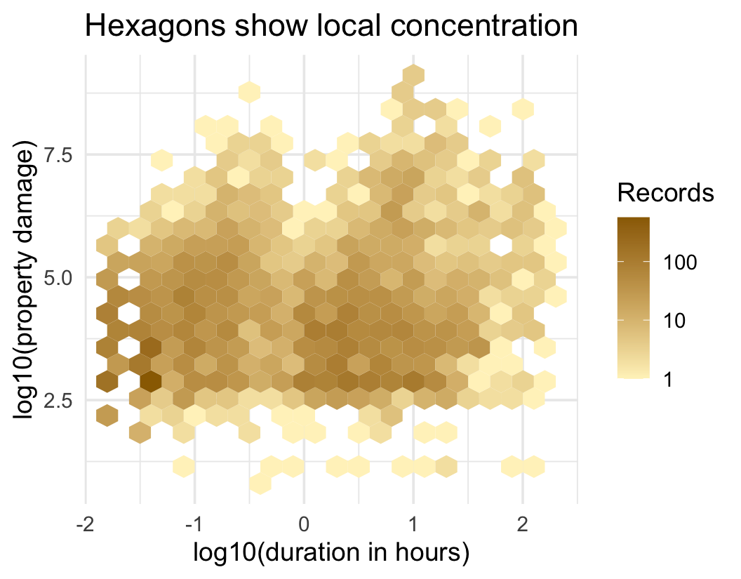
Alternative idea: hexagonal binning

Here, bins = 20 similarly controls the number of hexagons across each direction, not the total number of hexagons drawn.

Code
duration_damage |>
  ggplot(aes(
    log10(duration_hours),
    log10(prop_usd)
  )) +
  geom_hex(bins = 20) +
  scale_fill_gradient(
    low = pale_gold,
    high = deep_gold,
    trans = "log10"
  )

Hexagonal binned plot of duration and positive property damage.

Going from 1D to 2D density estimation

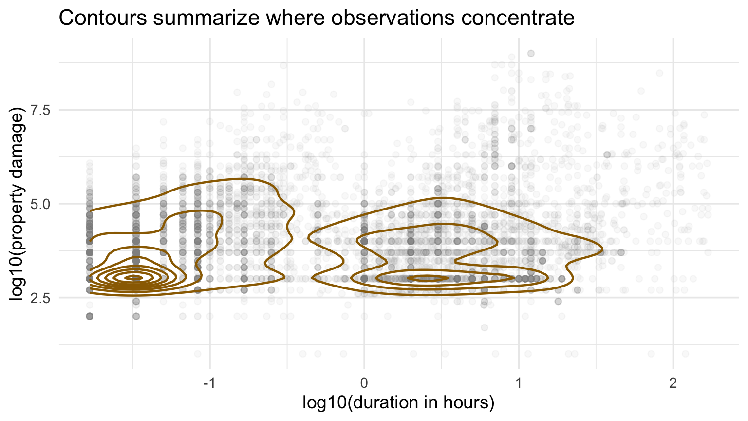
A two-dimensional kernel density estimate places a smooth surface over the plane. A contour line connects locations with the same estimated density, much as a topographic line connects locations with the same elevation.

With one shared bandwidth \(h\), a simplified estimator is
\[ \widehat f_h(x,y)=\frac{1}{nh^2}\sum_{i=1}^n K\!\left(\frac{x-x_i}{h},\frac{y-y_i}{h}\right). \]

The \(h^2\) appears because smoothing now occurs in two directions. Smaller \(h\) creates more local detail; larger \(h\) produces a smoother surface.

So how do we display densities for 2D data?

Code
duration_damage |>
  ggplot(aes(log10(duration_hours), log10(prop_usd))) +
  geom_point(alpha = 0.05, color = "gray55") +
  geom_density_2d(color = deep_gold, linewidth = 0.8) +
  labs(
    title = "Contours summarize where observations concentrate",
    x = "log10(duration in hours)",
    y = "log10(property damage)"
  )
Density contours over duration and positive property damage.

How to read contour plots?

A density contour connects locations with equal estimated density.

It does show:

  • high-density peaks,
  • clusters or multiple modes,
  • orientation and shape of the joint pattern,
  • steep density gradients where lines are close.

It does not show:

  • a regression line,
  • equal probability between contours,
  • causality,
  • exact counts unless levels are labeled appropriately.

Checkpoint 3 · Match graph to task

Choose scatterplot, fitted line, residual plot, or binned heatmap for each task:

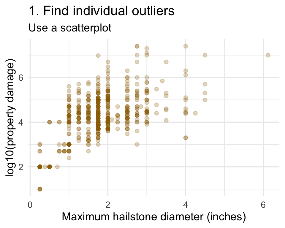
  1. find individual outliers;
  2. assess whether a line is adequate;
  3. show where thousands of points concentrate;
  4. summarize average association.

Checkpoint 3 answers · inspect individual records

Scatterplot for finding individual observations that depart from the main hail-damage pattern.

Residual-versus-fitted plot for assessing whether the fitted line is adequate.

Checkpoint 3 answers · summarize the pattern

Binned heatmap for showing where many event-duration and property-damage observations concentrate.

Scatterplot with fitted regression line for summarizing average association between hailstone diameter and log property damage.

Recap and next steps

  • Transparency and scale choices determine what a scatterplot reveals.
  • Trend lines are statistical summaries with assumptions.
  • Residuals are a visual model check.
  • Bins and contours answer density questions when points overplot.

Complete today’s checkpoint by 11:59 p.m. ET tonight, Wednesday, September 9.

Next: seeing structure across many variables.