Visualizing Quantitative Distributions

Lecture 4

Shannon Gallagher

September 2, 2026

Reminders, previously, and today…

Graded checkpoint: Due Wednesday, September 2 at 11:59 p.m. ET on Canvas.

  • see how histogram choices affect a story,
  • read an empirical cumulative distribution function,
  • understand what a density estimate smooths,
  • compare conditional distributions without hiding their shape.

Revisit histograms

The visible shape depends on:

  • bin width,
  • bin origin or boundary,
  • scale or transformation,
  • inclusion rules,
  • sample size.

Defaults are suggestions, not findings.

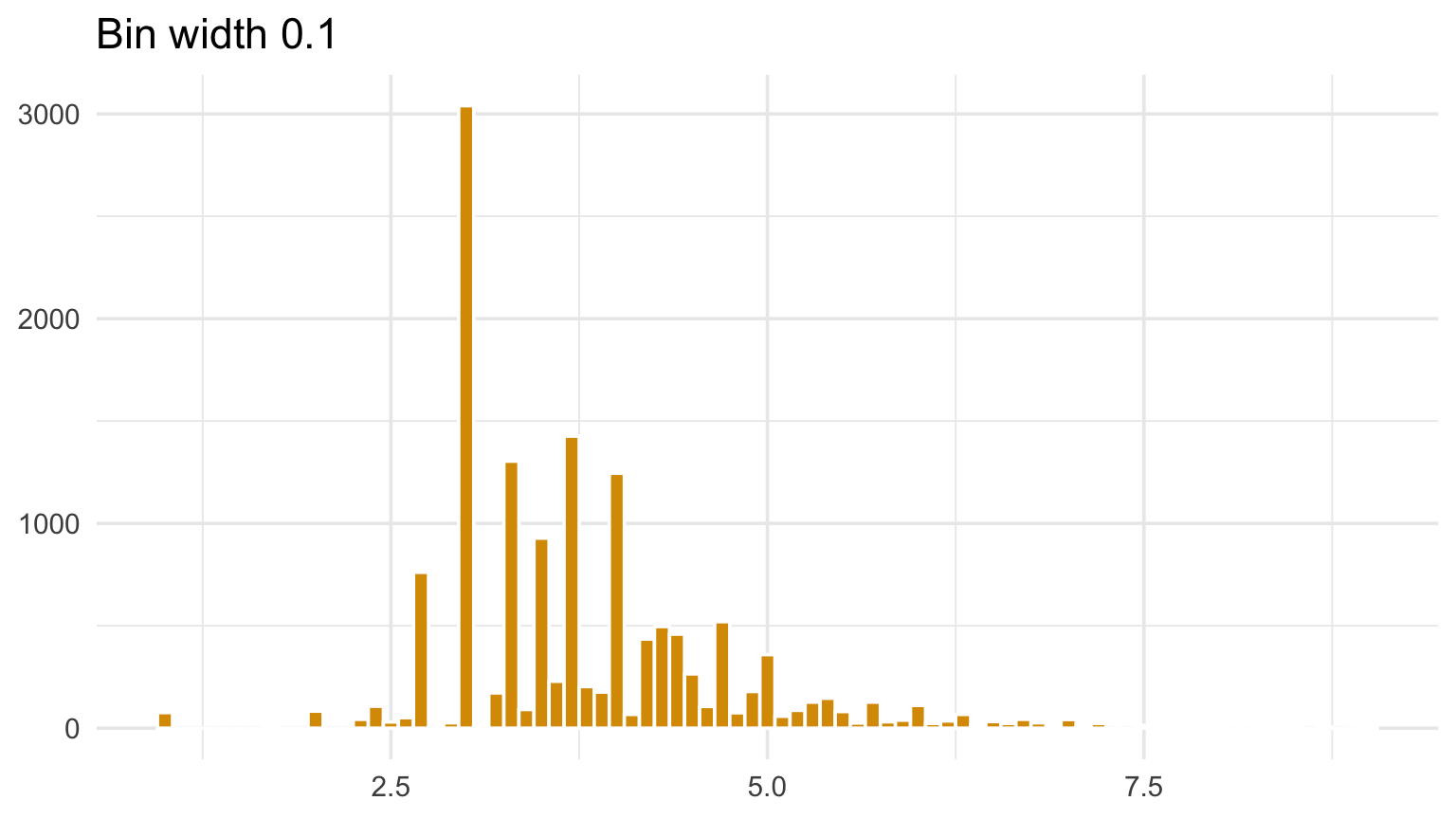
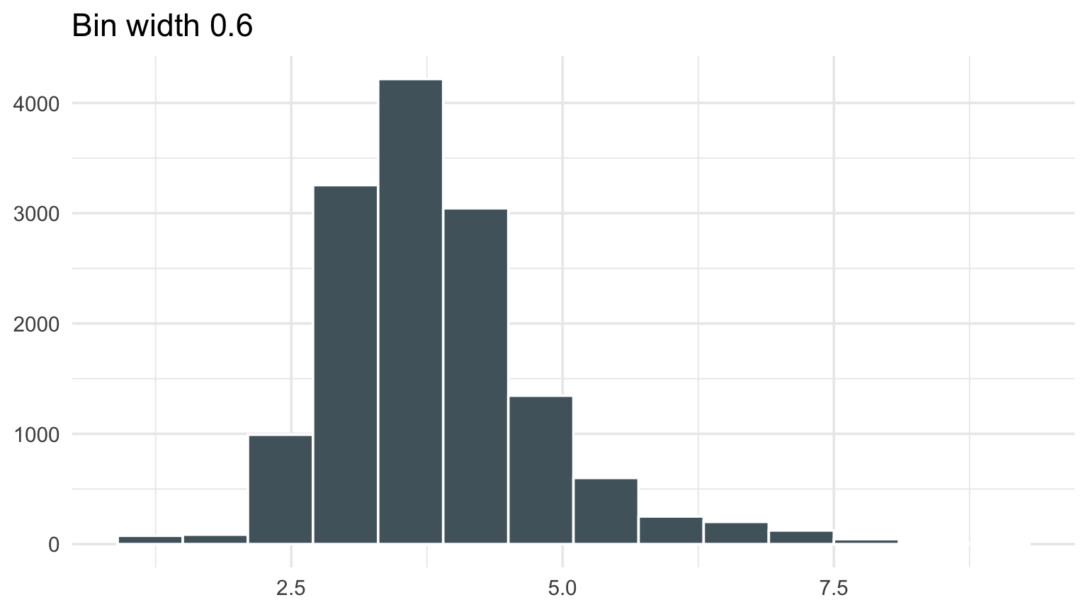
What happens as we change the bin width?

Code
p1 <- positive_damage |>
  ggplot(aes(log10(prop_usd))) +
  geom_histogram(binwidth = 0.1, fill = gold, color = "white") +
  labs(title = "Bin width 0.1", x = NULL, y = NULL)

p2 <- positive_damage |>
  ggplot(aes(log10(prop_usd))) +
  geom_histogram(binwidth = 0.6, fill = blue_gray, color = "white") +
  labs(title = "Bin width 0.6", x = NULL, y = NULL)

p1
Code
p2

What happens as we change the bin width?

Two histograms of log property damage using different bin widths.

Two histograms of log property damage using different bin widths.

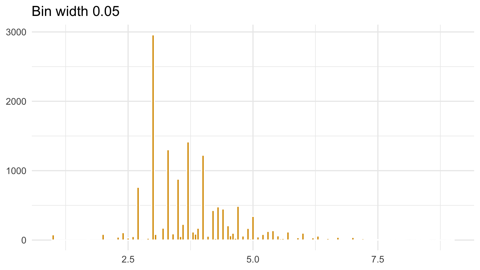
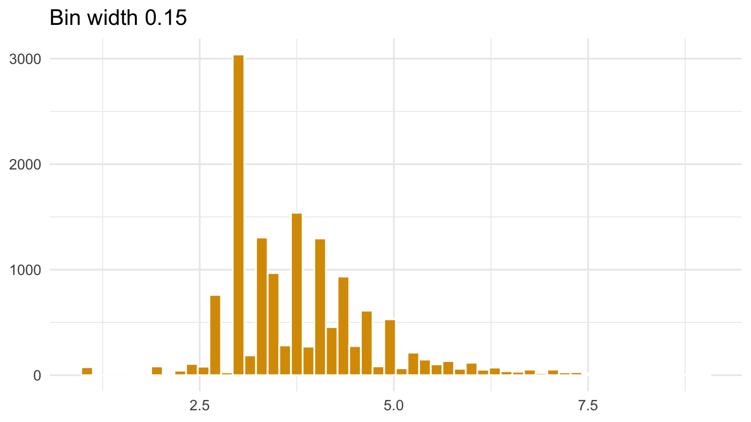
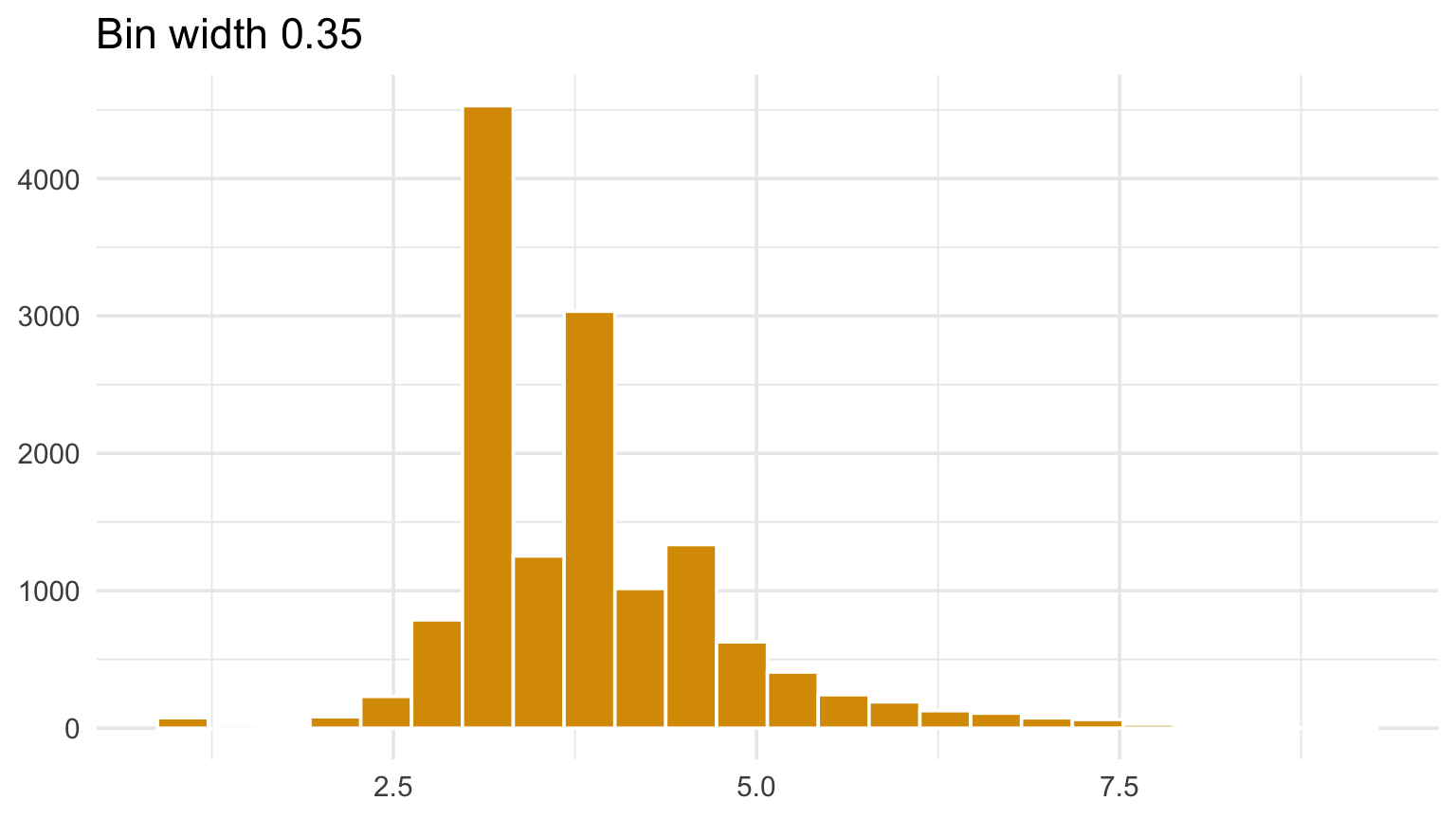
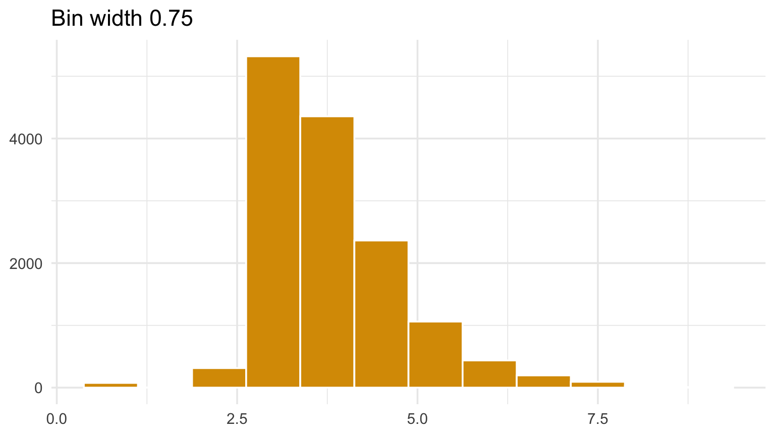
A feature should survive reasonable bin widths

Code
for (width in c(0.05, 0.15, 0.35, 0.75)) {
  print(
    positive_damage |>
      ggplot(aes(log10(prop_usd))) +
      geom_histogram(binwidth = width, fill = gold, color = "white") +
      labs(title = paste("Bin width", width), x = NULL, y = NULL)
  )
}

Stable conclusions should not depend on one convenient bin choice.

A feature should survive reasonable bin widths

Four histograms of the same NOAA damage data using different bin widths.

Four histograms of the same NOAA damage data using different bin widths.

Four histograms of the same NOAA damage data using different bin widths.

Four histograms of the same NOAA damage data using different bin widths.

Data or expertise can guide bin width

There are two useful starting points:

  • Numerical selection: use a data-driven rule or algorithm, much like bandwidth selection for a kernel density estimate.
  • Subject-matter selection: choose widths or boundaries that make meaningful differences easy to see.

On a \(\log_{10}\) scale:

  • a width of 1 compares orders of magnitude (each step is \(\times 10\)),
  • a width of 0.1 compares roughly 26% multiplicative steps (\(10^{0.1} \approx 1.26\)).

Treat any choice as a starting point, then check whether the story survives nearby widths.

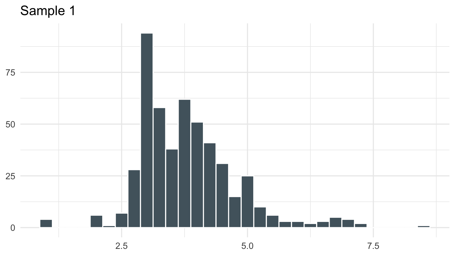
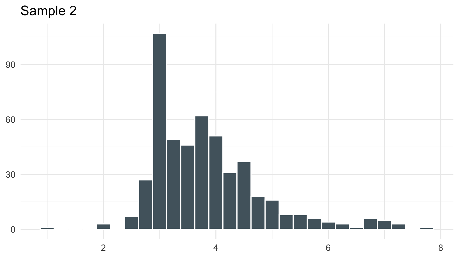
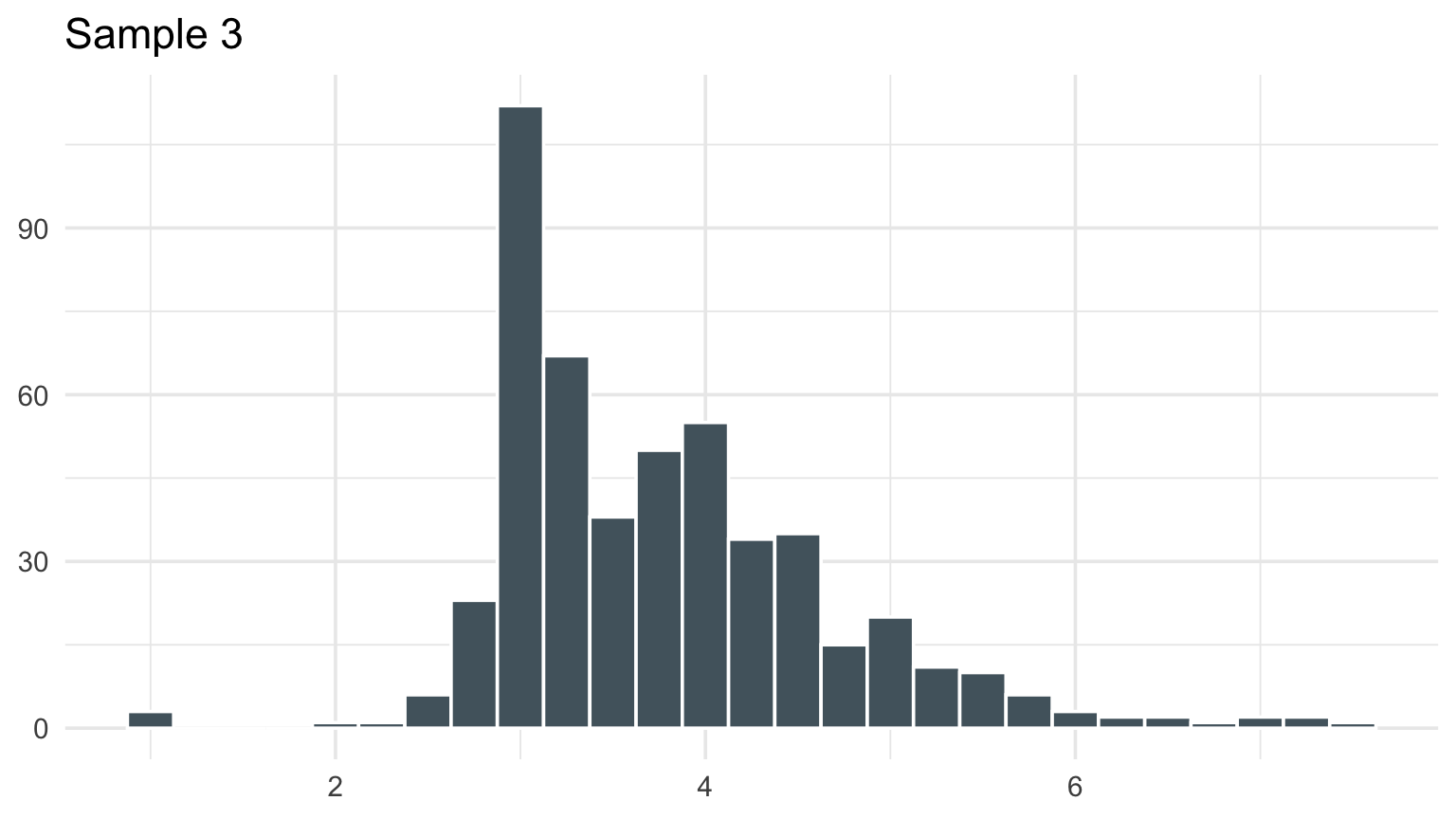
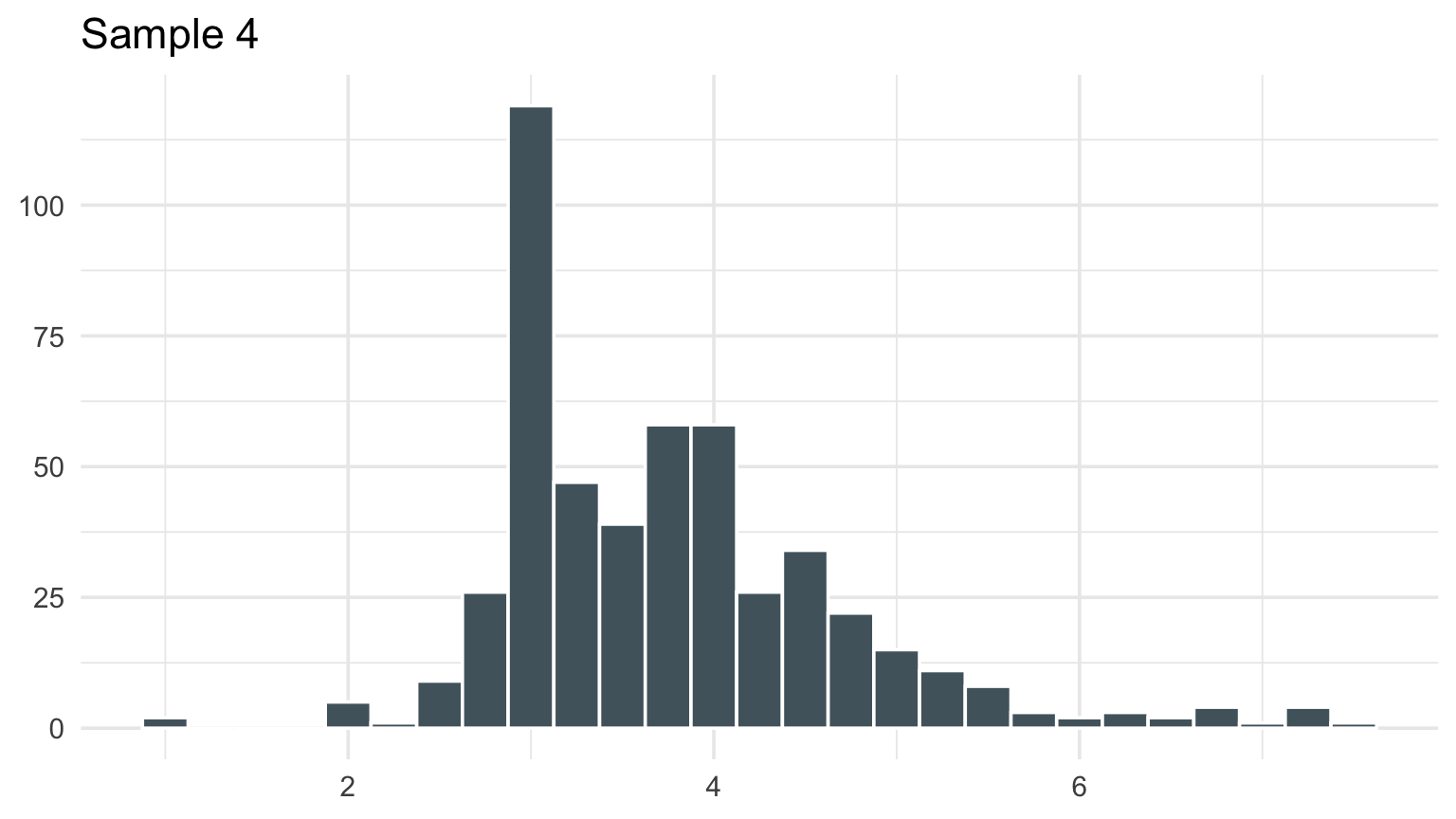
What happens with a different sample?

Code
set.seed(36613)
for (sample_id in 1:4) {
  print(
    positive_damage |>
      slice_sample(n = min(500, nrow(positive_damage))) |>
      ggplot(aes(log10(prop_usd))) +
      geom_histogram(binwidth = 0.25, fill = blue_gray, color = "white") +
      labs(title = paste("Sample", sample_id), x = NULL, y = NULL)
  )
}

Sampling variability affects the picture even when the plotting rule stays fixed.

What happens with a different sample?

Histograms from four random samples of positive NOAA damage reports.

Histograms from four random samples of positive NOAA damage reports.

Histograms from four random samples of positive NOAA damage reports.

Histograms from four random samples of positive NOAA damage reports.

Checkpoint 1 · What survives?

Compare the two histograms. List one feature that appears in both and one feature that depends on the binning. Which statement would you be willing to put in a report?

Display the full distribution with an ECDF plot

The empirical cumulative distribution function at value \(x\) is:

\[ \widehat{F}(x) = \frac{\#\{X_i \le x\}}{n} \]

Read it as: the share of observations at or below \(x\).

Build the fitted-normal reference

Code
log_damage <- log10(positive_damage$prop_usd)
normal_mean <- mean(log_damage)
normal_sd <- sd(log_damage)

normal_reference <- tibble(
  log_damage = seq(min(log_damage), max(log_damage), length.out = 400)
) |>
  mutate(
    prop_usd = 10^log_damage,
    cdf = pnorm(
      log_damage,
      mean = normal_mean,
      sd = normal_sd
    )
  )

Check both sides of each ECDF jump

Code
sorted_damage <- sort(log_damage)
n_damage <- length(sorted_damage)
fitted_normal_cdf <- pnorm(
  sorted_damage,
  mean = normal_mean,
  sd = normal_sd
)

ks_candidates <- bind_rows(
  tibble(
    log_damage = sorted_damage,
    empirical_cdf = seq_len(n_damage) / n_damage,
    fitted_cdf = fitted_normal_cdf
  ),
  tibble(
    log_damage = sorted_damage,
    empirical_cdf = (seq_len(n_damage) - 1) / n_damage,
    fitted_cdf = fitted_normal_cdf
  )
)

Keep the largest gap for annotation

Code
ks_mark <- ks_candidates |>
  mutate(gap = abs(empirical_cdf - fitted_cdf)) |>
  slice_max(gap, n = 1, with_ties = FALSE) |>
  mutate(
    prop_usd = 10^log_damage,
    label_x = prop_usd * 1.35,
    label_y = (empirical_cdf + fitted_cdf) / 2,
    label = paste0("KS gap: D = ", number(gap, accuracy = 0.001))
  ) |>
  select(prop_usd, empirical_cdf, fitted_cdf, label_x, label_y, label)

An ECDF answers threshold questions

Code
ggplot() +
  stat_ecdf(
    data = positive_damage,
    aes(prop_usd, color = "Fn: empirical"),
    geom = "step",
    linewidth = 1
  ) +
  geom_line(
    data = normal_reference,
    aes(prop_usd, cdf, color = "F0: fitted normal"),
    linewidth = 1,
    linetype = "dashed"
  ) +
  geom_segment(
    data = ks_mark,
    aes(
      x = prop_usd,
      xend = prop_usd,
      y = empirical_cdf,
      yend = fitted_cdf
    ),
    inherit.aes = FALSE,
    color = "#b31b34",
    linewidth = 1.6
  ) +
  geom_point(
    data = ks_mark,
    aes(x = prop_usd, y = empirical_cdf),
    inherit.aes = FALSE,
    color = "#b31b34",
    size = 2.7
  ) +
  geom_point(
    data = ks_mark,
    aes(x = prop_usd, y = fitted_cdf),
    inherit.aes = FALSE,
    color = "#b31b34",
    size = 2.7
  ) +
  geom_text(
    data = ks_mark,
    aes(x = label_x, y = label_y, label = label),
    inherit.aes = FALSE,
    color = "#b31b34",
    fontface = "bold",
    hjust = 0,
    size = 4.2
  ) +
  scale_x_log10(
    breaks = c(1e3, 1e6, 1e9),
    labels = c("$1K", "$1M", "$1B")
  ) +
  scale_y_continuous(labels = percent) +
  scale_color_manual(
    values = c("Fn: empirical" = deep_gold, "F0: fitted normal" = blue_gray),
    breaks = c("Fn: empirical", "F0: fitted normal")
  ) +
  labs(
    title = "The largest fitted-normal gap occurs at $5,000",
    subtitle = "Normal fit to log10(property damage) using the sample mean and SD",
    x = "Reported property damage",
    y = "Share at or below amount",
    color = NULL
  )
An ECDF answers threshold questions

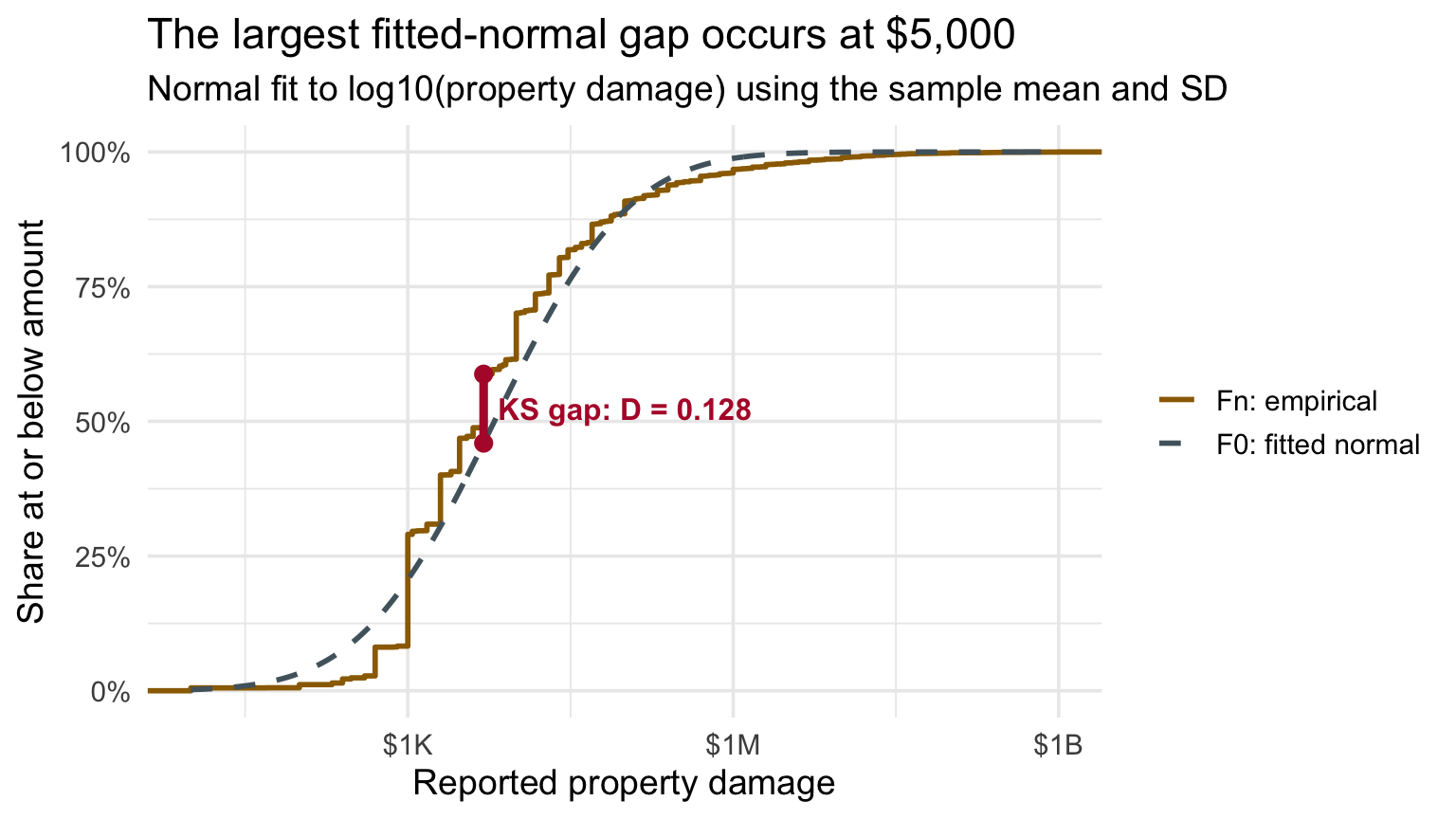
Empirical CDF of positive property damage and a fitted normal CDF on a logarithmic dollar axis. A red vertical segment at 5,000 dollars marks the maximum gap, the Kolmogorov-Smirnov statistic D equals 0.128.

One-Sample Kolmogorov–Smirnov Test

The one-sample KS statistic is the largest vertical gap between the empirical and reference cumulative distributions:

\[ D_n = \sup_x |F_n(x)-F_0(x)|. \]

  • \(F_n\): the empirical CDF from the observed sample.
  • \(F_0\): a fixed reference CDF, or one informed by independent data.

Ideally, \(F_0\) is specified in advance or estimated independently of the data behind \(F_n\). If the same data inform both curves—as they do here—treat the KS comparison as an approximation.

Boxplots compress aggressively

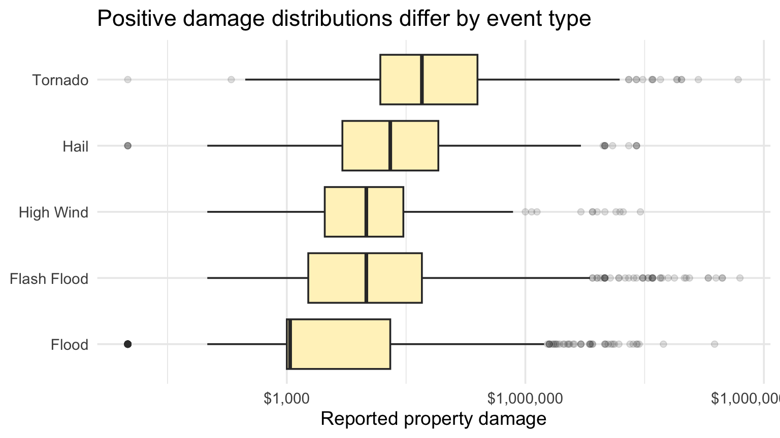
A boxplot shows median, quartiles, and a conventional outlier rule.

It does not show:

  • multimodality,
  • gaps,
  • detailed tail behavior,
  • every observation.

Use it for compact comparison, not as a complete distribution.

Boxplots enable compact comparisons

Code
compare_types <- positive_damage |>
  filter(event_type %in% c("Tornado", "Flash Flood", "Hail", "High Wind", "Flood"))

compare_types |>
  ggplot(aes(prop_usd, fct_reorder(event_type, prop_usd, median))) +
  geom_boxplot(fill = pale_gold, outlier.alpha = 0.15) +
  scale_x_log10(labels = label_dollar()) +
  labs(
    title = "Positive damage distributions differ by event type",
    x = "Reported property damage",
    y = NULL
  )

Boxplots enable compact comparisons

Boxplots of positive damage for five event types on a log scale.

Faceted histograms preserve each group’s shape

Code
compare_types |>
  ggplot(aes(log10(prop_usd))) +
  geom_histogram(binwidth = 0.3, fill = gold, color = "white") +
  facet_wrap(~ event_type, ncol = 2, scales = "free_y") +
  labs(title = "Small multiples separate shape from overlap", x = "log10(property damage)", y = "Reports")

Faceted histograms preserve each group’s shape

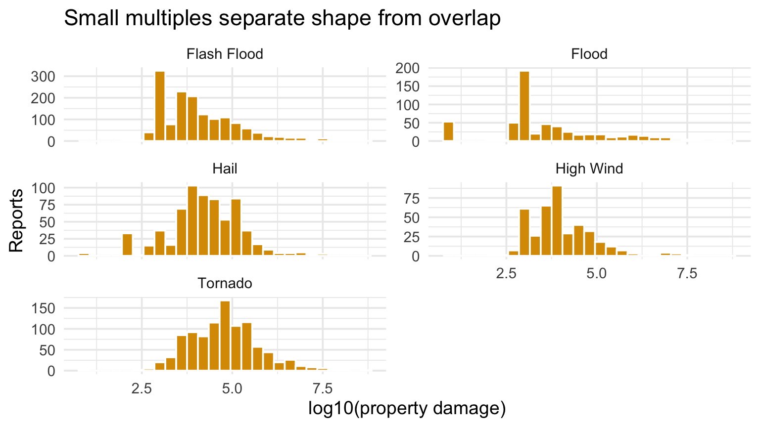
Faceted histograms of log damage for five NOAA event types.

Density curves estimate the PDF

Code
compare_types |>
  ggplot(aes(log10(prop_usd), color = event_type)) +
  geom_density(linewidth = 1) +
  labs(
    title = "Each KDE estimates a PDF with total area one",
    x = "log10(property damage)",
    y = "Estimated density",
    color = "Event type"
  )

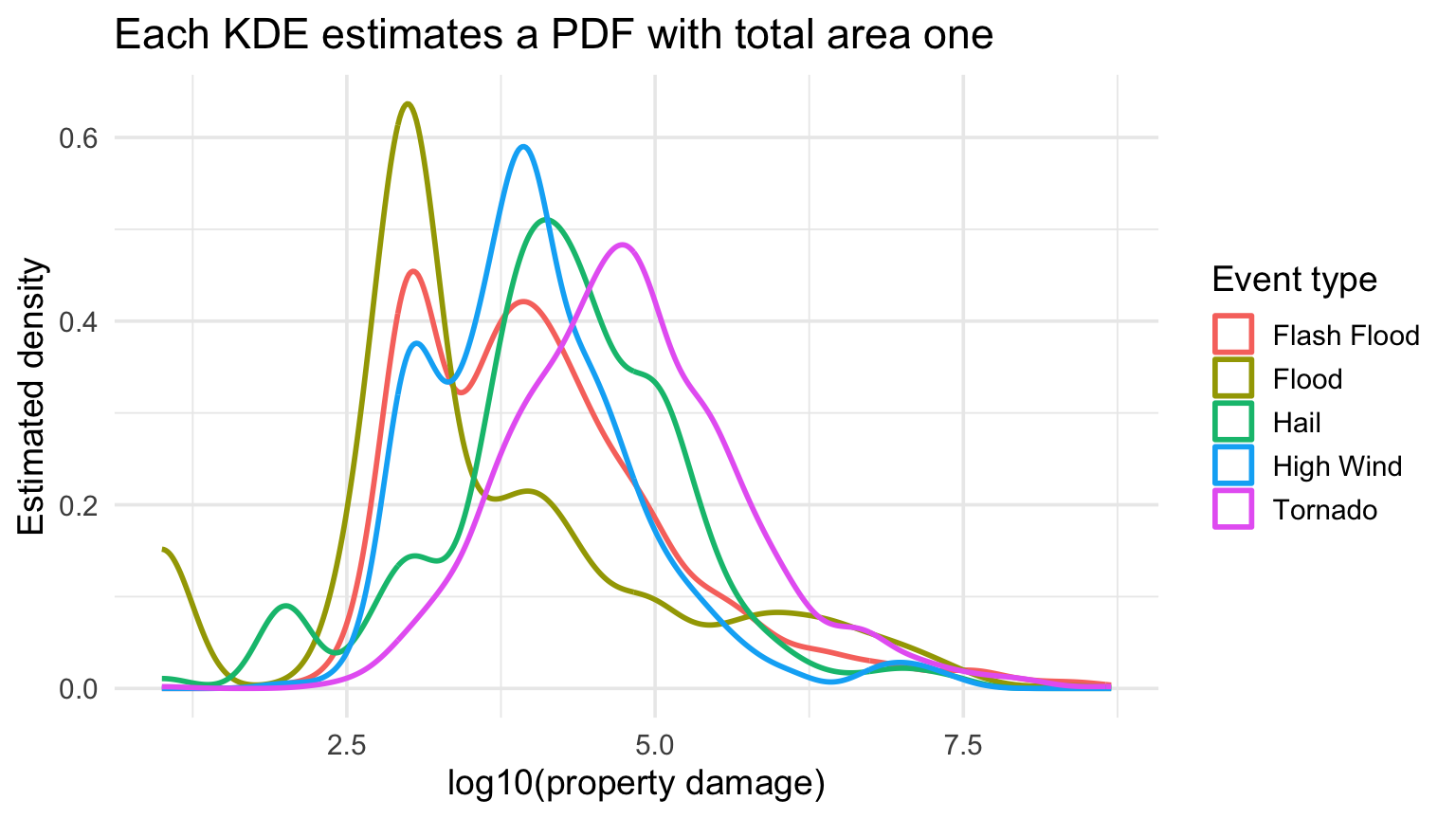
The curves compare estimated shapes. Because each integrates to one, height does not encode the number of observations in a group.

Density curves estimate the PDF

Density curves of log damage for selected NOAA event types.

Checkpoint 2 · What vanished?

Choose one event type in the boxplot. Name two facts the plot supports and two features you would need a histogram, ECDF, or raw points to inspect.

Bandwidth controls the bias–variance tradeoff

A kernel density estimate places a small smooth bump at every observation and adds them.

Bandwidth determines how much those bumps overlap:

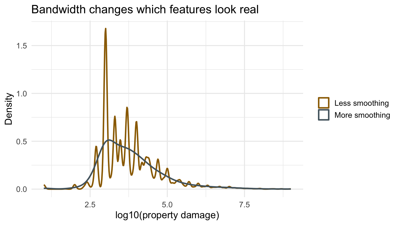
  • Smaller bandwidth: lower smoothing bias, higher sampling variance; noise can look meaningful.
  • Larger bandwidth: higher smoothing bias, lower sampling variance; real structure can disappear.

No single bandwidth reveals the truth. Look for conclusions that survive a reasonable range.

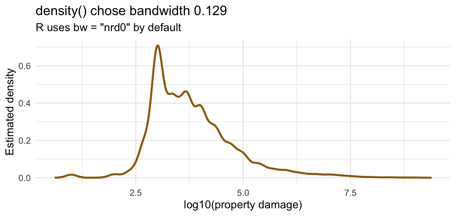
Let R choose a starting bandwidth

Code
default_kde <- density(log_damage)

default_kde_data <- tibble(
  log_damage = default_kde$x,
  estimated_pdf = default_kde$y
)

default_kde_data |>
  ggplot(aes(log_damage, estimated_pdf)) +
  geom_line(color = deep_gold, linewidth = 1.2) +
  labs(
    title = paste0(
      "density() chose bandwidth ",
      number(default_kde$bw, accuracy = 0.001)
    ),
    subtitle = 'R uses bw = "nrd0" by default',
    x = "log10(property damage)",
    y = "Estimated density"
  )

Let R choose a starting bandwidth

Bandwidth changes the apparent structure

Code
positive_damage |>
  sample_n(min(10000, nrow(positive_damage))) |>
  ggplot(aes(log10(prop_usd))) +
  geom_density(aes(color = "Less smoothing"), adjust = 0.35, linewidth = 1) +
  geom_density(aes(color = "More smoothing"), adjust = 1.8, linewidth = 1) +
  scale_color_manual(values = c("Less smoothing" = deep_gold, "More smoothing" = blue_gray)) +
  labs(title = "Bandwidth changes which features look real", x = "log10(property damage)", y = "Density", color = NULL)

Bandwidth changes the apparent structure

Density estimates of log property damage using two bandwidth adjustments.

We should NOT fill overlapping density curves

Multiple filled densities create an occlusion problem. Prefer:

  • lines for two or three groups,
  • small multiples,
  • violins plus raw points,
  • ECDFs when thresholds matter.

The comparison task should determine the display.

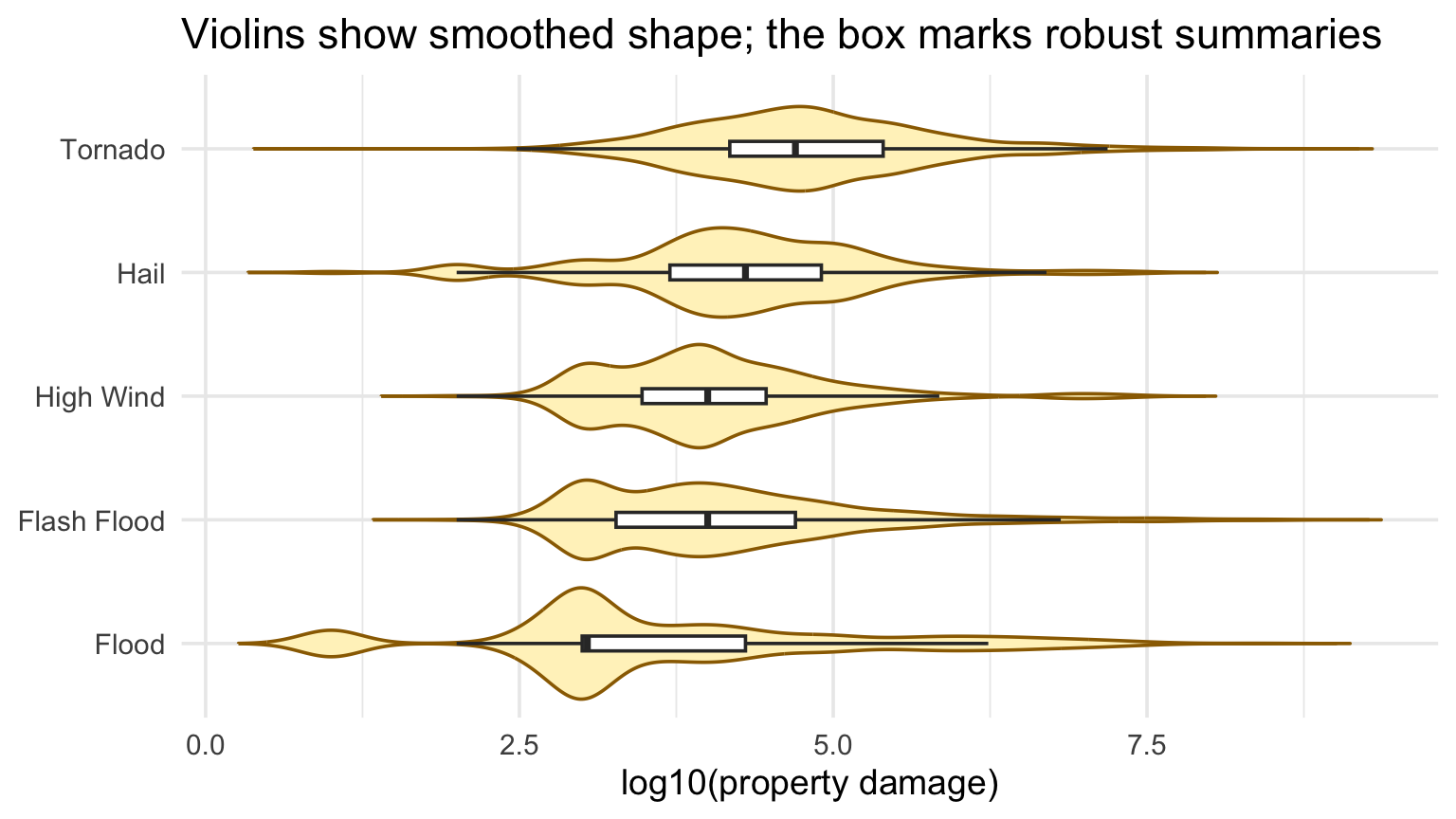
Violin plots show smoothed conditional shape

Code
compare_types |>
  ggplot(aes(fct_reorder(event_type, prop_usd, median), log10(prop_usd))) +
  geom_violin(fill = pale_gold, color = deep_gold, trim = FALSE) +
  geom_boxplot(width = 0.12, outlier.shape = NA, fill = "white") +
  coord_flip() +
  labs(title = "Violins show smoothed shape; the box marks robust summaries", x = NULL, y = "log10(property damage)")

Violin plots show smoothed conditional shape

Violin plots of log damage for selected NOAA event types.

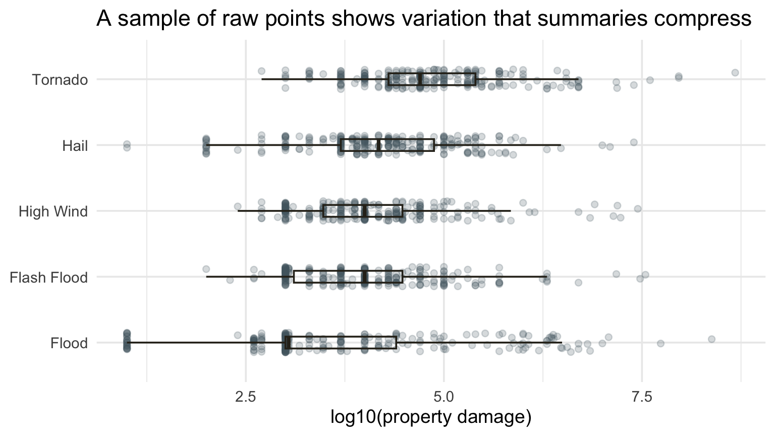
Raw points reveal within-group variation

Code
compare_types |>
  group_by(event_type) |>
  slice_sample(prop = 1) |>
  slice_head(n = 250) |>
  ungroup() |>
  ggplot(aes(fct_reorder(event_type, prop_usd, median), log10(prop_usd))) +
  geom_jitter(width = 0.15, alpha = 0.22, color = blue_gray) +
  geom_boxplot(width = 0.18, outlier.shape = NA, fill = NA, color = charcoal) +
  coord_flip() +
  labs(title = "A sample of raw points shows variation that summaries compress", x = NULL, y = "log10(property damage)")

Raw points reveal within-group variation

Jittered points and boxplots of sampled log damage by NOAA event type.

Checkpoint 3 · Choose the display

Choose one question:

  1. What share of flood records reported less than $50,000?
  2. Which event types have the widest positive-damage distribution?
  3. Is there evidence of multiple damage regimes?

Pick ECDF, boxplot, histogram, or density and defend the choice.

Recap and next steps

  • Histogram features must survive reasonable bin choices.
  • ECDFs are excellent for thresholds and comparisons.
  • KDEs estimate PDFs; bandwidth trades bias against variance.
  • Conditional displays need an explicit comparison task.

After class: Complete the graded checkpoint on Canvas by Wednesday, September 2 at 11:59 p.m. Eastern.

Next: relationships between two quantitative variables.