Visualizations for 2D Categorical and 1D Quantitative Data

Lecture 3

Shannon Gallagher

August 31, 2026

Last time and today

Last time:

  • map variables to aesthetics in ggplot2,
  • build and interpret plots for one categorical variable.

Today:

  • choose the denominator when comparing two categorical variables,
  • use residuals to find where an association occurs,
  • distinguish discrete and continuous quantitative variables,
  • make a first honest display of a skewed quantity.

2D categorical basics: marginal / conditional distribution

For a table of event type by state:

  • row percentages ask about the mix within an event type,
  • column percentages ask about the mix within a state,
  • joint percentages ask where all records occur.

There is no context-free “percent.”

Connecting distributions to visualizations

Code
state_type <- events |>
  filter(state %in% c("Texas", "Florida", "California", "Pennsylvania"), event_type %in% top_types) |>
  count(state, event_type)

state_type |>
  group_by(state) |>
  mutate(within_state = n / sum(n)) |>
  arrange(state, desc(within_state)) |>
  slice_head(n = 2)
# A tibble: 8 × 4
# Groups:   state [4]
  state        event_type            n within_state
  <chr>        <chr>             <int>        <dbl>
1 California   High Wind           583        0.487
2 California   Excessive Heat      186        0.156
3 Florida      Thunderstorm Wind   475        0.626
4 Florida      Flash Flood         188        0.248
5 Pennsylvania Thunderstorm Wind   971        0.594
6 Pennsylvania Hail                209        0.128
7 Texas        Hail               1588        0.312
8 Texas        Thunderstorm Wind   988        0.194

Stacked bar charts—a bar chart of spine charts

Code
state_type |>
  ggplot(aes(state, n, fill = event_type)) +
  geom_col() +
  labs(title = "Totals and composition are visible together", x = NULL, y = "Event records", fill = "Event type")
Stacked bar chart of common NOAA event types in four states.

The total bar height shows the marginal distribution of state. Segments show the joint counts, but only the bottom segment has a common baseline.

Stacked bar charts with conditional proportions

Code
state_type |>
  ggplot(aes(state, n, fill = event_type)) +
  geom_col(position = "fill") +
  scale_y_continuous(labels = percent) +
  labs(title = "Now each bar answers: within this state, what is the mix?", x = NULL, y = "Within-state share", fill = "Event type")
Proportional stacked bar chart of event types within four states.

Side-by-side bar charts

Code
state_type |>
  ggplot(aes(event_type, n, fill = state)) +
  geom_col(position = position_dodge(preserve = "single")) +
  coord_flip() +
  labs(title = "A common baseline helps compare states within an event type", x = NULL, y = "Event records", fill = "State")
Grouped bar chart comparing event type counts across four states.

Complete missing values to preserve location

Code
state_type |>
  complete(state, event_type, fill = list(n = 0)) |>
  arrange(state, event_type) |>
  slice_head(n = 12)
# A tibble: 12 × 3
   state      event_type            n
   <chr>      <chr>             <int>
 1 California Drought               0
 2 California Excessive Heat      186
 3 California Flash Flood         101
 4 California Hail                 21
 5 California Heat                106
 6 California High Wind           583
 7 California Thunderstorm Wind    73
 8 California Winter Weather      126
 9 Florida    Drought              10
10 Florida    Excessive Heat        0
11 Florida    Flash Flood         188
12 Florida    Hail                 75

An absent row and a true zero are not automatically the same. Complete the grid only after deciding what a missing combination means.

Visualize independence tests with mosaic plots

Mosaic plot of state and event type shaded by Pearson residuals.

Checkpoint 1 · Name the denominator

You are comparing Pennsylvania with Texas. Write one question that needs counts and one that needs within-state percentages. What misleading conclusion could arise from using the wrong denominator?

A chi-square test compares observed and expected counts

The null hypothesis says the two categorical variables are independent.

For cell \((i,j)\), independence predicts

\[ E_{ij}=\frac{(\text{row }i\text{ total})(\text{column }j\text{ total})}{\text{grand total}}. \]

Pearson residuals are the pieces of chi-square

The Pearson residual standardizes the observed-minus-expected discrepancy for one cell:

\[ r_{ij}=\frac{O_{ij}-E_{ij}}{\sqrt{E_{ij}}}. \]

The chi-square statistic adds their squared values:

\[ X^2=\sum_i\sum_j r_{ij}^2 =\sum_i\sum_j\frac{(O_{ij}-E_{ij})^2}{E_{ij}}. \]

The sign shows whether a cell is above or below expectation; the magnitude shows how strongly that cell contributes to the overall result.

A chi-square result is only a starting point

It does not tell us:

  • which cells drive the result,
  • whether the difference matters,
  • why the association exists,
  • whether the records represent the underlying hazard process fairly.

Shade by Pearson residuals

Code
tab <- state_type |>
  pivot_wider(names_from = event_type, values_from = n, values_fill = 0) |>
  tibble::column_to_rownames("state") |>
  as.matrix()

round(chisq.test(tab)$residuals[, 1:4], 1)
             Excessive Heat Flash Flood  Hail  Heat
California             12.4        -3.1 -14.8  -2.0
Florida                -7.0        10.9  -7.0  -9.0
Pennsylvania           -6.5        -1.6  -7.8 -13.3
Texas                   0.4        -1.8  14.3  12.0

Large positive residuals mean more records than independence predicts; large negative residuals mean fewer.

1D Quantitative Data

Quantitative variables encode amounts.

  • Discrete: counts such as injuries or deaths.
  • Continuous: duration, hail size, wind speed, or damage amount.

The stored type in R is not enough. Meaning comes from the data-generating process.

NOAA damage is not analysis-ready

Code
events |>
  select(damage_property_raw, prop_usd, prop_usd_zero) |>
  filter(!is.na(damage_property_raw)) |>
  distinct() |>
  slice_head(n = 8)
# A tibble: 8 × 3
  damage_property_raw prop_usd prop_usd_zero
  <chr>                  <dbl>         <dbl>
1 0.00K                      0             0
2 20.00K                 20000         20000
3 50.00K                 50000         50000
4 10.00K                 10000         10000
5 8.00K                   8000          8000
6 3.00K                   3000          3000
7 2.00K                   2000          2000
8 60.00K                 60000         60000

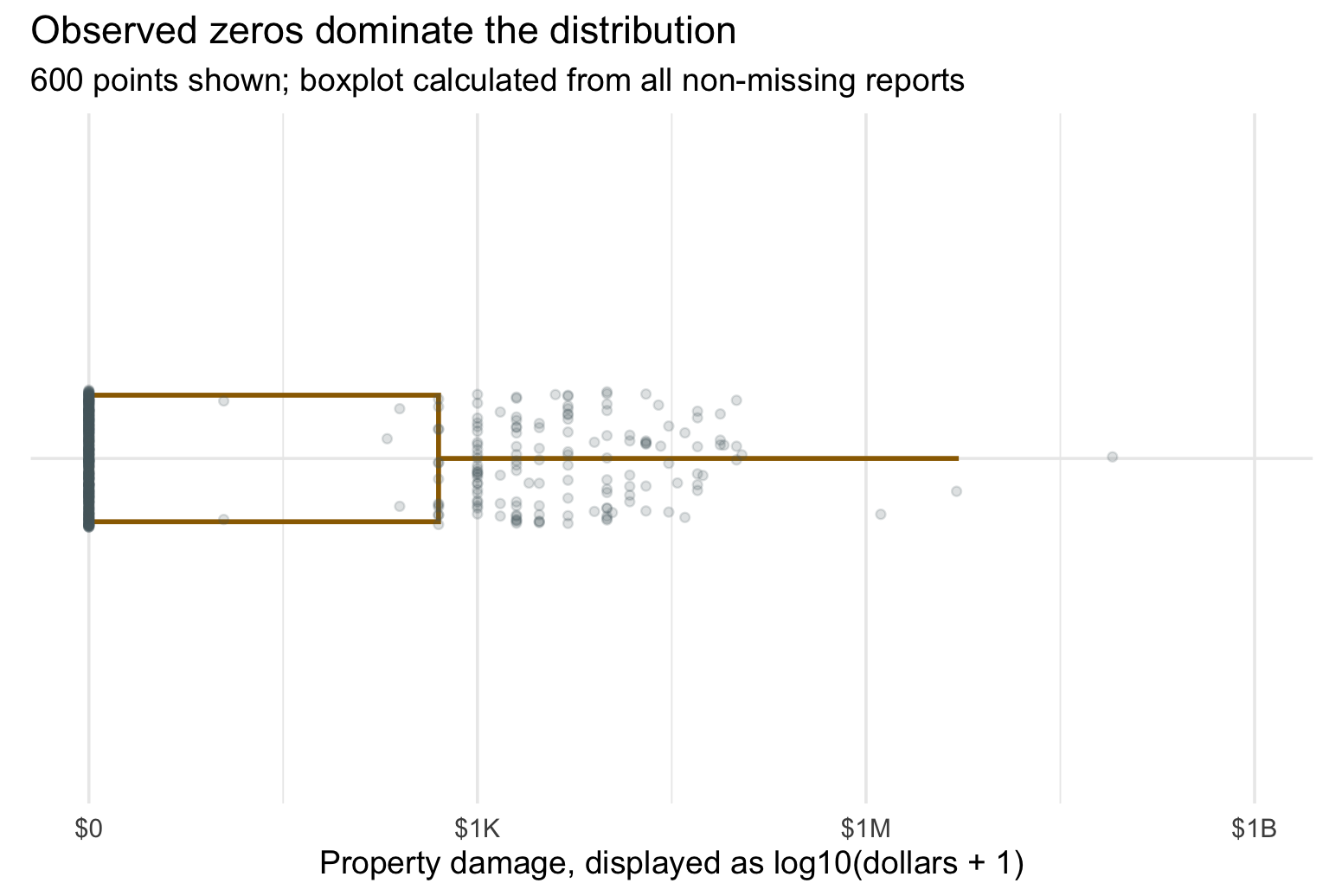
Missing damage and zero damage are different claims.

A summary can hide the distribution

Code
events |>
  filter(!is.na(prop_usd)) |>
  summarise(
    observed_reports = n(),
    zero_reports = sum(prop_usd == 0),
    zero_share = percent(mean(prop_usd == 0), accuracy = 0.1),
    median_all = median(prop_usd),
    median_positive = median(prop_usd[prop_usd > 0], na.rm = TRUE),
    largest = max(prop_usd, na.rm = TRUE)
  )
# A tibble: 1 × 6
  observed_reports zero_reports zero_share median_all median_positive    largest
             <int>        <int> <chr>           <dbl>           <dbl>      <dbl>
1            54755        40495 74.0%               0            5000 1000000000

A boxplot alone hides the distribution

Sampled non-missing damage reports, including zeros, shown as jittered points with a boxplot calculated from all non-missing damage reports.

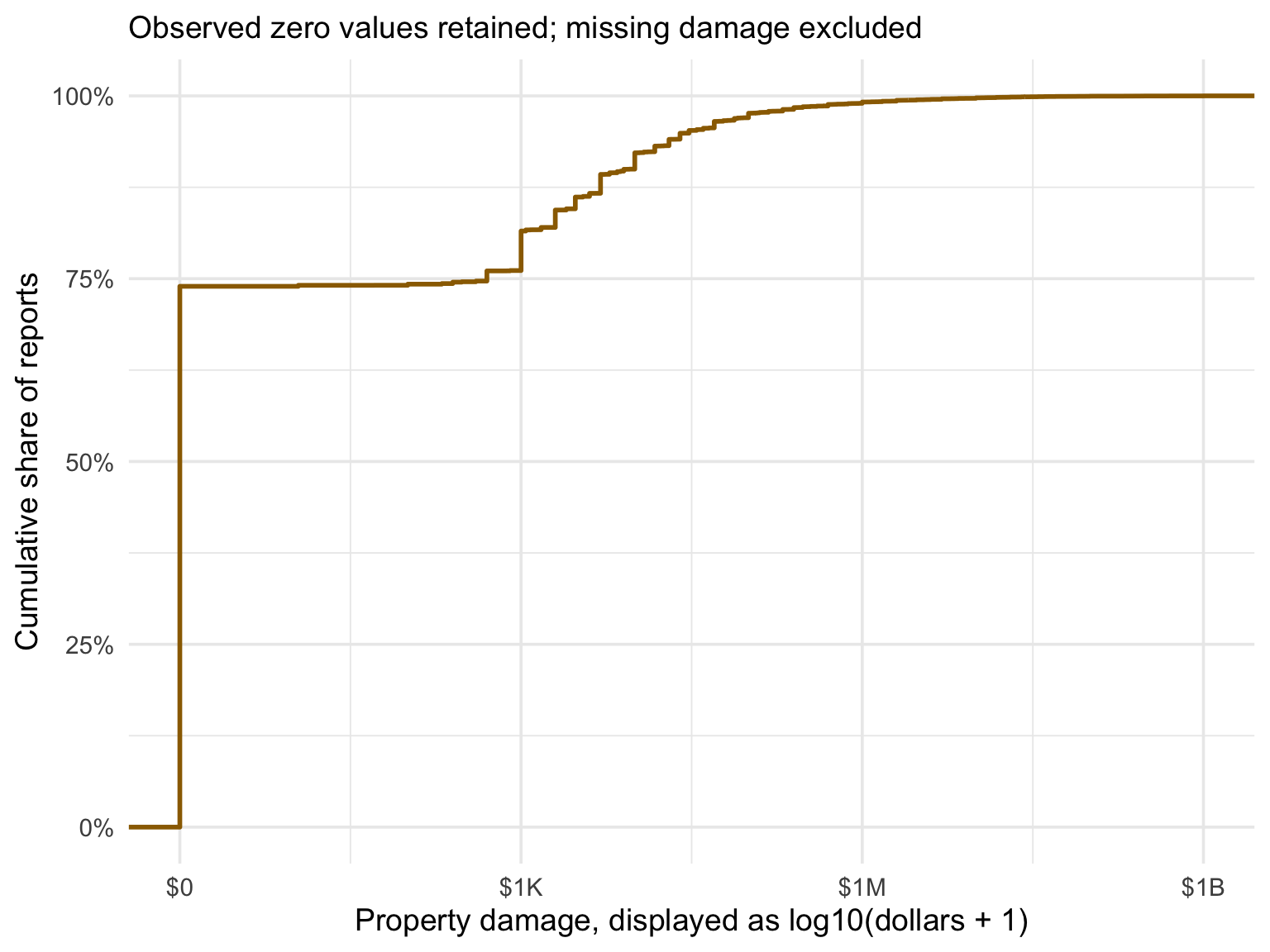
An ECDF answers threshold questions

The empirical cumulative distribution function at value \(x\) is

\[ \widehat{F}(x) = \frac{\#\{X_i \le x\}}{n}. \]

Read it as: the share of observations at or below \(x\).

Unlike a histogram, an ECDF has no bins to choose.

The jump at $0 is a feature, not a nuisance

Empirical cumulative distribution of non-missing NOAA property damage, including zeros, on a log10 damage-plus-one scale.

What about comparing to theoretical distributions?

A one-sample Kolmogorov–Smirnov statistic measures the largest vertical distance between an empirical cumulative distribution and a specified theoretical CDF:

\[ D_n = \sup_x |F_n(x)-F_0(x)|. \]

The test is about a fully specified distribution, not merely whether a histogram looks roughly bell-shaped.

Checkpoint 2 · Predict the shape

Before plotting, sketch the distribution of non-missing property damage. What feature should appear at $0? Where will the mean fall relative to the median? What will adding one and taking a log reveal?

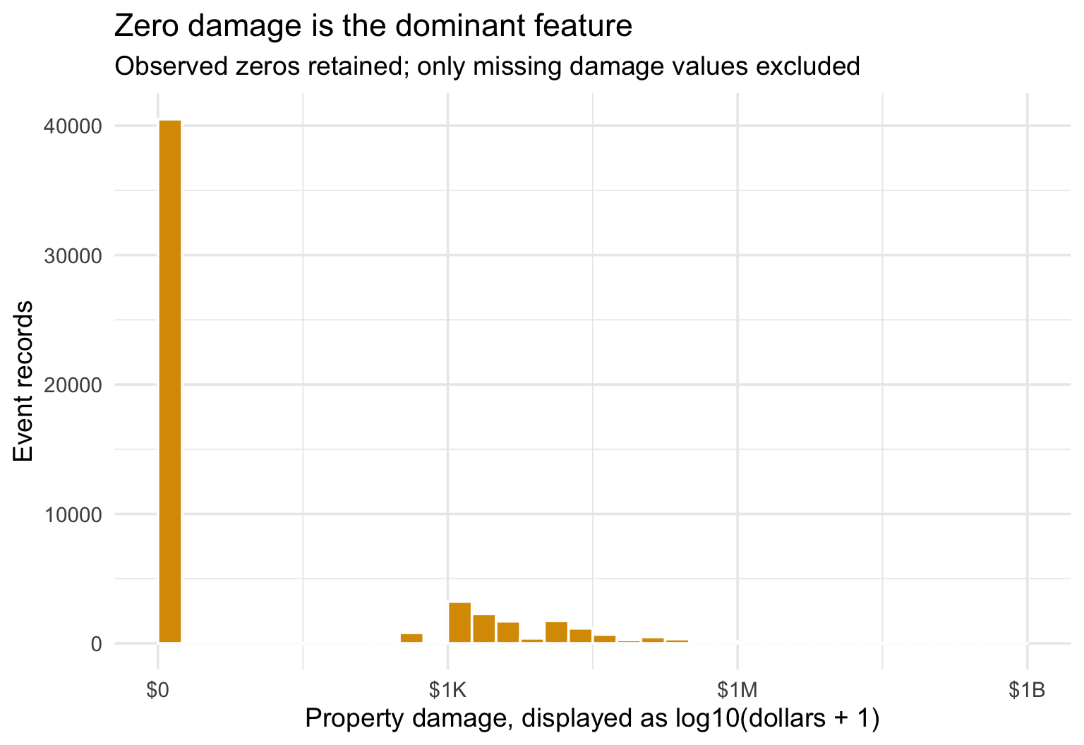
Histograms display 1D continuous distributions

Histogram of non-missing property damage, including zeros, after a log10 damage-plus-one transformation.

Why transform?

A \(\log_{10}(\text{damage}+1)\) transform keeps zero visible while making multiplicative differences readable:

  • 0 represents $0,
  • 3 is approximately $1,000,
  • 6 is approximately $1,000,000,
  • 9 is approximately $1,000,000,000.

The transform changes the visual scale, not the archived values. Missing damage remains missing rather than being recoded to zero.

Checkpoint 3 · Write the caption

Write a two-sentence caption for the histogram: one sentence describing the main pattern and one sentence explaining how zero and missing values were handled. Avoid saying the data are “normal.”

Recap and next steps

  1. Percentages require a named denominator.
  2. A test detects association; residuals help locate it.
  3. A quantitative summary is not a distribution.
  4. Cleaning and scale choices are part of the claim.

Next: choosing and tuning distribution displays, then comparing distributions across groups.