Principles and Visualizations for 1D Categorical Data

Week 1 Lecture 2 (async.)

Shannon Gallagher

August 26, 2026

Reminders, previously, and today…

  • Read the syllabus and complete Lab 0 if you have not already.
  • Make sure you can render .qmd files to HTML and PDF.
  • Last time: tidy data, the grammar of graphics, ggplot2 basics, and the historical gallery from van Langren through Tufte.

Today:

  • from principles to practice: infographics and insight,
  • categorical data, beginning with one variable,
  • counts, proportions, and uncertainty.

Infographics to communicate a story

Infographics can combine data, annotation, and structure for a broad audience. They still need clear comparisons, proportional encodings, and an honest claim.

Alberto Cairo and the art of insight

Useful graphics balance truth, function, beauty, and insight.

1D Categorical Data

Two main types:

  1. Nominal: categories with no inherent order.
  2. Ordinal: categories with a meaningful order.

NOAA examples:

  • nominal: EVENT_TYPE, STATE, SOURCE
  • ordinal: tornado EF scale, hurricane category, damage tier

R stores categorical variables as factors when their level order matters. Otherwise, alphabetical order is usually the default—and often not the most useful order.

1D categorical data structure

Observations form a vector \((x_1, \ldots, x_n)\). Each value belongs to one category \(C_1, C_2, \ldots, C_K\).

For NOAA Storm Events, focus first on event_type:

Code
events$event_type |> head()
[1] "Winter Weather" "Winter Weather" "Drought"        "Drought"       
[5] "Drought"        "Drought"       

How should we summarize those values?

Behind the scenes: statistical summaries

Code
type_counts <- events |>
  count(event_type, sort = TRUE) |>
  mutate(
    total = sum(n),
    prop = n / total
  )

type_counts |>
  slice_head(n = 8) |>
  transmute(
    `Event type` = event_type,
    Count = comma(n),
    Proportion = percent(prop, accuracy = 0.1)
  )

Behind the scenes: statistical summaries

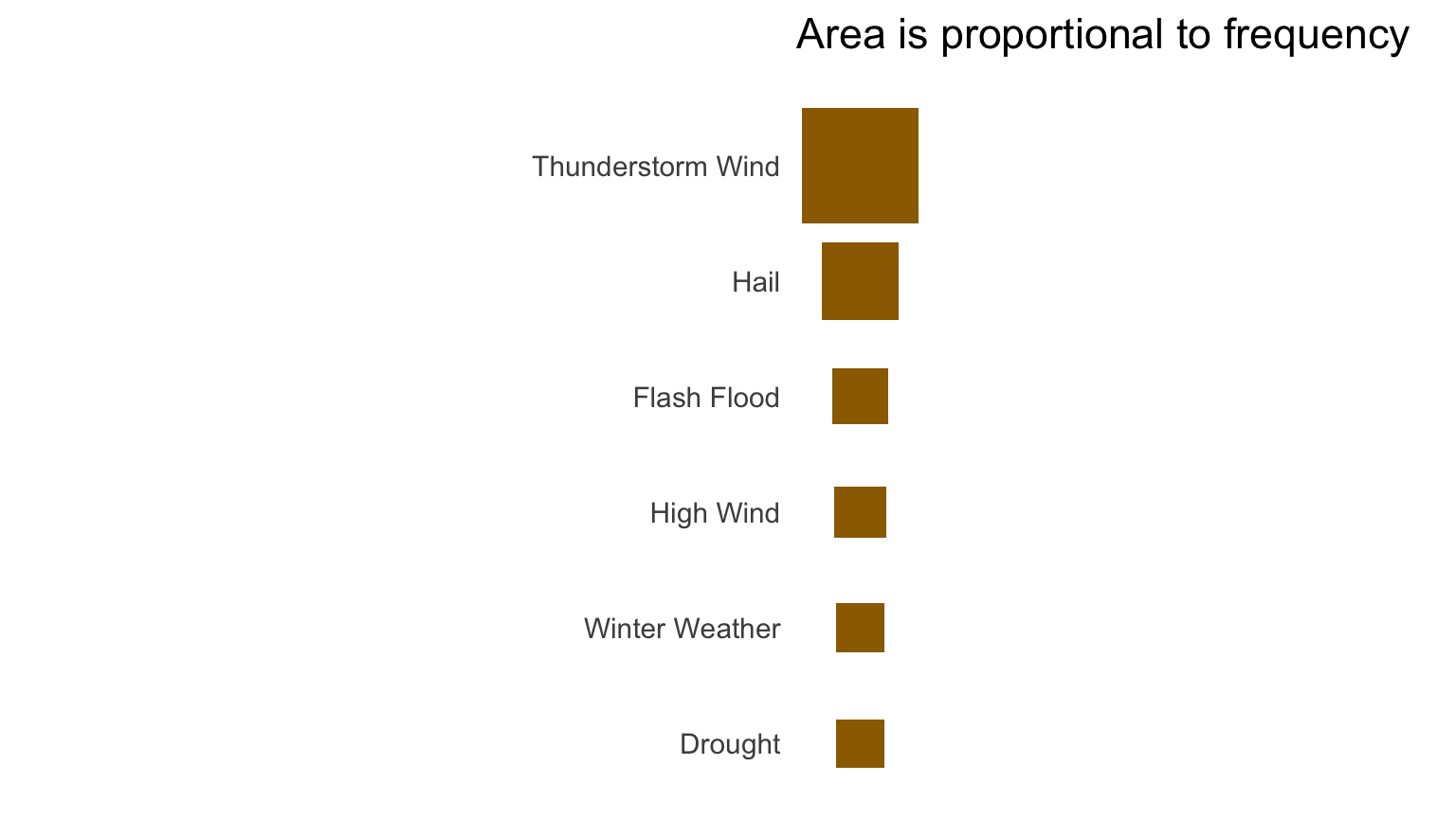
Area plots

Code
ggplot(area_counts) +
  geom_rect(
    aes(xmin = -side / 2, xmax = side / 2,
        ymin = row - side / 2, ymax = row + side / 2),
    fill = deep_gold
  ) +
  scale_y_continuous(
    breaks = area_counts$row,
    labels = area_counts$event_type
  ) +
  coord_fixed() +
  labs(x = NULL, y = NULL, title = "Area is proportional to frequency") +
  theme(
    axis.text.x = element_blank(),
    axis.ticks = element_blank(),
    panel.grid = element_blank()
  )

Area plots

Squares whose areas represent counts for the six most common NOAA event types.

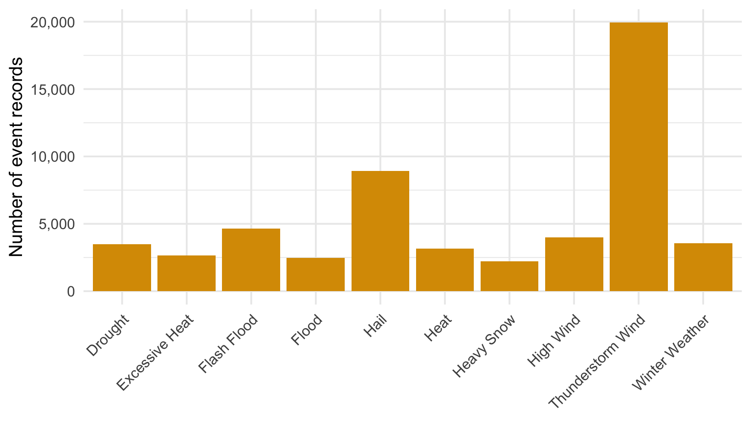
Bar charts

Code
type_counts |>
  slice_head(n = 10) |>
  ggplot(aes(event_type, n)) +
  geom_col(fill = gold) +
  scale_y_continuous(labels = comma) +
  labs(x = NULL, y = "Number of event records") +
  theme(axis.text.x = element_text(angle = 45, hjust = 1))
Horizontal bar chart of event type counts in 2024.

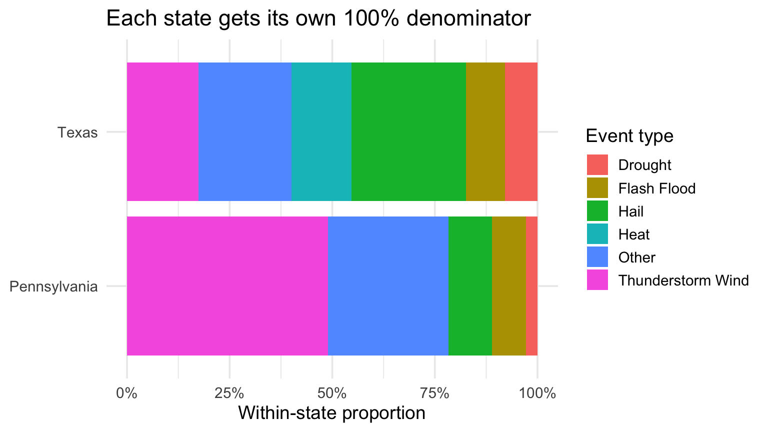
Conditional distributions fix the denominator

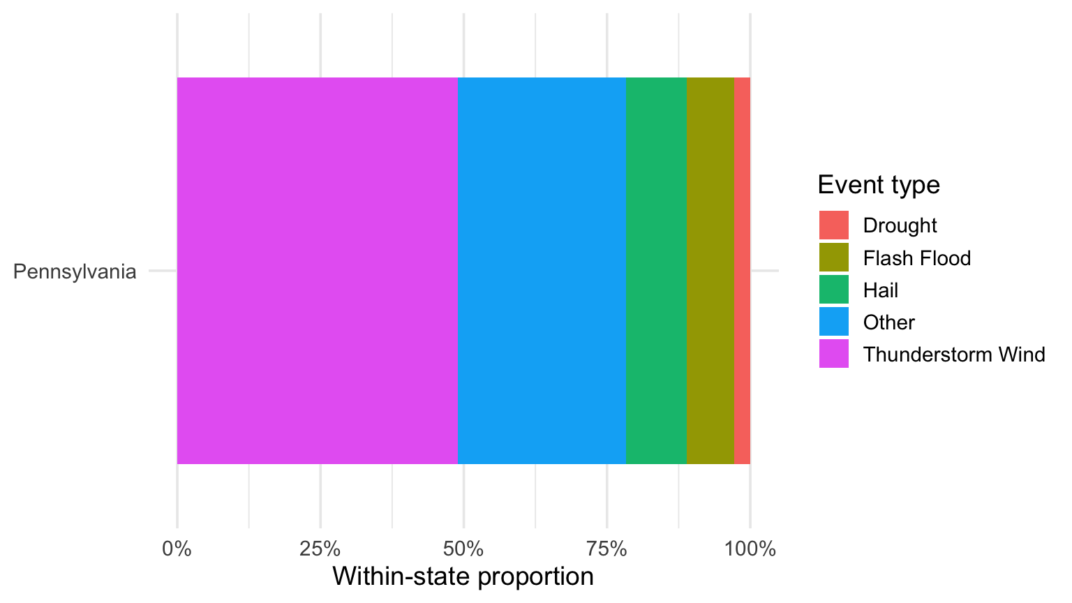
For \(X=\) event type, conditioning on Pennsylvania means \(P(X=C_j\mid\text{state}=\text{PA})\). The denominator is all Pennsylvania records.

One proportional spine bar showing the conditional distribution of event type within Pennsylvania.

Conditional distributions support fair comparisons

Two proportional spine bars comparing the conditional distribution of event type within Pennsylvania and Texas.

Probabilities are nonnegative and sum to one

For categories \(C_1, \ldots, C_K\), a marginal or conditional distribution must satisfy

\[ p_j \ge 0 \qquad\text{and}\qquad \sum_{j=1}^{K}p_j=1. \]

The empirical probabilities are \(\hat p_j=n_j/n\). Displayed categories have positive mass; in general, zero is allowed but a negative probability is not.

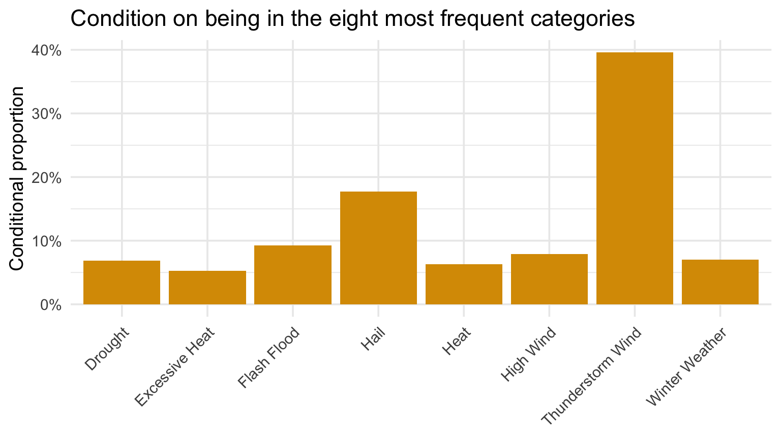
Bar charts with proportions

Code
events |>
  filter(event_type %in% type_counts$event_type[1:8]) |>
  ggplot(aes(event_type)) +
  geom_bar(aes(y = after_stat(count) / sum(after_stat(count))), fill = gold) +
  scale_y_continuous(labels = percent) +
  labs(
    title = "Condition on being in the eight most frequent categories",
    x = NULL,
    y = "Conditional proportion"
  ) +
  theme(axis.text.x = element_text(angle = 45, hjust = 1))
Bar chart of the proportions of common NOAA event types.

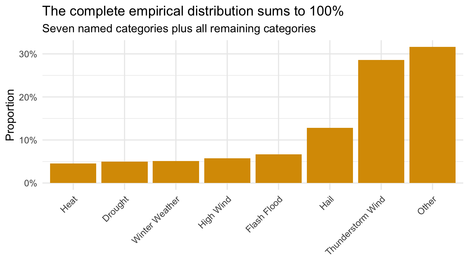
Compute and display the proportions directly

Code
type_display <- type_counts |>
  mutate(event_type = if_else(row_number() <= 7, event_type, "Other")) |>
  group_by(event_type) |>
  summarise(n = sum(n), total = first(total), .groups = "drop") |>
  mutate(
    prop = n / total,
    event_type = fct_reorder(event_type, prop)
  )

type_display |>
  ggplot(aes(event_type, prop)) +
  geom_col(fill = gold) +
  scale_y_continuous(labels = percent) +
  labs(
    title = "The complete empirical distribution sums to 100%",
    subtitle = "Seven named categories plus all remaining categories",
    x = NULL,
    y = "Proportion"
  ) +
  theme(axis.text.x = element_text(angle = 45, hjust = 1))

Compute and display the proportions directly

Ordered bar chart of proportions for common NOAA event types.

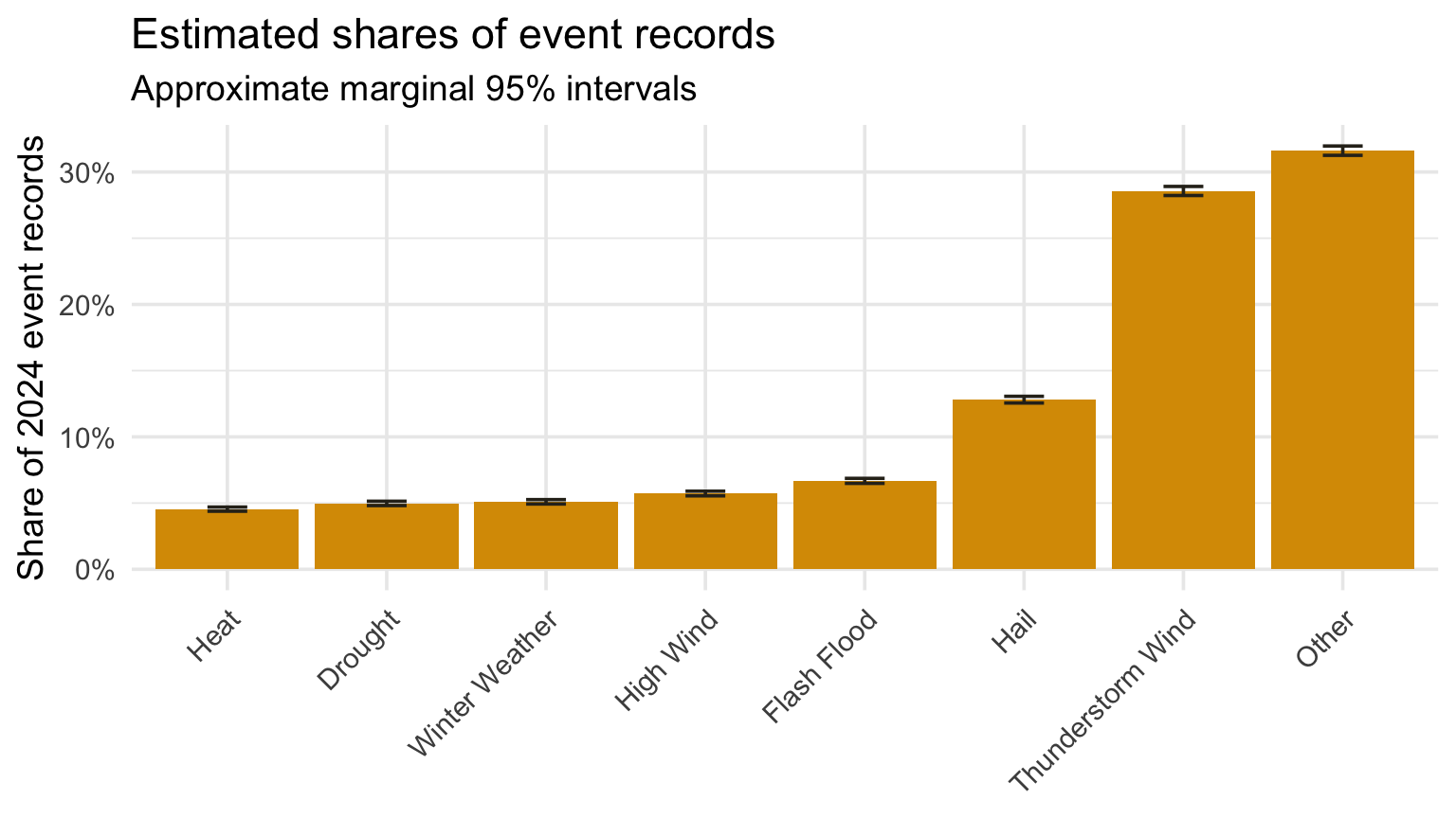
What about uncertainty?

The bar height \(\hat p_j\) is an estimate from the observed records. A standard error asks how much that estimate would vary under a binomial-style repeated-sampling model.

  • Larger denominators usually mean less sampling variability.
  • An interval does not repair reporting bias or missing events.

For a category share, \(SE(\hat p_j)=[\hat p_j(1-\hat p_j)/n]^{1/2}\). The central limit theorem motivates the approximate 95% interval \(\hat p_j \pm 1.96SE(\hat p_j)\), often rounded to \(\hat p_j \pm 2SE(\hat p_j)\).

Add standard errors to bars

Code
type_display |>
  mutate(
    se = sqrt(prop * (1 - prop) / total),
    lower = pmax(prop - 2 * se, 0),
    upper = pmin(prop + 2 * se, 1),
    event_type = fct_reorder(event_type, prop)
  ) |>
  ggplot(aes(event_type, prop)) +
  geom_col(fill = gold) +
  geom_errorbar(aes(ymin = lower, ymax = upper), width = 0.25, color = charcoal) +
  scale_y_continuous(labels = percent) +
  labs(
    title = "Estimated shares of event records",
    subtitle = "Approximate marginal 95% intervals",
    x = NULL,
    y = "Share of 2024 event records"
  ) +
  theme(axis.text.x = element_text(angle = 45, hjust = 1))

Add standard errors to bars

Bar chart of event type proportions with approximate standard error intervals.

Why does this matter?

Two nearly identical bars can support different conclusions when sample sizes differ. The interval supplies information that bar height alone omits.

For NOAA, these intervals describe binomial-style variability in the observed records. They do not correct reporting bias, missing events, exposure differences, or changes in data-collection procedures.

“Dynamite plots must die”

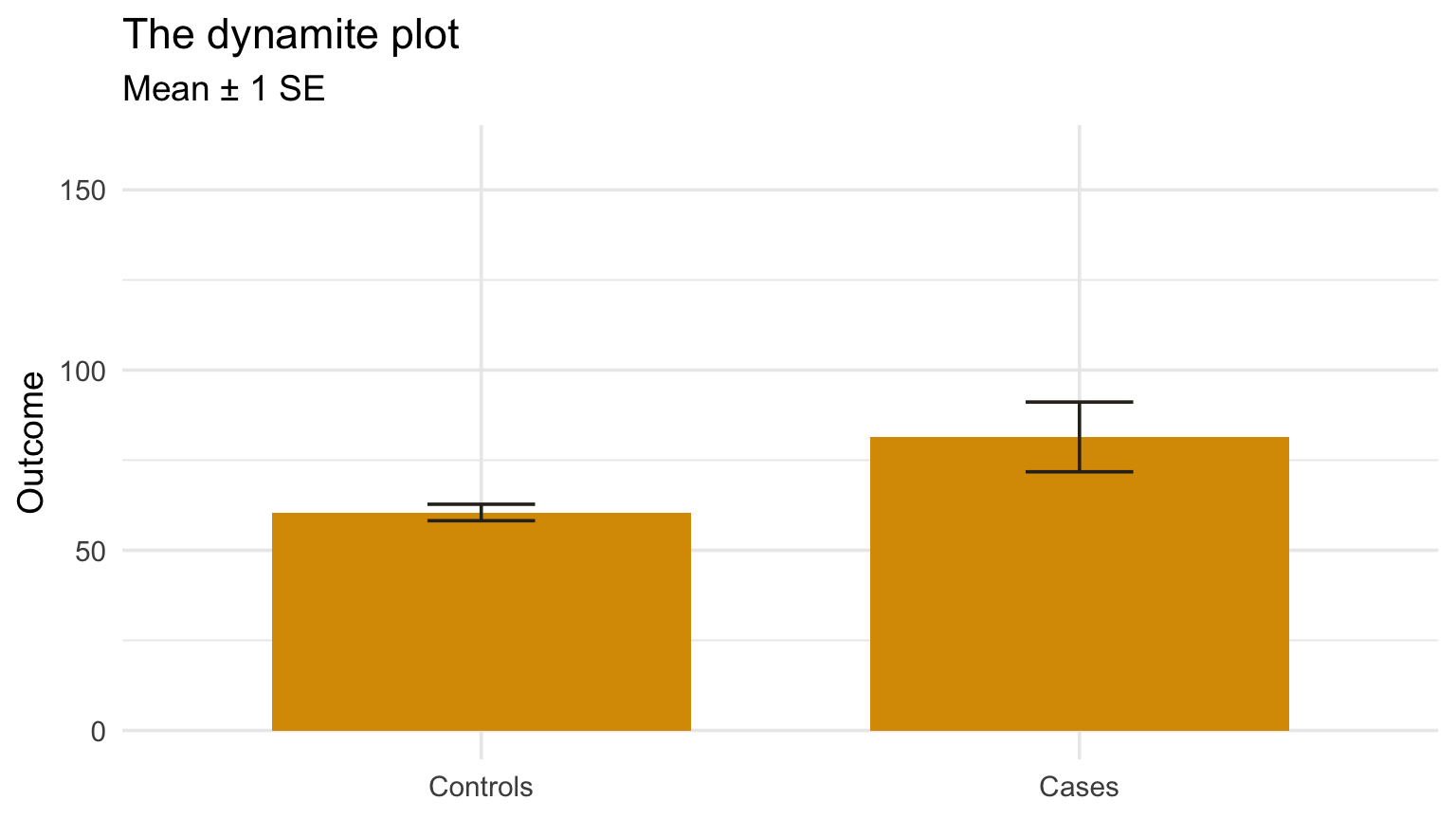
Rafael Irizarry’s delightfully blunt name for a mean-with-error-bars display is a dynamite plot: the error bar is the fuse, and the bar can conceal the data.

His example concerns group means, not category proportions—but the warning travels: a summary and an error bar are not the distribution.

Read Irizarry’s open letter: “Dynamite plots must die.”

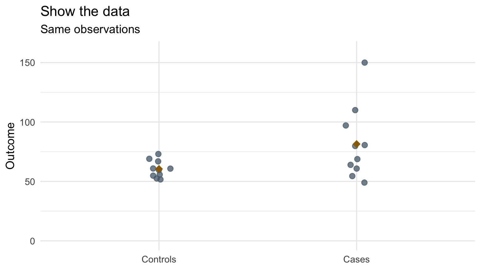
The bar hides what the points reveal

A mean plus standard-error bar chart beside the same groups shown as raw points, revealing skew and two high observations.

A mean plus standard-error bar chart beside the same groups shown as raw points, revealing skew and two high observations.

Example adapted from Rafael Irizarry (2019). For a group mean, \(SE(\bar x)=s/n^{1/2}\); the CLT motivates the approximate 95% interval \(\bar x\pm1.96SE(\bar x)\) under the usual sampling conditions.

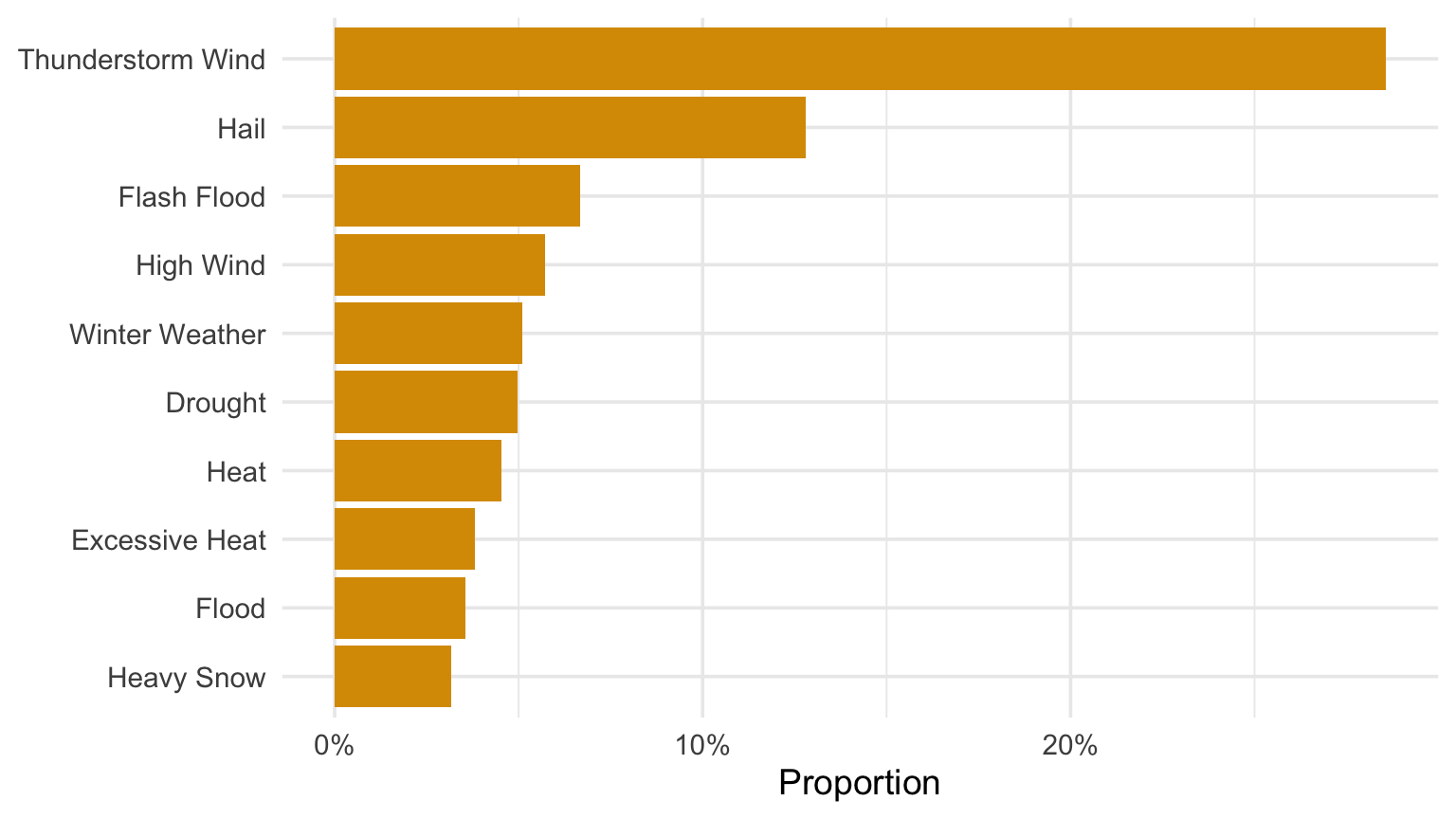
Useful to order categories by frequency with forcats

Code
type_counts |>
  slice_head(n = 10) |>
  mutate(event_type = fct_reorder(event_type, prop)) |>
  ggplot(aes(prop, event_type)) +
  geom_col(fill = gold) +
  scale_x_continuous(labels = percent) +
  labs(x = "Proportion", y = NULL)
Horizontal ordered bar chart of common NOAA event type proportions.

So you want to make pie charts…

Code
type_counts |>
  slice_head(n = 6) |>
  ggplot(aes(x = "", y = n, fill = event_type)) +
  geom_col(color = "white") +
  coord_polar(theta = "y") +
  labs(x = NULL, y = NULL, fill = "Event type") +
  theme_void()
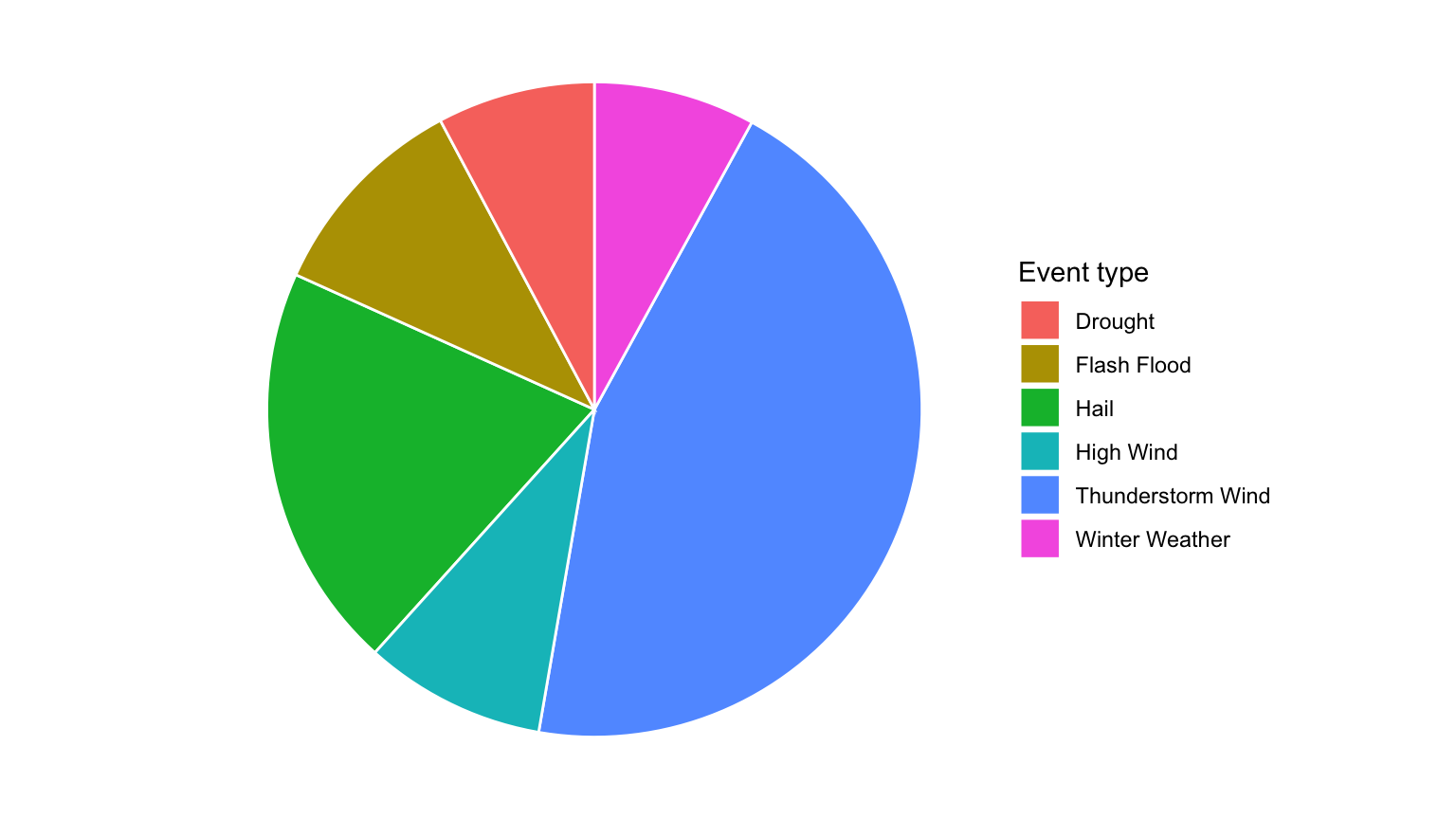
Pie chart of the six most common NOAA event types.

Andrew Gelman: start with the comparison

Statistician Andrew Gelman’s diagnostic is more useful than “never draw circles”:

  1. What comparison should the reader make?
  2. Does the radial layout make that comparison easier?

Pies and clock plots show a whole or a cycle, but they often sacrifice aligned positions and a common baseline. Use radial form when the cycle itself matters—not merely because a circle looks interesting.

One coordinate swap makes a racetrack

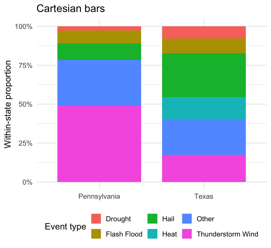
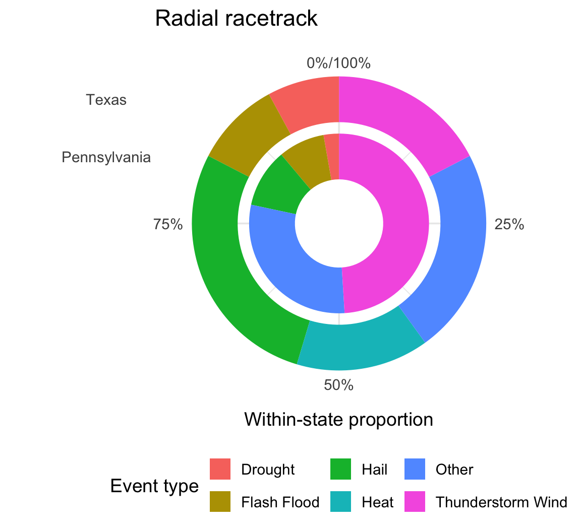
The data, aesthetic mapping, and geometry stay fixed. Only the coordinate system changes.

Code
race_base <- conditional_counts |>
  ggplot(aes(x = state, y = n, fill = event_type)) +
  geom_col(width = 0.8, position = "fill") +
  scale_y_continuous(labels = percent) +
  labs(x = NULL, y = "Within-state proportion", fill = "Event type") +
  theme(legend.position = "bottom")

race_base +
  coord_cartesian() +
  labs(title = "Cartesian bars")
Code
race_base +
  coord_radial(theta = "y", inner.radius = 0.3, expand = FALSE) +
  labs(title = "Radial racetrack")

One coordinate swap makes a racetrack

A proportional stacked bar chart shown first in Cartesian coordinates and then transformed into a radial racetrack plot.

A proportional stacked bar chart shown first in Cartesian coordinates and then transformed into a radial racetrack plot.

Waffle charts are cooler anyway…

Code
waffle_data <- type_counts |>
  slice_head(n = 6) |>
  mutate(tiles = pmax(1, round(100 * n / sum(n)))) |>
  select(event_type, tiles) |>
  uncount(tiles) |>
  mutate(tile = row_number(), row = (tile - 1) %/% 10, col = (tile - 1) %% 10)

waffle_data |>
  ggplot(aes(col, -row, fill = event_type)) +
  geom_tile(color = "white") +
  coord_equal() +
  labs(fill = "Event type") +
  theme_void()

Waffle charts are cooler anyway…

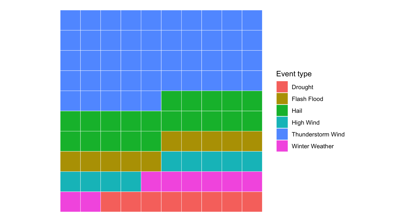
Ten-by-ten waffle chart showing approximate shares for common NOAA event types.

Checkpoint · Counts, proportions, or uncertainty?

Choose one NOAA categorical variable. Make an ordered bar chart and state whether the bars represent counts or proportions. Then name one source of uncertainty the graph does not capture.
Code
checkpoint_counts <- events |>
  count(YOUR_VARIABLE, sort = TRUE) |>
  mutate(prop = n / sum(n))

checkpoint_counts |>
  ggplot(aes(prop, fct_reorder(YOUR_VARIABLE, prop))) +
  geom_col(fill = gold) +
  scale_x_continuous(labels = percent) +
  labs(x = "Proportion", y = NULL)

Recap and next steps

  • Visualize one categorical variable with bars.
  • Distinguish counts from proportions.
  • Order categories to make comparison easier.
  • Display sampling-style uncertainty when it matters.
  • Prefer a common baseline to angles or areas for precise comparison.

Next: two categorical variables and one quantitative variable.