Week 1 Lecture 1

Why we visualize data

Shannon Gallagher

August 24, 2026

About me

Special Faculty and Lecturer, Carnegie Mellon Statistics & Data Science

  • Research: statistical machine learning, evaluation, and interpretable AI; previously biostats!
  • Dabble in sports statistics
  • Office: Baker Hall 129D
  • Office hours: Monday 11:00 a.m.–noon and Tuesday 1:00–2:00 p.m.

We visualize data to gain insights

  • To check the data — outliers, clusters, gaps, and data-quality problems.
  • To find structure that summaries hide — trends, nonlinearity, interactions.
  • To compare groups on a common scale.
  • To communicate a finding to someone who will not read your code.
  • To utilize human expertise

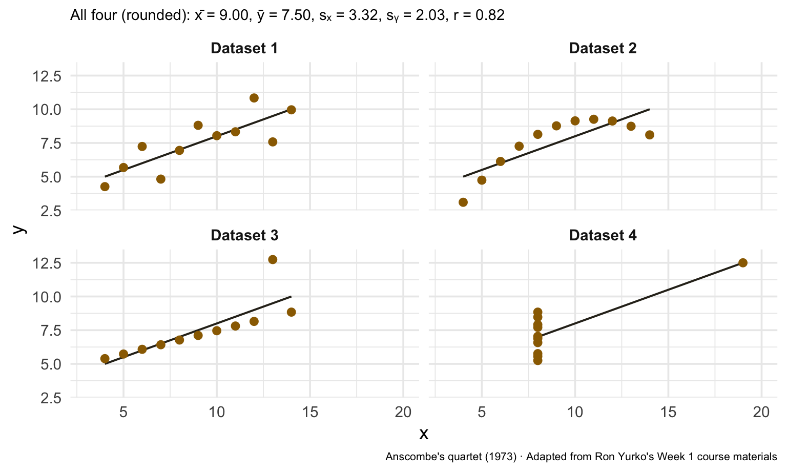
Two datasets can share nearly identical means, standard deviations, and correlations—and look nothing alike.

Always visualize your data before analyzing it.

Same summaries. Different data.

Anscombe's quartet shown as four scatterplots with the same fitted regression line but very different patterns: linear, curved, one vertical outlier, and one high-leverage point.

Course Structure

Lectures on Mondays and Wednesdays

  • examples, code, and discussion during class,
  • slides and supporting materials on the course site,
  • four homework assignments,
  • occasional checkpoints and two Piazza critiques,
  • one final visual report.

Opening week

  • Monday, August 24: remote class at the scheduled time
  • Wednesday, August 26: asynchronous recorded lecture with a graded checkpoint
  • Sunday, August 23: Homework 1 opens
  • Tuesday, September 1: Homework 1 is due at 11:59 p.m.

Before Wednesday: work through Lab 0 · Getting R, RStudio, and Quarto running. About 20 minutes, not graded. Any questions about it can be posted to Piazza.

Course Objectives

Work with tidy data and reproducible workflows.

Create high-quality statistical graphics.

Critique and write about visualizations.

Use visual evidence to support a clear recommendation.

Definition of Tidy Data:

  • Each variable is a column.
  • Each observation is a row.
  • Each value is a cell.

Our running example is the NOAA Storm Events Database.

Code
data_url <- paste0(
  "https://stat.cmu.edu/~sgallagh/courses/mads-fall-2026/",
  "datavis-36613/data/noaa_storm_events_2024_clean.csv.gz"
)
events <- read_csv(data_url, show_col_types = FALSE)

What does one row represent?

Code
events |>
  select(begin_dt, state, county_zone_name, event_type,
         damage_property_raw, deaths_direct) |>
  slice_head(n = 6)

One row is an event report—not one storm system, one county, one day, or one insurance claim.

Checkpoint 1 · Name the row

Choose one NOAA column. Explain what one value means and name one conclusion that would be invalid if you misunderstood the observational unit.

One NOAA event report

begin_dt state county_zone_name event_type damage_property_raw deaths_direct
Jan 01, 2024 00:00 Maryland Garrett Winter Weather 0.00K 0

A tidy table can still need cleaning

Code
events |>
  count(damage_property_raw, sort = TRUE) |>
  slice_head(n = 5)

NOAA publishes damage amounts as character strings with suffixes. The course file keeps both the raw field and a parsed dollar value.

The Grammar of Graphics

A graphic combines:

  1. data,
  2. geometries,
  3. aesthetic mappings,
  4. scales,
  5. statistical transformations,
  6. facets,
  7. coordinate systems.

Start with the data

Code
type_counts <- events |>
  count(event_type, sort = TRUE) |>
  slice_head(n = 10)

ggplot(type_counts)

The data alone do not tell ggplot2 what to draw.

Need to add geometric objects!

Code
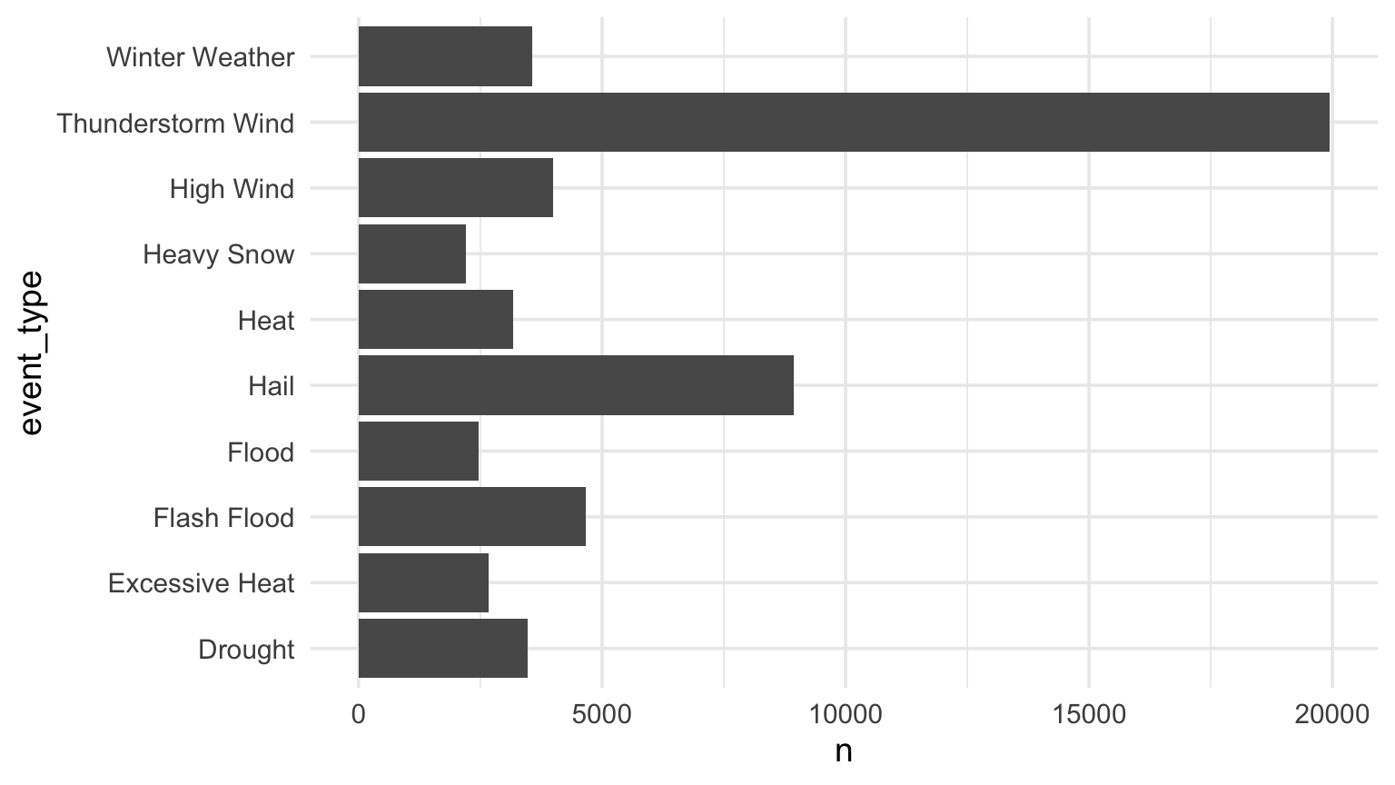
ggplot(type_counts, aes(x = n, y = event_type)) +
  geom_col()

The geometry is a bar. The columns are mapped to x- and y-position.

Order categories for comparison

Code
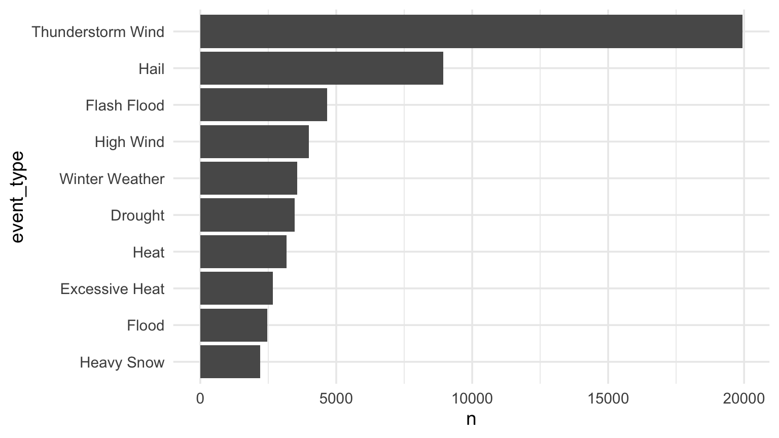
type_counts |>
  mutate(event_type = fct_reorder(event_type, n)) |>
  ggplot(aes(x = n, y = event_type)) +
  geom_col()

Ordering turns an unordered list into a visible ranking.

Modify scale, add statistical summary, and so on…

Code
event_type_plot <- type_counts |>
  mutate(event_type = fct_reorder(event_type, n)) |>
  ggplot(aes(x = n, y = event_type)) +
  geom_col(fill = gold) +
  scale_x_continuous(labels = comma) +
  labs(
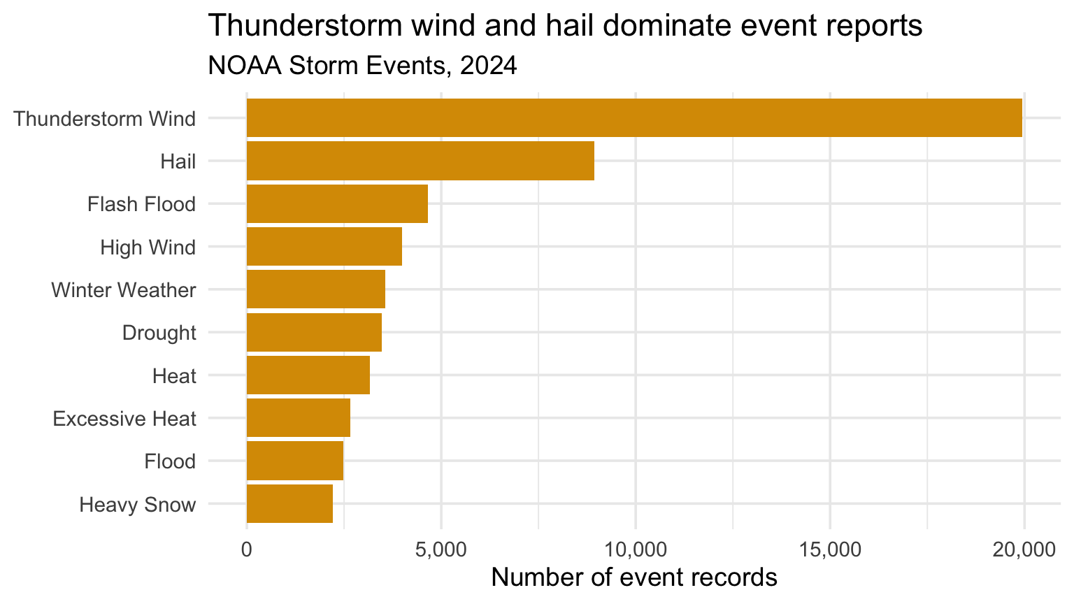
    title = "Thunderstorm wind and hail dominate event reports",
    subtitle = "NOAA Storm Events, 2024",
    x = "Number of event records",
    y = NULL
  )

event_type_plot

Modify scale, add statistical summary, and so on…

Horizontal bar chart of the ten most common NOAA storm event types in 2024.

What changed?

  • Data: counts by event type
  • Geometry: bars
  • Aesthetics: count to x-position; event type to y-position
  • Scale: comma-formatted counts
  • Coordinates: Cartesian
  • Labels: finding, scope, and units

Checkpoint 2 · Change one mapping

Change the plot to answer a question about state or source. Identify the data, geometry, and aesthetic mapping you changed.

Code
events |>
  count(___, sort = TRUE) |>       # choose state or source
  slice_head(n = 10) |>
  ggplot(aes(x = n, y = fct_reorder(___, n))) +
  geom_col(fill = gold) +
  labs(
    title = "___",
    x = "Number of event records",
    y = NULL
  )

In the beginning…

Michael Florent van Langren published one of the first known statistical graphics in 1644. It compared estimates of the longitudinal distance between Toledo and Rome.

John Snow Knows Something About Cholera

Snow mapped deaths around the Broad Street pump to connect a spatial pattern to a public health hypothesis.

John Snow's 1854 map of cholera deaths clustered around the Broad Street pump in Soho, London.

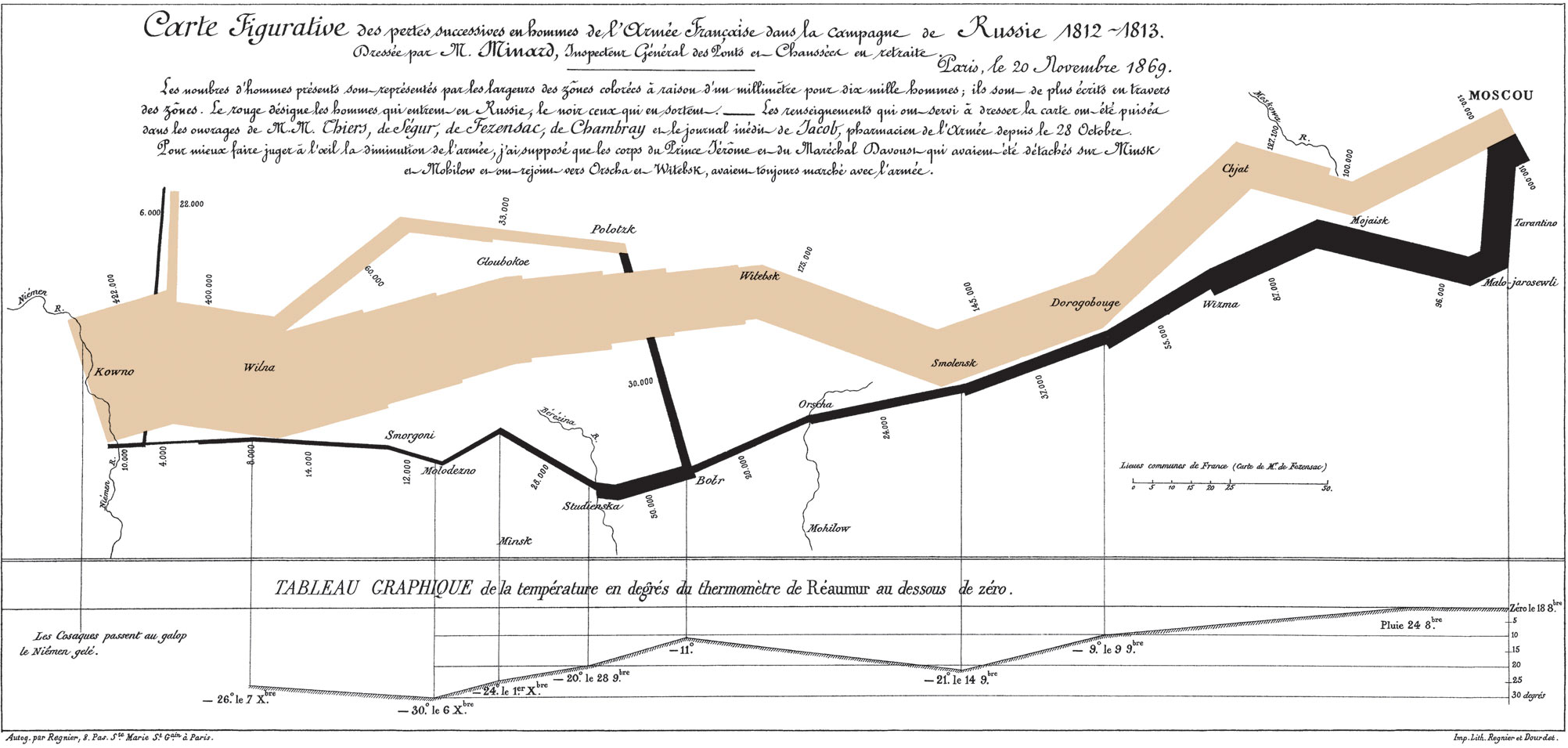
Charles Minard’s Map of Napoleon’s Russian Disaster

The graphic combines location, direction, army size, time, and temperature in one coherent account.

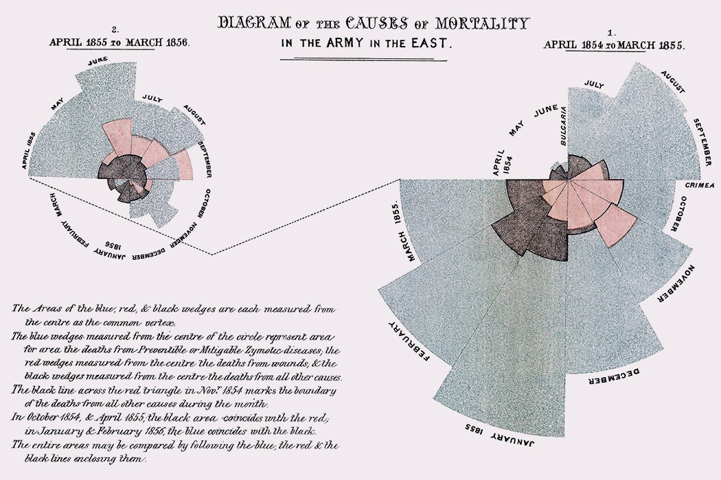
Florence Nightingale’s Rose Diagram

Nightingale used a statistical graphic to make preventable mortality visible to a policy audience.

Milestones in Data Visualization History

These graphics do more than decorate a result:

  • they answer substantive questions,
  • they make comparisons possible,
  • they combine variables deliberately,
  • they organize evidence into an argument.

Edward Tufte’s Principles of Data Visualization

  • Focus attention on the substance, not the drawing technique.
  • Make large or complex datasets more coherent.
  • Encourage comparison.
  • Describe, explore, and identify relationships.
  • Avoid data distortion and unnecessary decoration.
  • Use consistent graphic design.

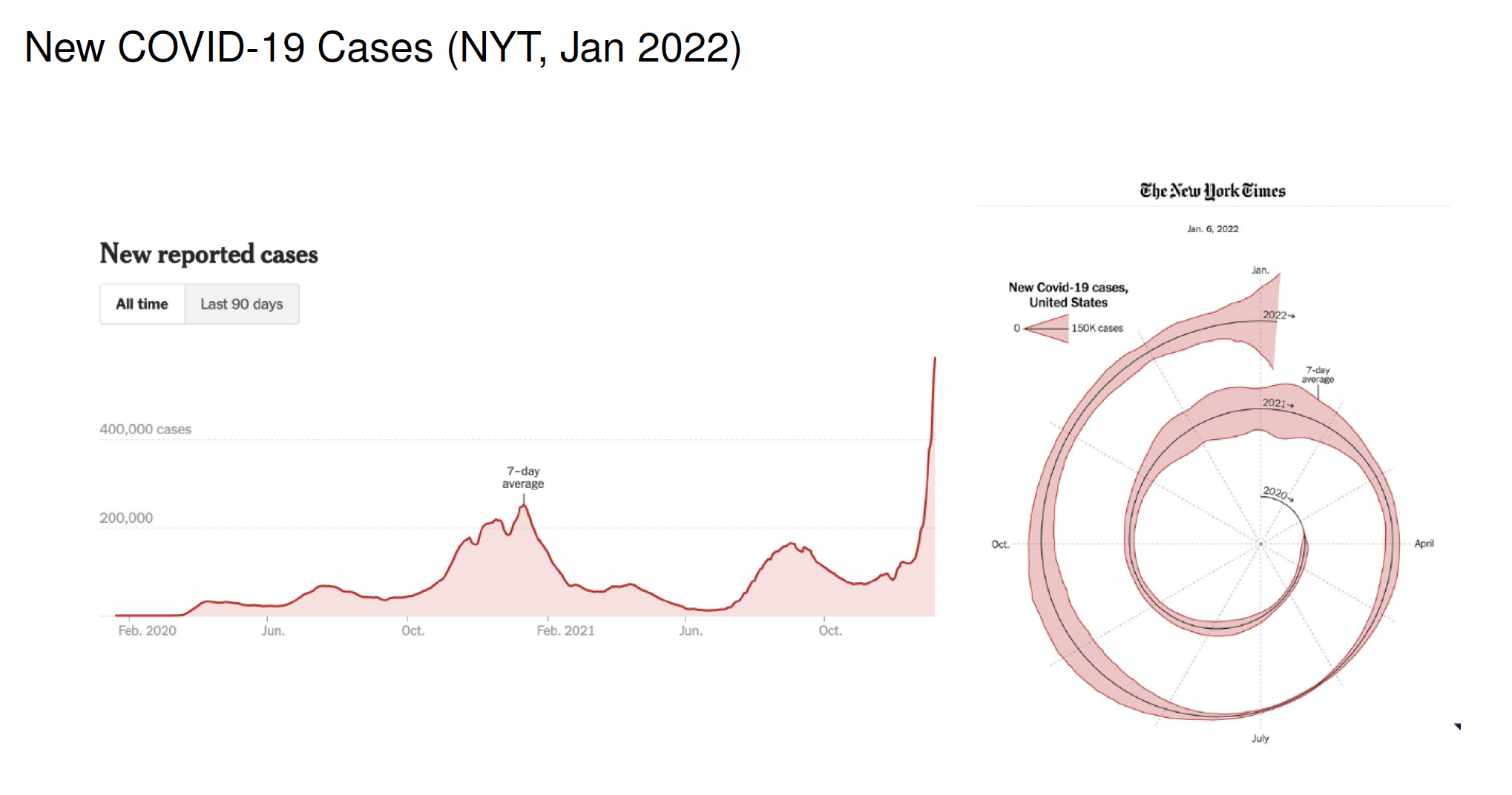
What about this spiral?

A conventional time-series chart of new U.S. COVID-19 cases beside the New York Times spiral version of the same data.

Does the form make comparison easier, or does it only make the chart memorable?

Infographics to communicate a story

An infographic can combine data, annotation, and structure for a broad audience. The same standards still apply: clear comparisons, proportional encodings, and an honest connection between evidence and claim.

Alberto Cairo and the art of insight

Useful graphics balance:

  • truth,
  • function,
  • beauty,
  • insight.

Visual polish matters only after the evidence and comparison are sound.

Checkpoint 3 · Translate the graph

Rewrite “Event type counts” as a title that states the main finding. Then add one sentence explaining the denominator: these are NOAA event records, not unique storms.

Code
event_type_plot +
  labs(
    title = "___",
    caption = "Each bar counts ___, not ___."
  )

Recap and next steps

  • Visualize before analyzing.
  • Know what one row represents.
  • Build graphics from data, geometries, mappings, scales, and labels.
  • Make the comparison easier—not merely more decorative.

Next time: one-variable categorical distributions, proportions, and uncertainty.
Before Sunday: Lab 0 · Getting R, RStudio, and Quarto running. HW1 opens Sunday, August 23.