% Produces four QQ plots for human eye saccade data. Each plot
% shows a different transformation, showing that some
% transformations get the data closer to a normal distribution.
%
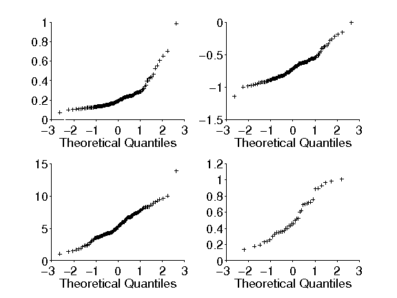
% Figure caption: Q-Q plots.
%
% Upper Left: QQ plot for the data from a particular patient,
% shown in Chapter 1, from the study by Behrmann et al. (2002)
%
% Upper Right: QQ plot of the same data following a log
% transformation
%
% Lower Left: QQ plot following a reciprocal transformation. The
% plot for the log transformed data is straghter than that for the
% raw data; the plot for the reciprocal-transformed data is
% straighter still.
%
% Lower Right: QQ plot
% of data from a different patient, which
% exhibits an S shape.
patient1 = csvread('../data/p3359b.csv', 0, 0);
logReactionTimes = log10(patient1);
reciprocalReactionTimes = 1 ./ patient1;
patient2 = csvread('../data/p3437b.csv', 0, 0);
pd = ProbDistUnivParam('normal', [0, 1]);
behrmanFig = figure
set(gcf, 'Position', [200, 100, 1100, 900])
%% QQ for original data.
subplot(2, 2, 1)
qq1 = qqplot(patient1, pd);
set(qq1, 'Color', 'w', 'MarkerSize', 5, 'MarkerEdgeColor', 'k')
set(gca, 'xlim', [-3, 3], 'ylim', [0, 1], ...
'XTick', -3:1:3, 'YTick', 0:0.2:1, ...
'FontSize', 18, 'TickDir', 'out')
xlabel('Theoretical Quantiles', 'FontSize', 18)
ylabel('')
title('')
%% QQ for log data.
subplot(2, 2, 2)
qq2 = qqplot(logReactionTimes, pd);
set(qq2, 'Color', 'w', 'MarkerSize', 5, 'MarkerEdgeColor', 'k')
set(gca, 'xlim', [-3, 3], 'ylim', [-1.5, 0], ...
'XTick', -3:1:3, 'YTick', -1.5:0.5:0, ...
'FontSize', 18, 'TickDir', 'out')
xlabel('Theoretical Quantiles', 'FontSize', 18)
ylabel('')
title('')
%% QQ for reciprocal data.
subplot(2, 2, 3)
qq3 = qqplot(reciprocalReactionTimes, pd);
set(qq3, 'Color', 'w', 'MarkerSize', 5, 'MarkerEdgeColor', 'k')
set(gca, 'xlim', [-3, 3], 'ylim', [0, 15], ...
'XTick', -3:1:3, 'YTick', 0:5:15, ...
'FontSize', 18, 'TickDir', 'out')
xlabel('Theoretical Quantiles', 'FontSize', 18)
ylabel('')
title('')
%% QQ for another patient's data.
subplot(2, 2, 4)
qq4 = qqplot(patient2, pd);
set(qq4, 'Color', 'w', 'MarkerSize', 5, 'MarkerEdgeColor', 'k')
set(gca, 'xlim', [-3, 3], 'ylim', [0, 1.2], ...
'XTick', -3:1:3, 'YTick', 0:0.2:1.2, ...
'FontSize', 18, 'TickDir', 'out')
xlabel('Theoretical Quantiles', 'FontSize', 18)
ylabel('')
title('')
% Close device.
saveas(behrmanFig, '../figures/behrmanQQ.png', 'png')