motif()
or X11() if you are using a UNIX workstation or win.graph()
if you are running S-PLUS on Windows. Either function should cause a
window titled ``S-PLUS'' to appear. Plot commands entered at the regular
S-PLUS prompt will cause pictures to appear in the S-PLUS window.
Let's start with a histogram of the miles per gallon data (after opening the graphics window).
> motif()
> hist(car.mpg)
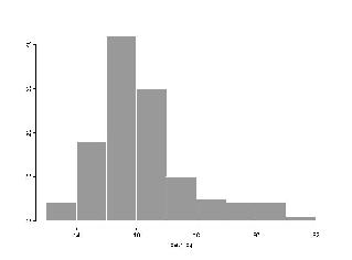
If you try this, your plot will probably be in a different color scheme (probably white boxes on a black background). The color scheme is controlled by a menu in the graphics window, and you may want to change it to ``Black on White'' or whatever you find easiest to read.
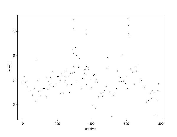
To find out the relationship between how long a car has been owned and
how many miles per gallon it gets, plot car.time on the x-axis
and car.mpg on the y-axis.
> plot(car.time, car.mpg)There doesn't appear to be any obvious relationship between how long a car has been owned and its mileage per gallon.
Question: Is there a relationship betweenIf you givecar.timeandcar.miles, or betweencar.timeandcar.gals? Do some plots and find out.
plot just one argument then it will plot that
vector on the y-axis against an index (this is useful when you want to plot
residuals in the order they were observed, to make sure that the variance
was constant).
When you are done, use the function q() to quit S-PLUS.
You do not need to close the graphics window, it will close on its own.