Functions that create a new picture are called ``high-level'' in S-PLUS
terminology. Some useful high-level functions are hist (produces
a histogram), qqnorm (produces a normal quantile plot) and
plot (described in more detail below).
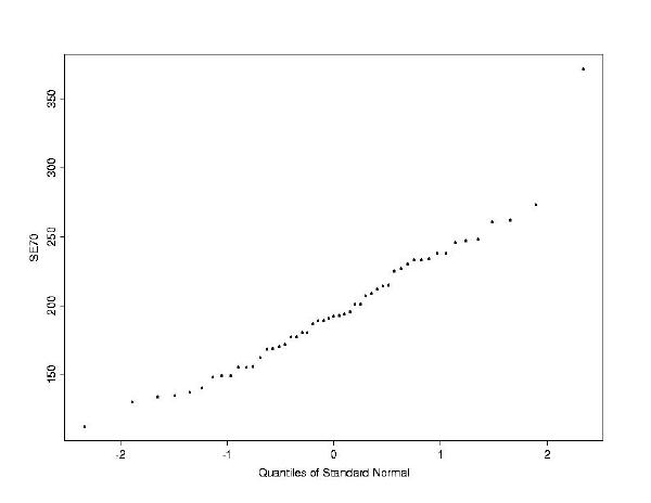
Let's begin our analysis of the education data by examining the distribution
of the response variable, SE70.
> hist(SE70)

> qqnorm(SE70)
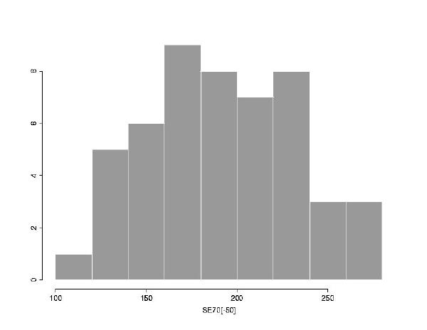
SE70[-50] (school expenditures
of every state but the 50th).
> hist(SE70[-50])
SE70 does not have a particularly
normal distribution after all. Of course, you should check this by doing
another normal quantile plot.
The next step is to examine the relationship between SE70
and the other variables. The function plot will come in handy
here. This function can be called in several different ways, and since S-PLUS
uses Object Oriented Programming, plot will produce a different
sort of plot depending on the class of object it receives. The most common
use is plot(x,y), with x a numeric vector, which
results in a scatterplot of x against y. If
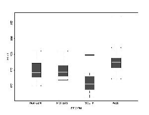
x is a factor, this will instead produce boxplots.
We can expect that school expenditures will be related to the number of
students, so let's plot Y69 (students) against SE70
.
> plot(Y69, SE70)

We can also plot the Region vector (a factor) against school
expenditures.
The function plot can also be called with a single argument,
and the output will be a plot of an index against that vector (if the argument
is a vector) or a series of diagnostic plots (if the argument is a model,
see the handout on models for an example).
Question: How do you do the above boxplots, excluding Alaska? How do you plot only the North East and North Central data?